
Saptarshi Ghosh
The way in which we experience music today has radically changed. In times when bleeding-edge technologies are so closely enmeshed with our daily lived experiences, it is only logical that our insatiable demand for convenience has birthed streaming platforms, which can magically summon any song at any instant. Gone are the days when one would collect music cassettes of their favourite indie band or visit the music store to grab the music CD of the latest Bollywood film whose songs have been doing the rounds on the radio.
In today’s age, music albums are no longer ‘tangible’ entities one can physically hold on to. Earlier, albums were distinct physical commodities that had to serve the profit-driven goal of drawing potential buyers. Hence, the design of album covers became a matter of aesthetic deliberations. People used to explore new music after being lured in by gorgeously designed album covers.
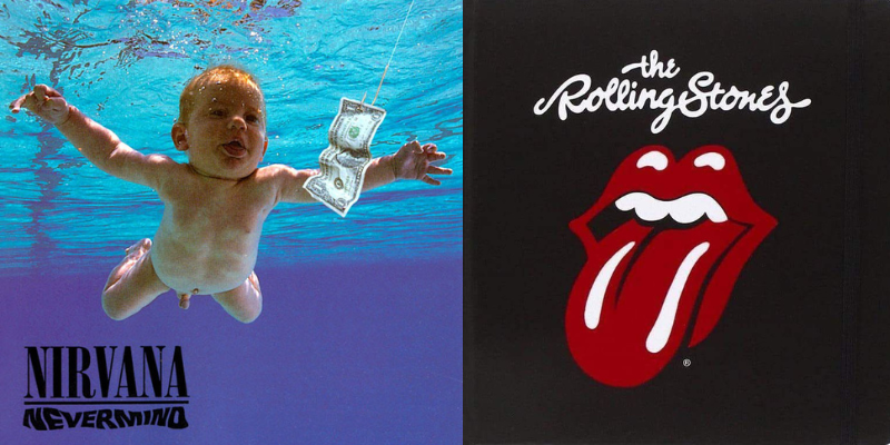
(L) Album cover of Nirvana’s Nevermind(1991); (R) The iconic logo of the band Rolling Stones, designed by John Pasche, which appeared on many of their albums
Courtesy: Entertainment Weekly; Pinterest
Today, we will take a short trip down history to explore how the art of album covers evolved through time!
Beginnings
The early pioneer in album cover art was Alex Steinweiss, an American graphic designer who was hired by Columbia Records in 1938 as the very first director of art. Before Steinweiss broke onto the scene, music records came in blank cardboard or leather-bound covers resembling hardback books or photo albums (the origin of the phrase “music album”). In his prolific career, Steinweiss went on to design albums for eminent musicians like Paul Robeson, Billie Holiday and Igor Stravinsky.

Album cover designs by Alex Steinweiss
Courtesy: alexsteinweiss.com
The advent of 12 inches LP (long-playing) 331/3 rpm records in the 1950s was another crucial moment. The earlier mode of packaging was no longer suitable and record companies started using a folded-over board format sleeve instead. This format paved the way for further experimentation with album cover designs.
Jazz-era album designs
Jim Flora was another important album art designer who gained widespread recognition for his distinctive style featuring a playful blend of caricature and surrealism. Flora mostly designed jazz albums in the post-war era and worked closely with the musicians themselves.

Album cover designs by Jim Flora
Courtesy: La Fiambrera
Hawaii-born graphic designer S Neil Fujita, who was employed at Columbia Records from 1954 to 1960, is known for his work with jazz musicians like Art Blakeley and Miles Davis. Fujita is credited with bringing aesthetics from contemporary modern art into the realm of album art. His design for Dave Bruebeck’s Time Outalbum (1959), for instance, exhibits the influence of Paul Klee and Picasso.

Cover design for Dave Bruebeck’s Time Outby S Neil Fujita
Courtesy: The Jazz Record
Apart from graphic designers, even photographers contributed to creating significant album covers. Charles Stewart was a well-renowned American photographer whose powerful portraits of jazz singers and musicians, like John Coltrane, Ella Fitzgerald and Miles Davis, would feature on their albums.
The Golden Age
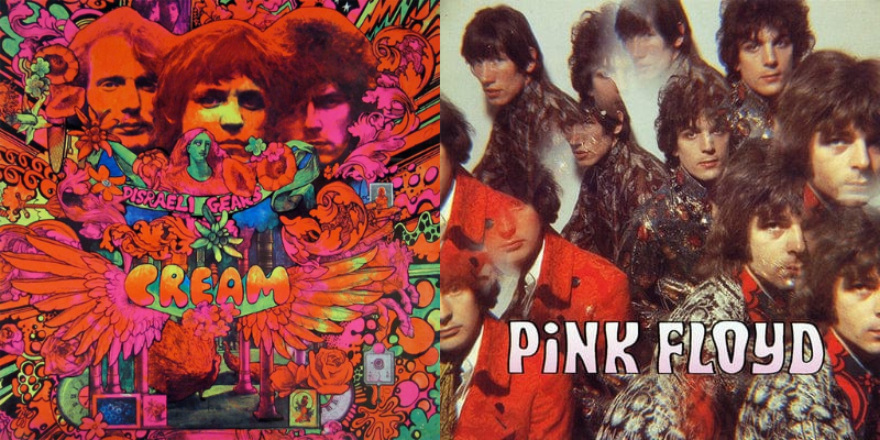
The period between the late 1960s and early 1980s is generally considered the golden age of music album art. During this period, musicians frequently collaborated with artists to carefully craft a visual aesthetic that would complement the music contained in the record. The period witnessed dazzling innovations in album cover design, which inevitably resulted in some of the most iconic album art of all time.
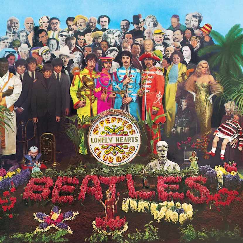
Album cover for the Beatles’ Sgt. Pepper’s Lonely Hearts Club Band
Courtesy: uDiscover Music
In this context, it is imperative to discuss the album design for the Beatles’ Sgt. Pepper’s Lonely Hearts Club Band (1967), is one of the greatest music albums of all time. Designed by Peter Blake and Jann Haworth, the album cover was groundbreaking since it elevated album cover design to a legitimate art form in its own right. The cover featured a collage of famous figures from history and popular culture, including Marilyn Monroe, Bob Dylan and Karl Marx. The cover was a psychedelic masterpiece that not only reflected the vibrant and colourful spirit of the 1960s but prepared listeners for the experimental nature of the music.

Andy Warhol’s album cover for the Velvet Underground
Courtesy: MFA Gallery
Andy Warhol’s design for the Velvet Underground’s eponymous debut album (1967) became iconic for its simple design of a banana, with the words “Peel slowly and see” printed above it. The cover was also significant for its use of a peel-off sticker that revealed a flesh-coloured banana underneath, which was considered controversial at the time.
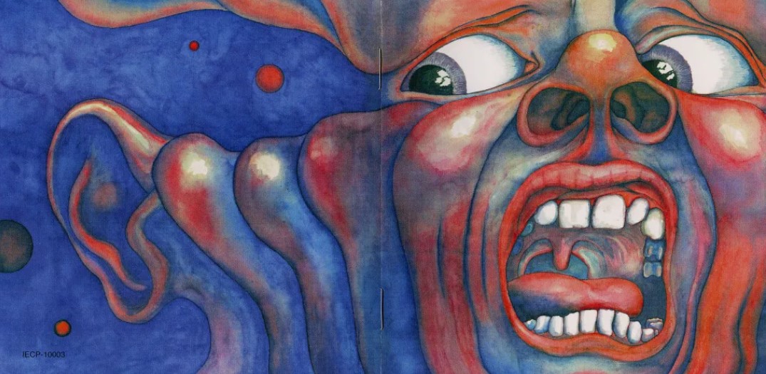
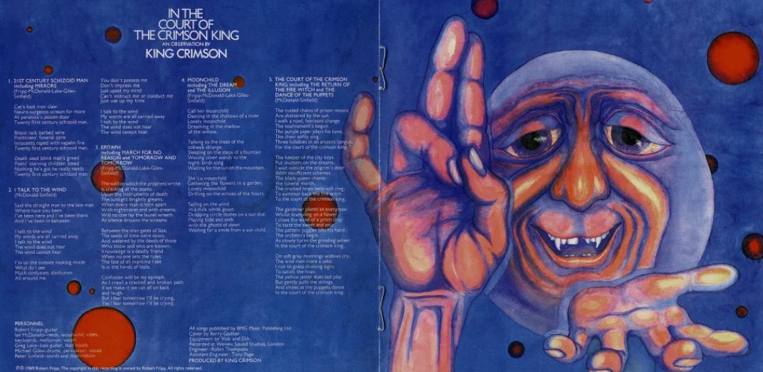
Album design of In the Court of the Crimson King
Courtesy: DGM Live
King Crimson’s In the Court of the Crimson King(1969) was another album cover that embodied the psychedelic aesthetic prevalent during the 1960s. Designed by Barry Godber, the cover featured a surreal painting of a demonic figure surrounded by flames, with the band’s name emblazoned across the top in bold letters. The cover perfectly captured the dark and mystical tone of King Crimson’s first album.
Much of album cover designs in the late ‘60s and early ‘70s used psychedelic aesthetics
The psychedelic aesthetic that influenced many of these album designs drew from a range of artistic movements, including Art Nouveau, Pop Art and Surrealism. Artists such as Peter Max, Wes Wilson and Rick Griffin were at the forefront of the psychedelic art movement and created some of the most memorable album covers of the era. Their designs featured bold, colourful images with intricate patterns and designs.
Concept Albums
As part of ongoing experimentation in rock music, many serious musicians began envisioning their albums as a single, coherent piece of work dwelling on a common theme or concept, like a book or a film. This gave birth to concept albums, some notable examples of which include the Beatles’ Sgt. Pepper’s Lonely Hearts Club Band and Pink Floyd’s The Dark Side of the Moon(1973). Consequently, album designs had to reflect the overarching theme or concept the band was trying to convey through their music. Listeners would not be expected to just listen to the music; they would also be encouraged to view the album cover art, which would constitute another layer of sensory experience.
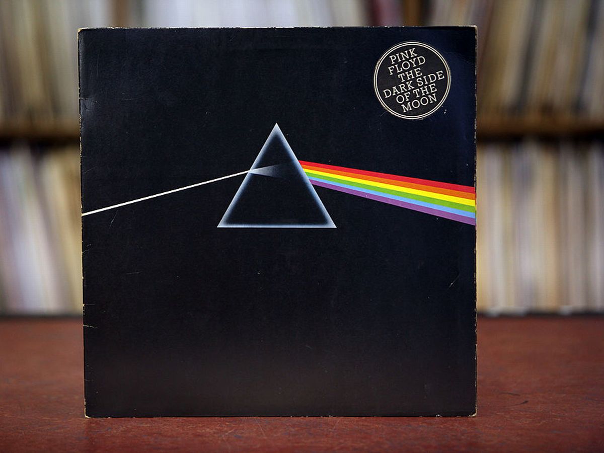
Album cover for The Dark Side of the Moon
Courtesy: The Mirror
Hipgnosis, a British graphic design studio founded in the 1960s by designers Storm Thorgerson and Aubrey Powell, was responsible for creating some of the most iconic album covers of the 20th century. They are perhaps best remembered for their frequent collaboration with the legendary rock band Pink Floyd. Their most famous work with the band was the cover for their concept album The Dark Side of the Moon.
The album cover featured a striking image of a prism refracting light into a rainbow. The image was designed by Thorgerson and Powell and was based on an actual prism they had acquired for the project. The prism was photographed and the final image was created by overlaying the prism image onto a black background. The simplicity and elegance of The Dark Side of the Moon cover made it an instant classic. Widely reproduced and imitated, it has become one of the most recognisable album covers in history.
Music Album Art in India
Music album design in India has undergone a remarkable transformation since the late 1990s. Earlier, album covers featured a photograph of the artist or band with the album title and tracklist superimposed on it. Also, the fonts used were simple and straightforward. The focus was on the music rather than the design of the album cover.
However, in the late 1990s and early 2000s, there was a shift towards more creative and experimental album designs. The rise of the independent music scene in India led to a surge in creative album designs that challenged the traditional norms of album cover design.
This is a trend that continues to this day. Currently, the most cutting-edge innovations in album cover design are being carried out in the indie music scene. Anup Bhat is an illustrator for international brands who have created designs for the British rock band Anathema and the Swedish progressive act Opeth. Saloni Sinha is another Bangalore-based illustrator who has designed for the metal project Amogh Symphonyand the ambient act Riatsu. Known for her dreamy aesthetics, Sinha’s creative process involves extensive conversations with the band and repeatedly listening to their music. Suryakant Sawhney aka Lifafa’s 2019 album Jaagoboasts a gorgeously vibrant album cover. Featuring a technicolour portrait of the artist himself, it was the brainchild of the painter Vivitsa Kohli.

(L) Anup Bhat’s design for Anathema; (M) Saloni Sinha’s album design for Amogh Symphony; (R) Vivitsa Kohli’s album design for Jaago
Courtesy: Indulge Express
So, the next time you stream music on Spotify or YouTube, take note of the thumbnail displaying the album art. You might stumble upon some stunning pieces of art!
Bibliography:
- https://www.udiscovermusic.com/in-depth-features/history-album-artwork/
- https://www.solopress.com/blog/art-design/a-brief-history-of-album-art/
- https://ahummingheart.com/features/what-independent-music-visuals-designers-dig/
- https://www.indulgexpress.com/culture/music/2019/jun/21/meet-the-illustrators-who-help-bring-indias-indie-music-into-the-picture-literally-15859.html
https://www.dazeddigital.com/music/article/21648/1/alex-steinweiss-the-art-of-music


