

Iftikar Ahmed

Colour psychology is a fascinating field of study that explores the powerful impact that different colours can have on human emotions and behaviour. From calming blues to energising yellows, each colour has its own unique ability to evoke specific moods and feelings within us. This knowledge has been widely applied in various industries such as marketing, advertising, and branding to create powerful messages that resonate with their intended audience. By understanding how colours influence our perception and emotions, we can use this information to create more effective visual communication and to better understand the psychology behind our own responses to different colours. In this way, colour psychology offers valuable insights into the ways in which we interact with the world around us and how we can use colours to enhance our experiences and improve our lives. In this article, we will discuss 11 things about colour psychology that you should know.
-

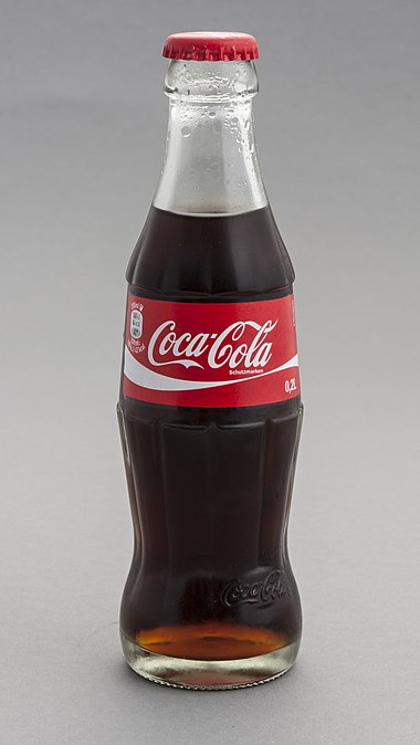
Coca-Cola uses red prominently in its branding and packaging, and the colour is associated with the brand’s signature drink. Courtesy:wiki Red: Red is associated with passion, love, and excitement. It can increase heart rate and create a sense of urgency, which is why it is often used in advertising and marketing to create a call-to-action.A common example of a product that uses the color red in its advertising and marketing to create a call-to-action is Coca-Cola.
- Blue: Blue is associated with calmness, tranquility, and stability. It can reduce stress and anxiety and create a sense of trust and security, which is why it is often used in branding for banks and financial institutions.
- Yellow: Yellow is associated with happiness, optimism, and energy. It can create a sense of warmth and friendliness and is often used in advertising for children’s products and fast food restaurants.
- Green: Green is associated with nature, growth, and harmony. It can create a sense of balance and relaxation and is often used in branding for environmentally friendly and organic products.
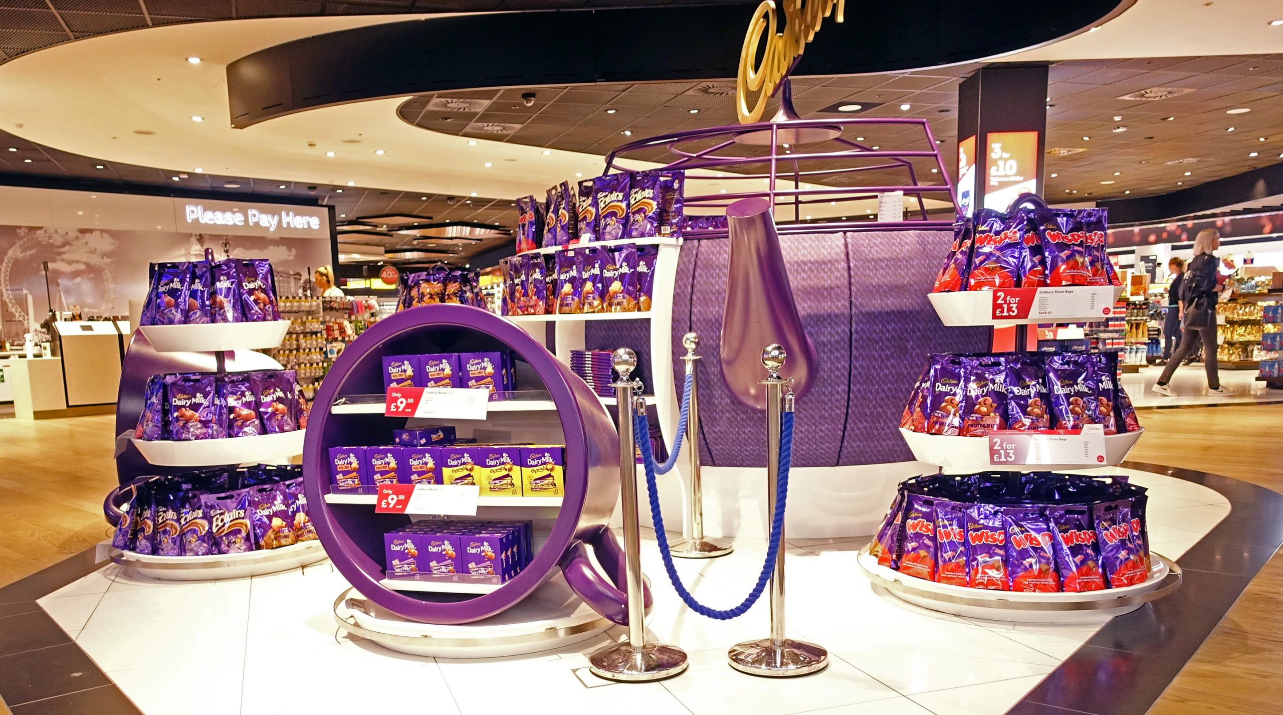
- Purple: Purple is associated with luxury, royalty, and creativity. It can create a sense of sophistication and elegance and is often used in branding for high-end products and services.

Cadbury aims to establish itself as a premium and sophisticated chocolate brand, appealing to consumers who value quality and indulgence in their food choices.
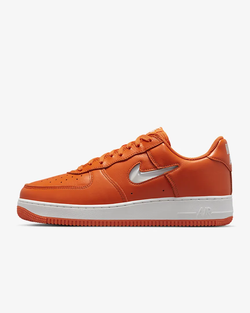
Courtesy: wiki - Orange: Orange is associated with excitement, enthusiasm, and warmth. It can create a sense of fun and playfulness and is often used in advertising for sports and entertainment. One example of a product that uses the color orange in its advertising for sports and entertainment is Nike. Nike’s iconic “swoosh” logo is usually displayed in a bright shade of orange, which is intended to convey excitement, enthusiasm, and warmth.

The color orange is also used in Nike’s marketing campaigns for its sportswear and equipment, which often feature athletes engaging in high-energy activities like running, basketball, and soccer.
Courtesy :Nike - Pink: Pink is associated with femininity, love, and compassion. It can create a sense of nurturing and caring and is often used in branding for beauty and skincare products.
- Black: Black is associated with power, sophistication, and mystery. It can create a sense of authority and exclusivity and is often used in branding for luxury products and high-end services.
- White: White is associated with purity, cleanliness, and simplicity. It can create a sense of clarity and neutrality and is often used in branding for healthcare and wellness products.
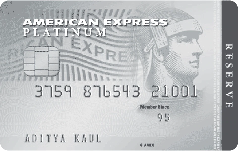
- Gray is associated with professionalism, formality, and sophistication. It can create a sense of stability and balance and is often used in branding for business and financial services.One example of a product that uses the colour gray in its branding for a business and financial services is American Express.

American Express uses a shade of gray as the primary color in its logo and branding, which is intended to convey professionalism, formality, and sophistication.
Courtesy:American Express - Brown: Brown is associated with nature, warmth, and simplicity. It can create a sense of comfort and reliability and is often used in branding for food and beverage products.
Color psychology is a powerful tool that can be used to create a specific mood or feeling in advertising, marketing, and branding. Different colors can evoke different emotions and moods, and understanding this can help companies create a strong and effective visual identity.


