What is Color?
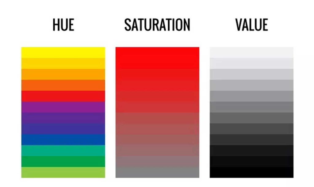
In art, color is more than just a visual component; it’s a potent language expressing meaning, mood, and emotion. Artists have used color combinations to convey concepts and emotions to produce visual harmony throughout history. Hue, value, and saturation are the three main characteristics of color in painting, all of them found on the color wheel.

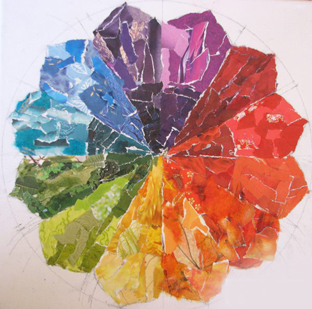
Image Courtesy- Louise Gale
Elements of Painting in Color
Hue, which describes the actual color—such as red, blue, or yellow—is frequently what people identify with immediately.
Value establishes a color’s lightness or darkness, affecting the composition’s contrast and depth.
The intensity or purity of a color is referred to as its saturation in the color theory for artists, and it can either increase vibrancy or produce a more subdued appearance.
To investigate the subtleties of a single color, an artist can work with different tints (made by adding white), shades (made by adding black), and tones (made by mixing with grey) creating various color combinations out of it.
How Can Color be Used?
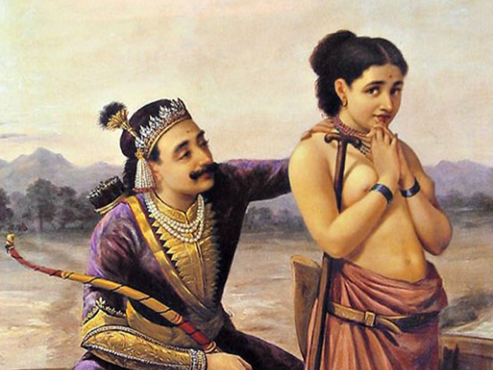
Artists employ color to accomplish effects and direct the viewer’s attention. While cool colors like blues and greens frequently imply calmness, serenity, or sorrow, warm colors like reds and yellows can inspire warmth, passion, or vitality. Knowing color combinations can expands an artist’s emotional language when creating art and improves their technical proficiency.
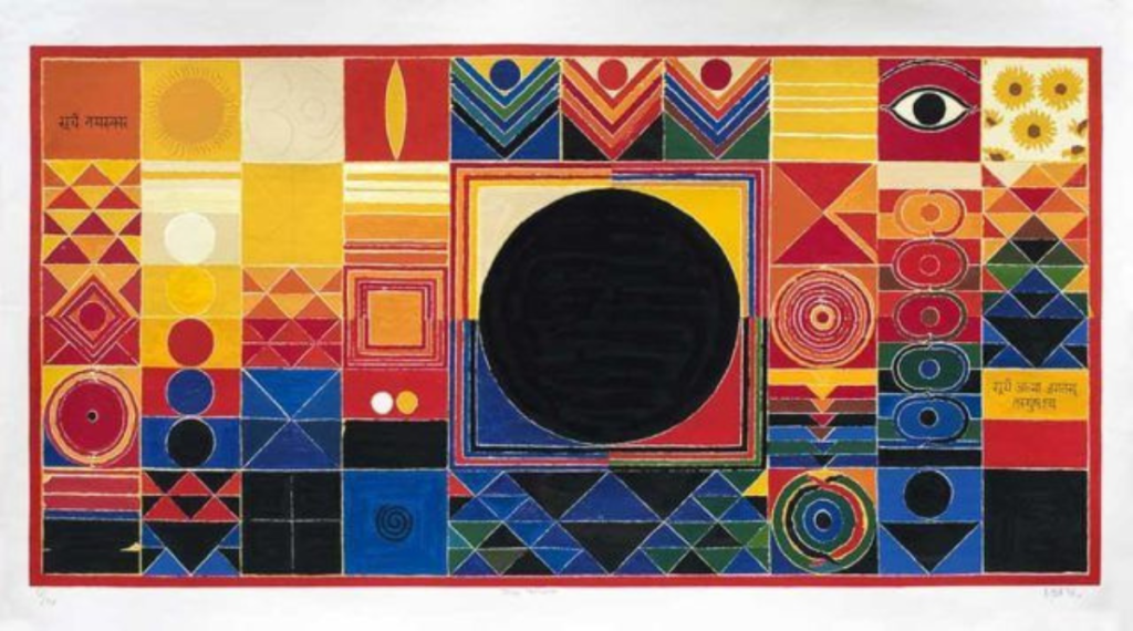
Image Courtesy- laasyart
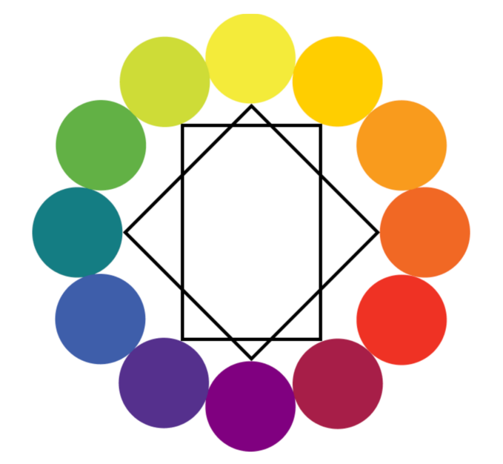
The Color Wheel for Artists
The color wheel is defined as an arrangement of color in a circle that shows the relationship between primary and secondary colors, while also identifying complementary, contrasting and cancelling hues in the spectrum of color.
The popular illustration has played a very important role in art and visual media. developed over centuries as an example of science and artistic expression coming together to facilitate invention and art. The color wheel is made use of in fine arts, print and audio-visual media and technology.
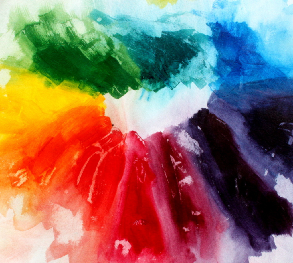
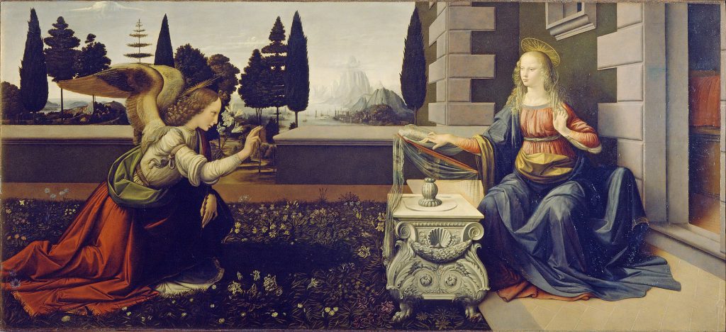
Image Courtesy- Louise Gale
Primary, Secondary and Complimentary Colors
The fundamental hues from which all other colors are generated are known as primary colors. These colors are red, yellow, and blue in traditional art. By carefully combining fundamental colors, artists may create many options to add depth and vitality to their works. Primary colors contribute significantly to art’s emotional language and provide a technical basis in color theory for artists
Secondary colors are produced by an endless combination of primary colors. They help increase the spectrum of colors that can be used and are essential to composition and color harmony. Through the skilful manipulation of primary and secondary colors, artists can augment story components and intensify the audience’s interaction with their artwork. .
When two hues are paired and put precisely across from one another on the color wheel, they produce a striking contrast. These colors are known as complementary colors. For example, the pairs of red and green, yellow and purple, and blue and orange show these complementary associations. They tend to imply visual equilibrium. They help draw attention to a composition’s particular details or focus points.
Color Psychology in Art
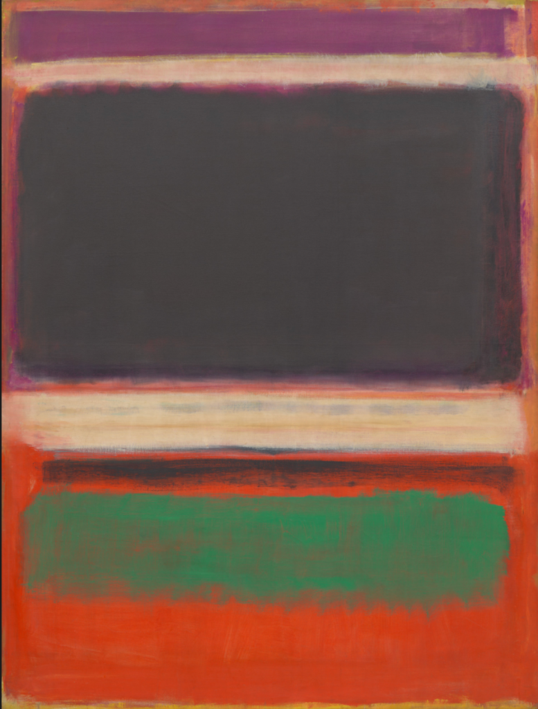
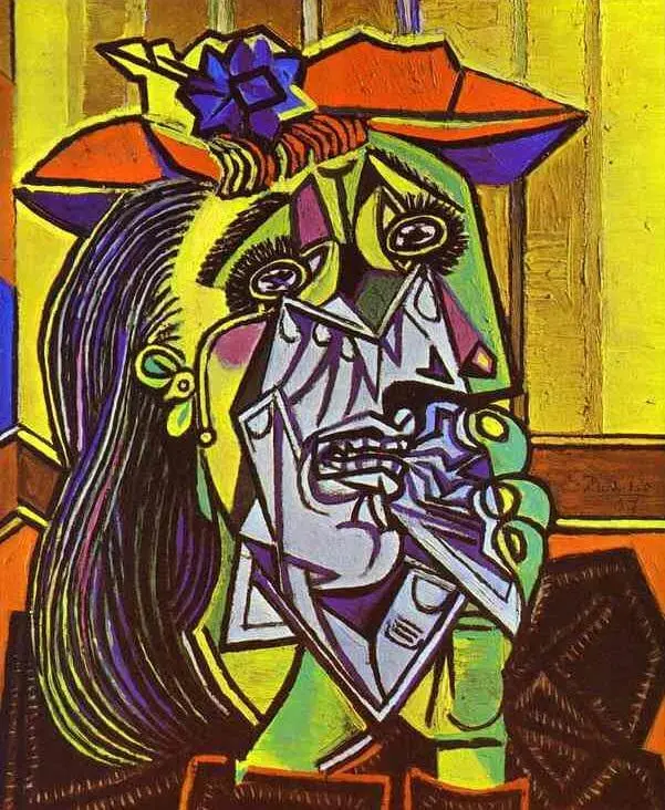
Image Courtesy- MoMA
The importance of color theory is rooted in the color psychology of art. The effects of color significantly influence how people view art. Specific colors are culturally linked to particular feelings or concepts, and colors have the power to elicit strong emotional reactions. Blue, for example, is frequently associated with peace and steadiness, whereas crimson might stand for passion, danger, or love.
Another importance of color theory for artists is how artists can use color to reach out to the people interacting with their art. Fundamentally, color is the difference between different tints and tones the human eye perceives when light bounces off an object. Artists have used color throughout history to build communication with the viewer. Color can help create a visual image of the artists thought process. The development of colors broadens the artist’s range and enables the investigation of novel spatial and emotional nuances.
Conclusion
There are many meanings and uses of color theory for artists, and studying color in art is extensive and complex. Color theory for artists can significantly improve artistic expression. Artists can use color as a solid instrument to bring their ideas to life and capture the complexity of the human experience through visual art by grasping these elements of color theory. However, color theory does not limit itself to simply understanding the structure of color alone, it evokes recognition that color goes beyond the visual medium- it elicits emotion, thought, cultural symbols