Pratiksha Shome
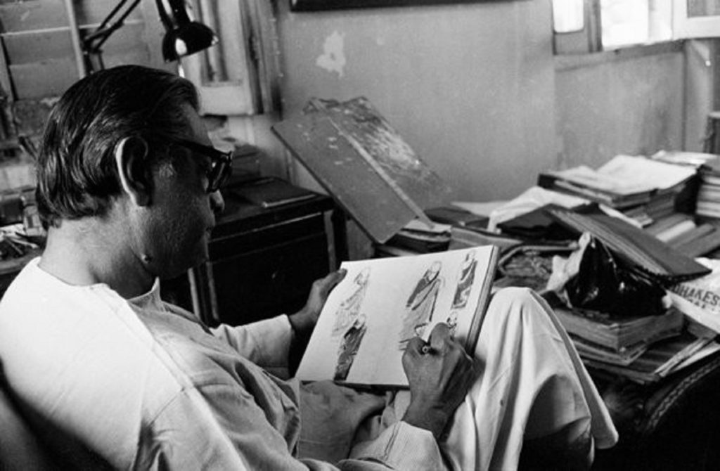
A relatively lesser-known artistic identity of Manik babu, aka the world-renowned Satyajit Ray is often overshadowed by his films and his identity as a filmmaker. Ray’s films, books, and magazines, would have been incomplete without his illustrations. A glimpse of this is shown in his biographical cinema “Aparajito” by Anik Dutta. The illustrations and artworks done by Ray left an impact on his cinema and writings which should be mainstream and appreciated by art consumers and lovers.
His story of illustrating and making artwork began at a very young age. When Ray graduated from Presidency University, much to his dismay, his mother persuaded him to study under the fine arts (Kala Bhavan) department of Viswabharati University (A cultural and intellectual hub of then Bengal).
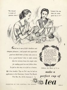
Now, Ray belongs to a family that went down in history for creating art(illustration, poetry and writings). His grandfather Upendrakishore Roychowdhury, a profound children’s books writer and painter introduced colour printing in Bengal. His father, Sukumar Ray a very famous poet of his time, introduced “nonsense poetry” (Abol-Tabol) and illustrated some of his famous characters. This explains the lineage of artistic abilities in Ray, despite his denial of studying art. Ray, after all, was a natural artist and later in his career, he credited Visvabharati for his learnings. He quoted: It was there that I learnt to look at nature, how to respond to nature and how to feel the rhythm of nature. Despite studying at a prestigious university under mentors like Nandalal Bose(The pioneer of contextual artwork and lino art in India) and Binode Behari Mukhopadhyay(Another pioneer of modern and contextual Indian art), Ray never completed his study. He spent only two years at Shantiniketan as his city-dwelling instincts took over and he joined a UK-based advertisement company, D.J. Keymer as a copywriter and illustrator. It was the time when Calcutta was being built, Hollywood movies were played at theatres, GIs were all over the town and intellectualism was at its peak. Ray did not want to miss out, he was a city-bred and he returned. Although Ray never appreciated himself for the artwork he did as he mentioned in an interview about making art as a career, he said: “I have never taken my graphic words seriously, and never considered it as worthy of being exposed to the public.” Most of his days were spent working as an artist, he worked for the company he joined where he created advertisement most of which is lost now or cannot be identified as he rarely or never signed his works. The only testimonial that is present is an advertisement for a tea brand that Ray signed his name under.
Courtesy: Firstpost
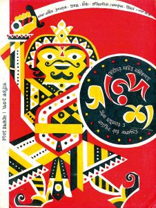
By the time Ray joined the ad company, he was already theoretically indulged in filmmaking and the innumerable books on film of the Kala Bhavan library helped him to know and learn about films. Together, this was an extremely inspiring phase for Ray. He recalled how Nandalal Bose sent him along with 20 students to Ajanta caves and Sun temple and the experience honed his sensibilities. The result of the amalgamation of understanding of Art and cinema is profoundly witnessed in his movies, which by the way was not really restricted to the cinema but to the covers of books and magazines as well. Satyajit Ray, singlehandedly and unflaggingly churned out countless covers which spanned across calligraphy, designs, layouts, techniques and the gamut of graphic art for not only Signet Press but the family magazine of Ray “Sandesh” that he revived in 1961.
Courtesy: সত্যান্বেষী 2.0
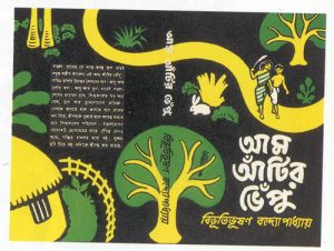
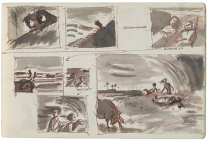
The first cinema, “Pather Panchali” that Ray made was an adaptation of Bibhutibhusan Bandyopadhyay’s novel of the same name. A section of that book, called “Aam aatir bhepu”, something that is still being taught at the schools of Bengal, was published by Signet whose cover was illustrated by Ray and later he painted the storyboard for the movie in half-tone wash art.
Courtesy: Satyaneshi 2.0
Courtesy: scroll.in
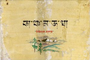
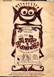
Calligraphy was also a tool that Manik babu often used to embellish his movie posters and book titles, many of whose original copy is now lost or the time has taken its toll to destroy them. Take an example of the title card for Kanchenjungha that manifests paintings, with the titles done in Tibetan style in photo-tint which is the use of transparent colours or the Goopy Gyne Bagha Byne’s titles created in pen and ink wash with a touch of half-tone. —
Courtesy: Wikipedia
Courtesy: Wikipedia
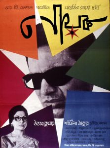
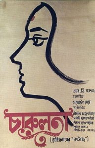
Since Kanchenjungha was his first colour film, he chose pastels in his palette to design costumes, contradicting the natural brightness of the background. This is a clear indication of having an eye as an artist. In tune with art and calligraphy, Ray showed his crafting skills which can be observed in the poster of “Nayak” where he cut the paper in the shape of a star through which the dark glasses of Uttam Kumar stare out at the world. Another art form, Linocut, that he might have acquired from his mentor Nandalal Bose since he was an advocate of such an art form, was used in the posters of Charulata(Whose original copy has now come to the end of existence)
Courtesy: IMDB
Courtesy: Wikipedia
The artworks of Ray were noticeable in his movies as well, the opening credits of “Joy Baba Felunath” was hand painted by Ray, also the art on the streets of Banaras near Maganlal Meghraj’s house was Ray’s creation.
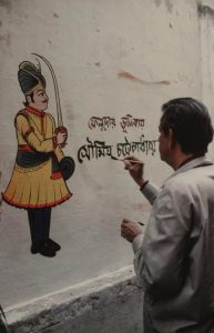
Courtesy: Reddit
Ray gave tribute to Shantiniketen with the two best Arts that he learned there, “The Inner Eye” a documentary on his mentor Binode Behari Mukhopadhyay (a blind artist) is the first and the second time it was done while shooting Feluda’s drawing room from “Sonar Kella” where the Jamini Roy piece hanging in the backdrop was painted by Ray. Since it was not the era of the internet, procuring art and printing them was difficult, hence his artistic qualities came to the rescue.
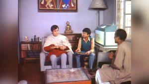
Courtesy: Telegraph
In 1961, Ray revived the Children’s Magazine that his grandfather started, where he discovered his literary ability and wrote stories along with illustrating its characters. One such persona is “Professor Shanku” whose 1st appearance was marked with “Byomjatrir Diary”. He also worked with other magazines making artwork of his most famous character “Feluda” for Desh during the Pooja release. He apparently took inspiration from the actors that played his characters in the two Feluda movies he made. After the death of Santosh Dutta(The actor who played Jatayu), Ray stopped making Feluda movies, he said he could not imagine anyone else playing the character, in fact, his illustration of Jatayu was in accordance with Santosh babu.
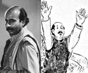
Courtesy: Twitter

Courtesy: Satyaneshi 2.0
Ray was a curator of stationeries, he would collect exquisite pens and inks all over the world while travelling. His fondness for art materials was so strong that he preferred the crow-quill method and derived artistic pleasure and satisfaction from it because of the exclusivity of the nib. Satyajit Ray’s son once revealed that during his lifetime until his death his father would draw, probably spending more time exploring his artistic abilities than with movies. During his era of making movies, he unlike other directors of his time used handmade illustrations in his movie posters. The use of lino cut, woodcuts and pen-ink sketches often found residence in his works giving a glimpse of typography. He, in fact, won an award for two typefaces he designed- Ray Roman and Ray Bizzare- about which not many people are aware.
Ray’s illustrations of par excellence are now surviving in his films, posters, books and magazines, even tho we lost the maestro in 1991.

