Abirpothi

India’s only daily art newspaper

An Odyssey of Web Design Across Time: Revealing the Art of Images in Sculpting Digital Worlds

The development of web design is an interesting journey that reflects the confluence of changing design philosophies, user expectations, and technology advancements. Information access was revolutionised in the late 20th century with the launch of the World Wide Web, led by Tim Berners-Lee. A revolutionary era began in 1991 with the launch of CERN’s first website.

The 1991 release of HTML (Hypertext Markup Language) gave web documents a standardised format. The basic language paved the way for the creation of increasingly complex websites.

The mid-1990s saw the emergence of Netscape Navigator and the start of the Microsoft Internet Explorer Browser Wars. This competition spurred quick innovation, creating new HTML tags and reshaping the internet’s visual interface.

In Pictures: A visual history of Netscape Navigator - Slideshow - ARN
In Pictures: A visual history of Netscape Navigator | Courtesy: ARN

The late 1990s to early 2000s saw the emergence of Macromedia Flash, a popular tool for creating interactive and multimedia-rich websites. This period witnessed a multimedia renaissance, with animations, sound, and video transforming the digital experience.

Download Macromedia Flash 8 8.0
Flash 8 8.0 | Courtesy: Soft32

Cascading Style Sheets (CSS) emerged in the late 1990s, allowing for the separation of content from presentation. This development enhanced flexibility and control over visual elements, paving the way for cleaner and more efficient code.

What Is Cascading Style Sheets (CSS)? Definition from TheServerSide
Cascading Style Sheets| Courtesy: TheServerSide

The dot-com boom in the late 1990s marked a surge in businesses establishing an online presence. While the initial focus was on digital presence, this period laid the groundwork for a subsequent demand for more sophisticated web design services.

In the early 2000s, the Web Standards Project (WaSP) advocated for standardised practices, promoting browser compatibility and accessibility. This movement signaled a shift towards more consistent and user-friendly designs.

The mid-2000s ushered in the era of Web 2.0, emphasising user-generated content and dynamic interactivity. Blogs, social media platforms, and content-sharing websites became prominent, reshaping the user experience.

Responsive web design gained prominence in the 2010s, addressing the proliferation of devices. This approach ensured websites seamlessly adapted to different screen sizes, with a growing emphasis on mobile-first design.

The 2010s witnessed the rise of flat design, emphasizing simplicity and minimalism. Simultaneously, Google introduced Material Design, adding depth and vibrant colors to enhance digital interfaces.

Google I/O 2010 Theme[Aero Version]
Google I/O 2010 Theme[Aero Version] | Courtesy: Google
Advancements in web technologies, including HTML5 and CSS3, in the 2010s and 2020s enabled more interactive and visually appealing designs. JavaScript frameworks like React and Angular facilitated the development of sophisticated single-page applications.

In recent years, design trends like dark mode and minimalism gained popularity, emphasizing simplicity and user-centered experiences. The integration of Artificial Intelligence (AI) and chatbots has humanised digital interactions, providing personalised and responsive experiences.

How to Turn Off Dark Mode on Google Search Pages
Dark Mode settings on Google Search Pages | Courtesy: Google

The history of web design is am evolution of the dynamic nature of the internet and the continuous changes in design principles. As technology advances, the future promises further innovations, pushing the boundaries of what is possible in the realm of web design.

The relationship between design and content in the context of web design is frequently compared to a royal partnership. In the wise words of Lee Odden, “Content isn’t King, it’s the Kingdom.” The users are the subjects in this digital realm, and the content is the foundation of their experience. Images stand out among the various types of digital content as a potent communicator that may draw viewers in, communicate ideas, and improve user experience in general.

Understanding Web Content

Web content encompasses everything that fills a website, shaping the user experience through text, images, video, animation, and audio. In this exploration, our focus turns to images, delving into their pivotal role in user experience design.

Types of Images in Web Content

1. Logo: A Symbolic Identity

Logos, symbolic representations of brands, adorn the digital landscape. Placing them strategically in the header ensures high visibility, while maintaining the convention of linking to the homepage offers seamless navigation. Consider incorporating subtle logo animations to infuse interactivity and vibrancy into the user journey.

Abir Pothi landing page with an interactive logo

2. Photos: Web Design Classics

Photos, the quintessential elements of web design imagery, serve various purposes, from showcasing products on e-commerce sites to adding aesthetic appeal to blog articles. Whether obtained through custom shoots, paid stock photos, or free stock photo websites, high-resolution, and well-optimized images are essential. Embrace the trend of using photos as background images for a visually immersive experience, but ensure contrast and legibility for optimal design.

Photo gallery on Abirpothi.com

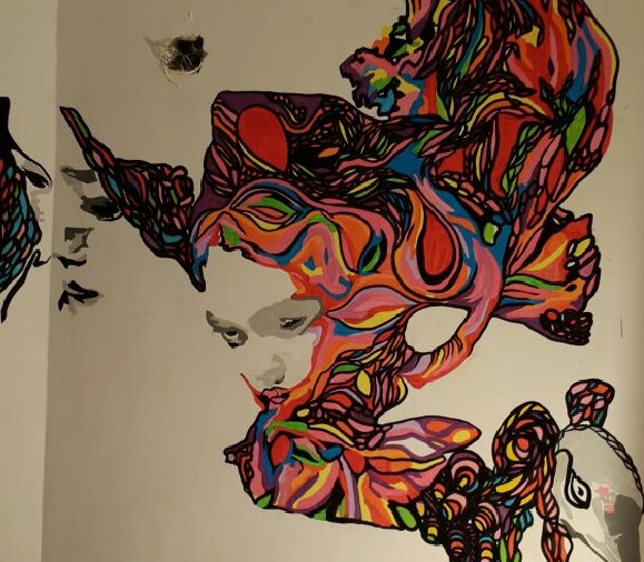
3. Illustrations: Adding Originality

Custom illustrations, a rising trend in web design, contribute to visual originality and efficient information communication. From hero images to storytelling and infographics, illustrations find diverse applications. Tailor them to match the tone and voice of the platform, creating a visually engaging and cohesive user experience.

Wix is a popular website for a designer, digital agency landing page

4. Mascots: Humanising Interaction

Mascots, personified images representing brands or services, introduce a human touch to interactions. These characters can change appearance, express emotions, and provide instructions, enhancing the overall user experience. Leveraging mascots fosters a more relatable and engaging interaction with the system.

Mozilla Firefox Review | PCMag
It’s a common misbelief that the #Firefox #logo is a fox but it is actually a red panda! The red panda (Ailurus fulgens) is a mammal native to the eastern Himalayas and southwestern China. The English word for red panda is “Firefox,” and that’s where the browser gets its name!

5. 3D Renders: Realism in Design

3D renders, with their photorealistic effects, bring a touch of realism to web design. While they require specific skills and can be costly, well-executed 3D graphics have a significant impact on design aesthetics and conversion rates. Ideal for showcasing products or services that are challenging or expensive to photograph.

homepage for the 3d website apple

Why Images Matter

The significance of images in web content design is underscored by several compelling reasons:

  • Rapid Perception: People perceive images 60,000 times faster than text, facilitating quick understanding.
  • Memory Retention: Visuals stick better in long-term memory, enhancing user interactions.
  • Global Appeal: Thoughtfully used images make interfaces more universal for diverse user bases.
  • SEO Benefits: Well-optimised images improve search engine rankings, driving organic traffic.
  • Accessibility: Images cater to users with text recognition challenges, ensuring inclusivity.

The dynamic interplay of text and images forms the foundation of a compelling web experience. As we navigate the ever-evolving landscape of web design, understanding the nuances of each image type empowers designers to create captivating and user-centric digital realms.

Feature image Courtesy: Simply learn

Designing Intuitive and Engaging User Interactions: A Dive into Psychological Principles for Optimal User Experience

Leave a Comment

Your email address will not be published. Required fields are marked *