Everything You Must Know About Federal Architecture Style
After the American Revolution, a new style of architecture was born in 1780-1830. It was at its peak in 1785-1815. Federal style architecture is also called Adamesque architecture, alluding to English architect, Robert Adam. It was Thomas Jefferson, Benjamin Latrobe, and their contemporaries who modified Palladian architecture to engender a new category. Some of the most popular Federal architecture buildings remain the White House, Capital Building; Richmond, Virginia, University of Virginia, and Jefferson’s Monticello estate. It also applies to furniture design.
The American Federal style architecture is comparable to the French Empire style, Britain’s Regency architecture, and the classic Biedermeier style. This style alluded to the Roman republican ideals and the Grecian democracies. America’s Minard Lafever and Charles Bulfinch are credited with popularising the neoclassical high style. By the 1820s, the admiration of the style saw a decline, only to be succeeded by the Greek or Classical Revival Style.
It must not be confused with the Federal Enterprise Architecture Framework or FEAF, which is the protocol the US federal government sets for in-house federal enterprise architecture to achieve maximum productivity.
Characteristics of Federal Style Architecture
You can also see them in lighthouses, harbour buildings, universities, and hospitals. Now that we know the foundations of federal period architecture, let’s find out some of the defining characteristics of federal architecture houses, and buildings.
1. Materials Used
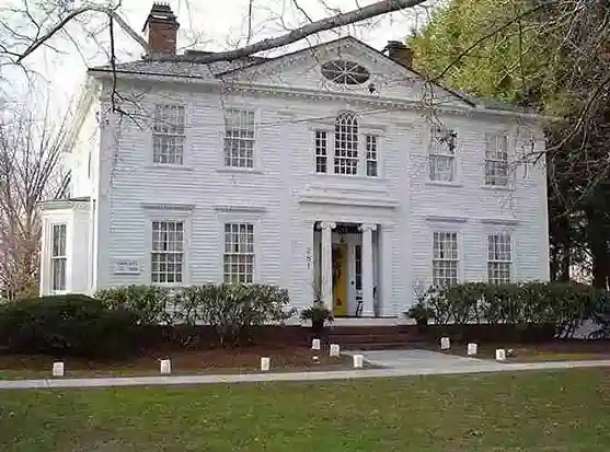
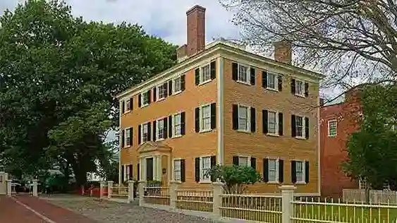
The building materials used differ depending on the location. The Federal architecture houses in the urban north were mostly made of brick as fireproofing was desirable. The houses in the Northeast were made of clapboard.
2. Federal Architecture Buildings’s Plans
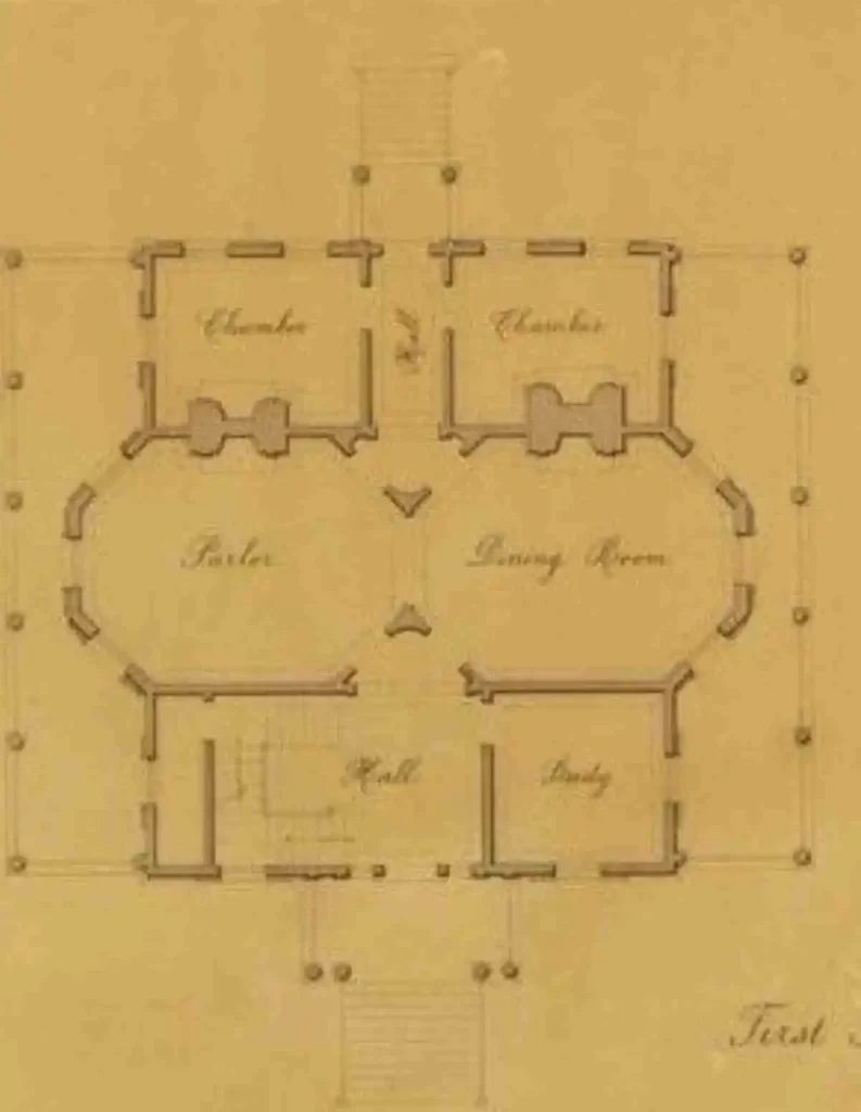
The Federal style is centred on a side hall for narrow row houses or a centre hall floor plan. It is usually made on a straightforward square or rectangular plot that is two or three stories high. Some houses are enlarged, to include attached dependencies, projecting wings, or even both.
3. Exteriors and Facades
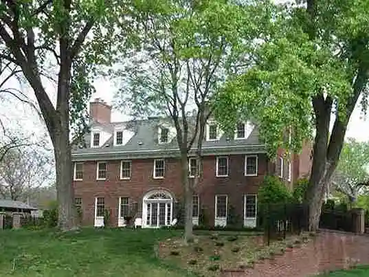
American Federal architecture often carries plain surfaces with attenuated detail, typically isolated in panels, tablets, and friezes. The smooth and flat pilaster façades carried the ellipse and bald eagle. It has a side-gabled roof and fenestrations which assists in creating symmetry. There are even roofs with a centre gable topped by a front façade pediment, such as the Friendship House. They were topped off by dormers, adding light and space to an attic.
4. Ornamentation and Detailings
Federal architecture style’s details are more delicate, slender, and finely drawn, created by fluted radiating lines. Often, they include urns, garlands, and swags. The cornices are also adored with ornamental mouldings such as teeth like dentils. For example, the ceiling of Mount Vernon’s dining room, executed in plaster, features a central rosette and an ornamental rinceau border festooned with corn husks.
5. Doors and Windows
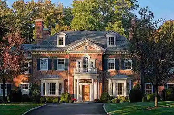
More formal elements were introduced in the Federal style architecture such as the front door’s fanlight window, with flanking or elliptical sidelights, and more elaborate door surrounds and porticos. Ornamentation is limited to the doors only. The windows were seldom three-part, dramatic, or Palladian with curved arches. A rarely seen feature is the curving or polygonal window projections.
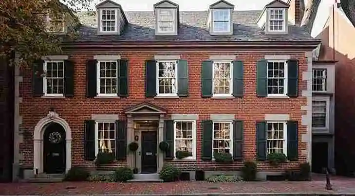
Windows with flat lintels that frequently have bull’s eye corners cornice. They are double-hung and have thin muntins between the panes. They are always arranged separately in rigid horizontal and vertical symmetry. There are three, five, or seven ranked front windows. Windows are nearly always made of double-hung wood sashes, with metal pins holding the top sash in place.
6. Entrance
A small entry porch or elaborate moulding surrounds the doorway. Curvilinear lines, front stair rails, iron balconies, and even curved fronts are common ways for some American architectural style houses to heighten the drama.
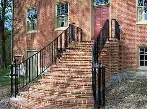
Image Courtesy – Architectural Digest
Contributor

