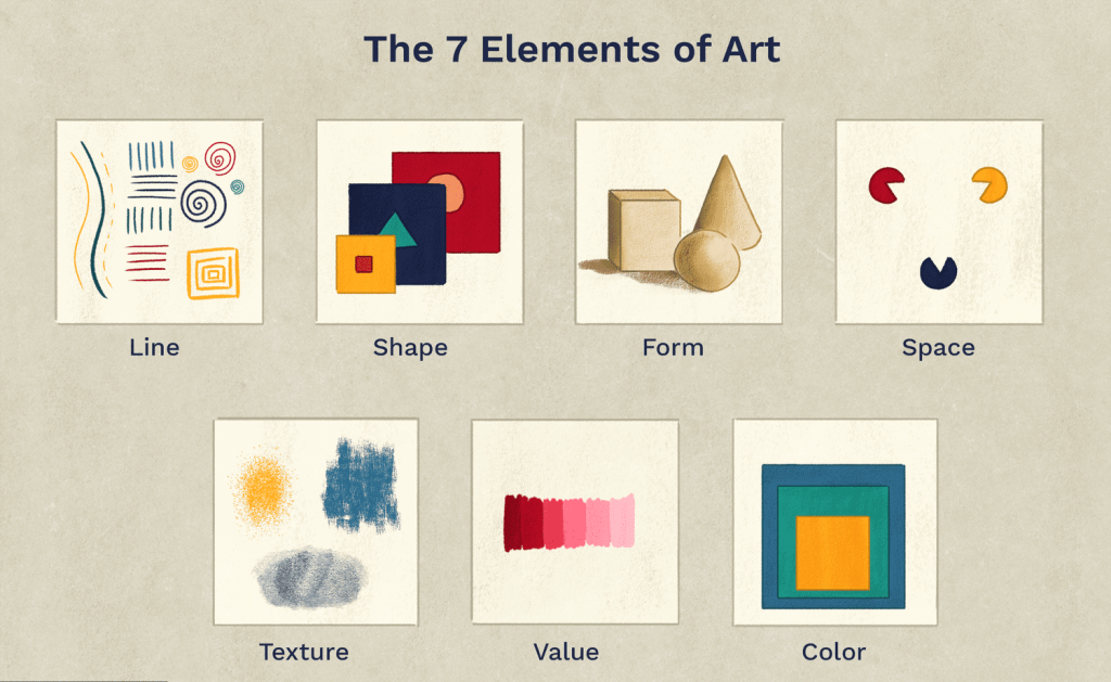
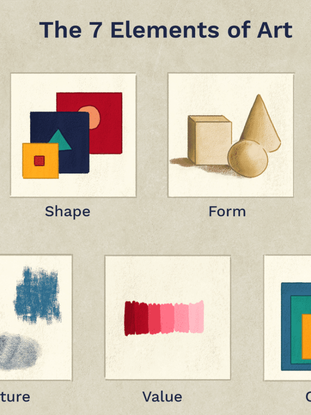
We know that atoms are the building blocks of matter; cells are the building blocks of biotic entities; but does art have building blocks as well? Yes, indeed. There exist 7 elements of art and design which serve as the building blocks of any art (amateur and professional). It must be interesting to note that an artist doesn’t need to have all 7 elements of art in their project. However, two are always present. While it will undoubtedly better your artwork, it also gives you control over how fluently and in which way your audience’s eyes move. Let’s learn more about these 7 elements of art and design and understand their significance. These will assuredly help you create your next big hit.
Line
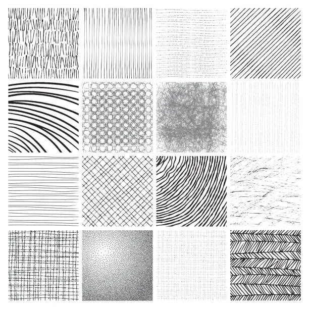
The line is the most basic among the 7 elements of art. Without it shape and form could never exist. Traditional definitions dictate that a line is simply a moving dot which overlaps constantly to produce a straight line. If they don’t then it is a dotted line. Lines are frequently mixed to develop visual texture. There are several kinds of lines. Let us study them briefly.
- Long or Short Line: The use of long or short lines helps create an outline, alternatively called contour, which results in the formation of shapes.
- Thick or Thin Line: Thick or thin lines aid you in emphasizing or receding your forms.
- Straight Line: Straight lines are more mechanical and dynamic. Seldom, they can have a jarring effect on your audiences.
- Curved Line: Curved lines connote ease and fluidity. Since they have no sharp angles, it suggests comfortability in changing directions.
- Zigzag Line: Zigzag lines have the same effect as straight lines with the added benefit of direction change albeit jarring. They denote feelings of turmoil and unrest.
- Diagonal Line: Diagonal lines are almost the same as zigzag lines, but create a sense of dynamic movement.
- Horizontal Line: A horizontal line creates a sense of calmness and stability.
- Vertical Line: A vertical line gives a sense of height, strength, and grandeur. Since a vertical line is often aligned towards the length, it seldom connotes a sense of spirituality.
- Imaginary Line: Can a line even be imaginary? It sure can. For instance, if you point at something with your finger and draw an amalgamation of several line types, it will be considered an imaginary line.
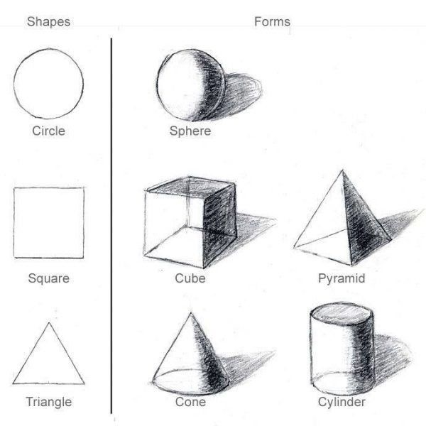
Shapes
When a line traverses back to where it began, it forms an enclosed structure; commonly referred to as a shape. Shapes can be geometric or organic (a composite of different lines). It can also be thought of as an outline. Shapes have no depth, only height and width. Shapes can be negative or positive. Imagine drawing a shape on paper. The shape itself will be positive. The rest of the paper is also a shape, albeit negative.
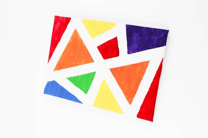
Geometric or simple shapes are seldom seen as synthetic and man-made. Pointed shapes (especially acute-angled) are often seen as dangerous. The rectilinear shapes represent stability and dependability. Curvilinear shapes induce a chaotic yet malleable feeling in the viewers.
Forms
Forms are advanced levels of shapes. Forms are always three-dimensional, with an added element of depth. For example, squares (shapes) turn into cubes (forms); triangles (shapes) turn into cones (forms); and so forth. Like shapes, they too can be geometric or organic. While sculptures play with shapes and forms, it is an arduous task to inculcate forms in paintings. However, painters, illustrators, and draughts people do it using visual illusions (Trompe l’oeil) through an exquisite play of lines, colours, and value.
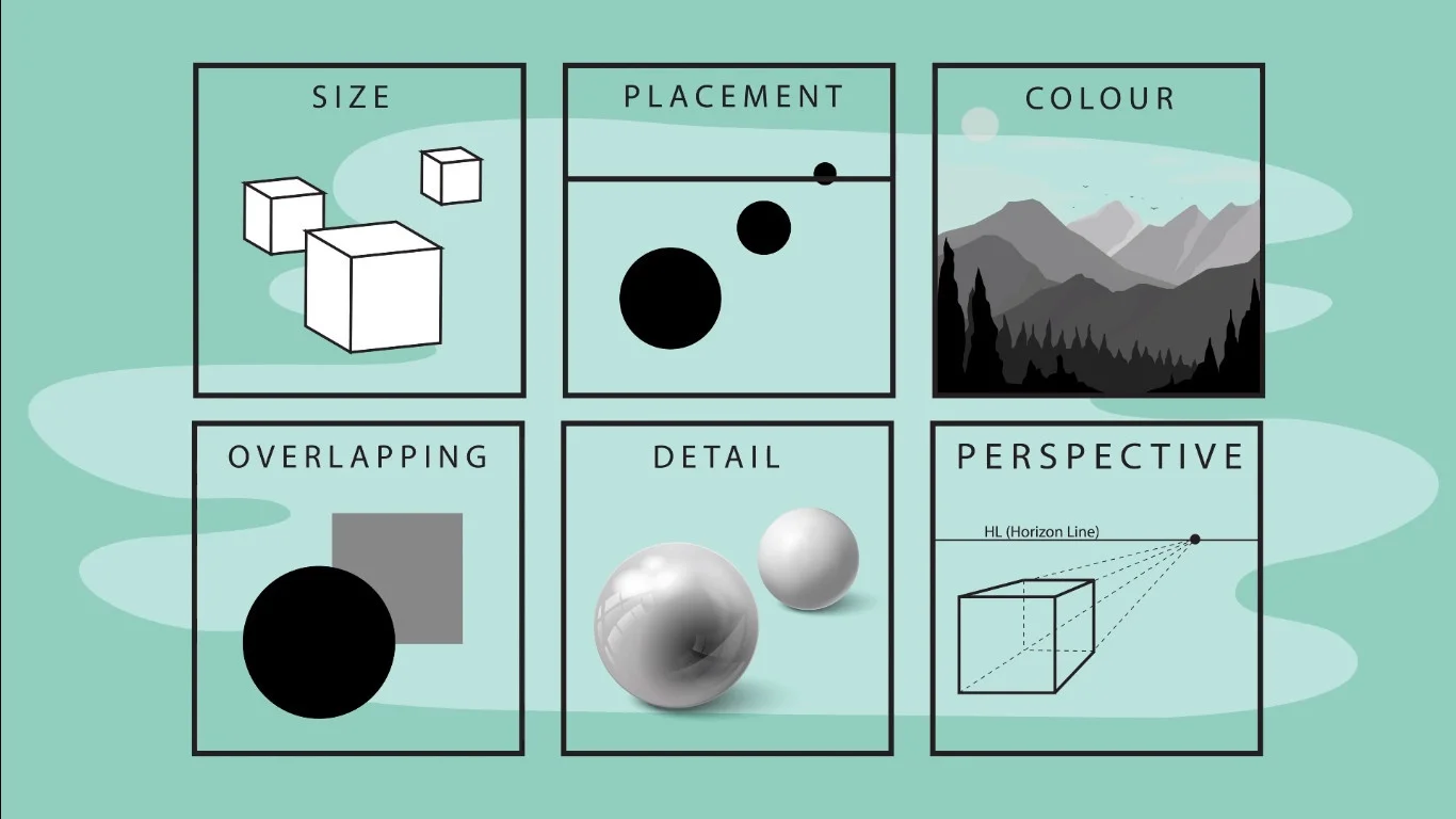
Space
Space is essentially the surroundings of forms. It represents volume or the area around the focal object. Space can be connoted through the following techniques:
- Overlapping: One object is drawn on top of the other.
- Placement: The higher the object, the further away it is.
- Size: The bigger the form, the closer it is to the viewer
- Details: Closer objects are more detailed than the father objects.
- Colour and Value: Closer objects are much warmer and darker than farther objects, which are cooler and lighter.
- Perspective: With perspectives, all parallel lines merge at a single vanishing point. This is known as linear perspective. There exist several types of perspective all differing in the number of vanishing points used. Linear perspective and 2-point perspective are the most commonly used.
Like shapes and forms, space too can be either negative or positive. The subject of the painting takes up positive space, whereas the rest of the paper/background is a cumulative negative space.
Value
Value reflects the lightness and darkness of the colour in comparison to its brightness and not the other colours. Value will always lie between pure white and pitch black. Lighter values are known as tints, whereas darker values are called shades. Through the use of differing values, two-dimensional objects can be contorted into three-dimensional objects. Differing values create a contrast. It is advised to draw the space around the focal point with high contrast so that the viewers’ eyes automatically navigate to the subject. Increasing the contrast will make the subject pop out, whereas decreasing it will make them melt into the background space.
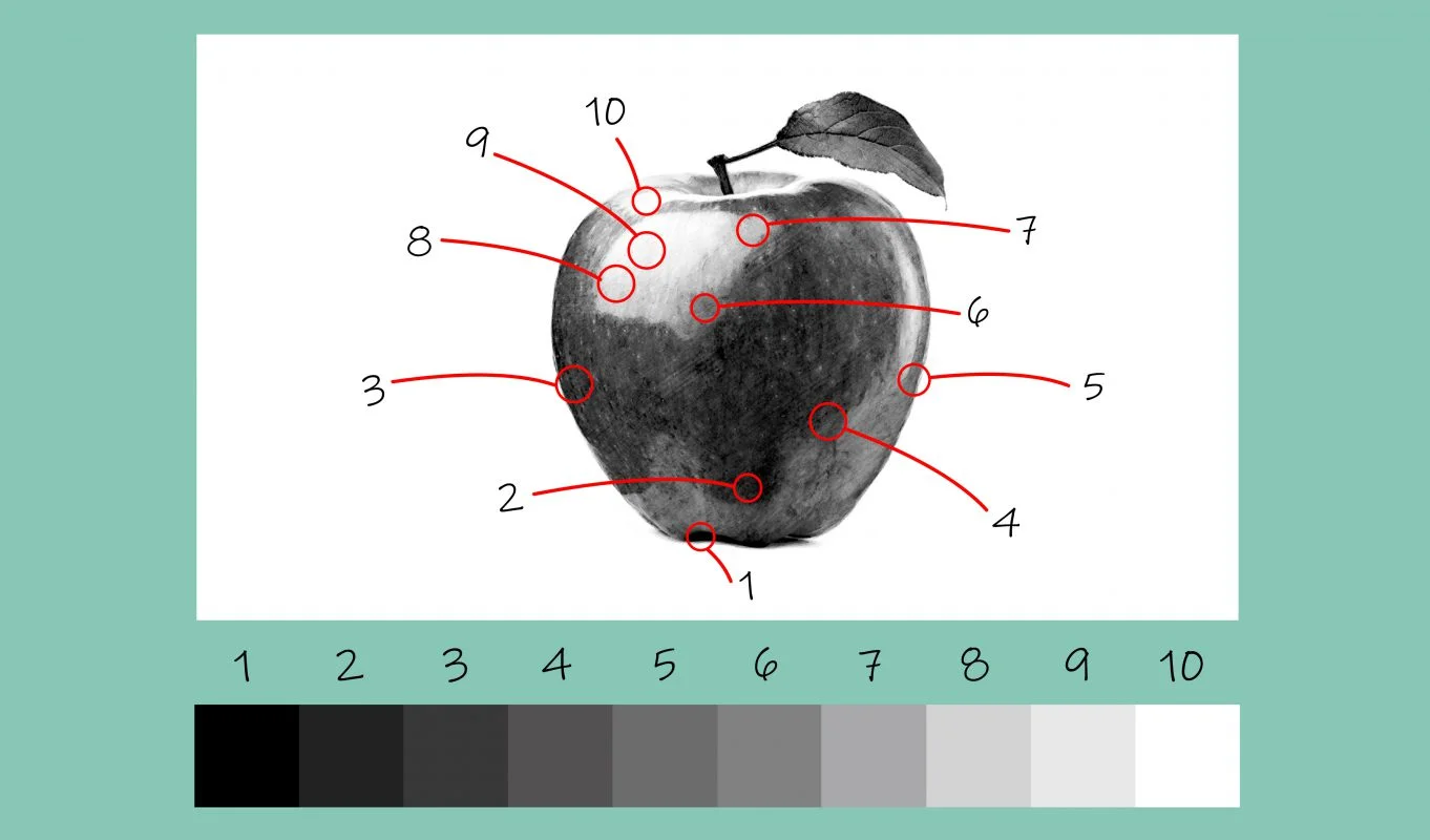
A painting which has a darker value is called a ‘low key’ painting. These often connote a sense of mystery, drama, and brooding. The painting which has a lighter value is called a ‘high key’ painting and connotes serenity, purity, and lightness. Value is a great element to detail forms and connotes space. If an object is far from the light, it will have a darker value. Hence, value is essential in creating shadows as well. If there is a gradual change in the value, the forms’ surface seems rounder. This is also known as a soft edge. In contrast, if there’s a stark change in the value, the forms have hard edges.
Colour
Colour is essentially the light reflected by the object and perceived by the viewer. There exist three primary colours, which cannot be created by mixing — red, yellow, and blue; three secondary colours, formed by mixing two primary colours — orange, green, and violet; and six tertiary colours, made by mixing a primary and a secondary colour — amber, vermillion, magenta, violet, teal, and chartreuse.
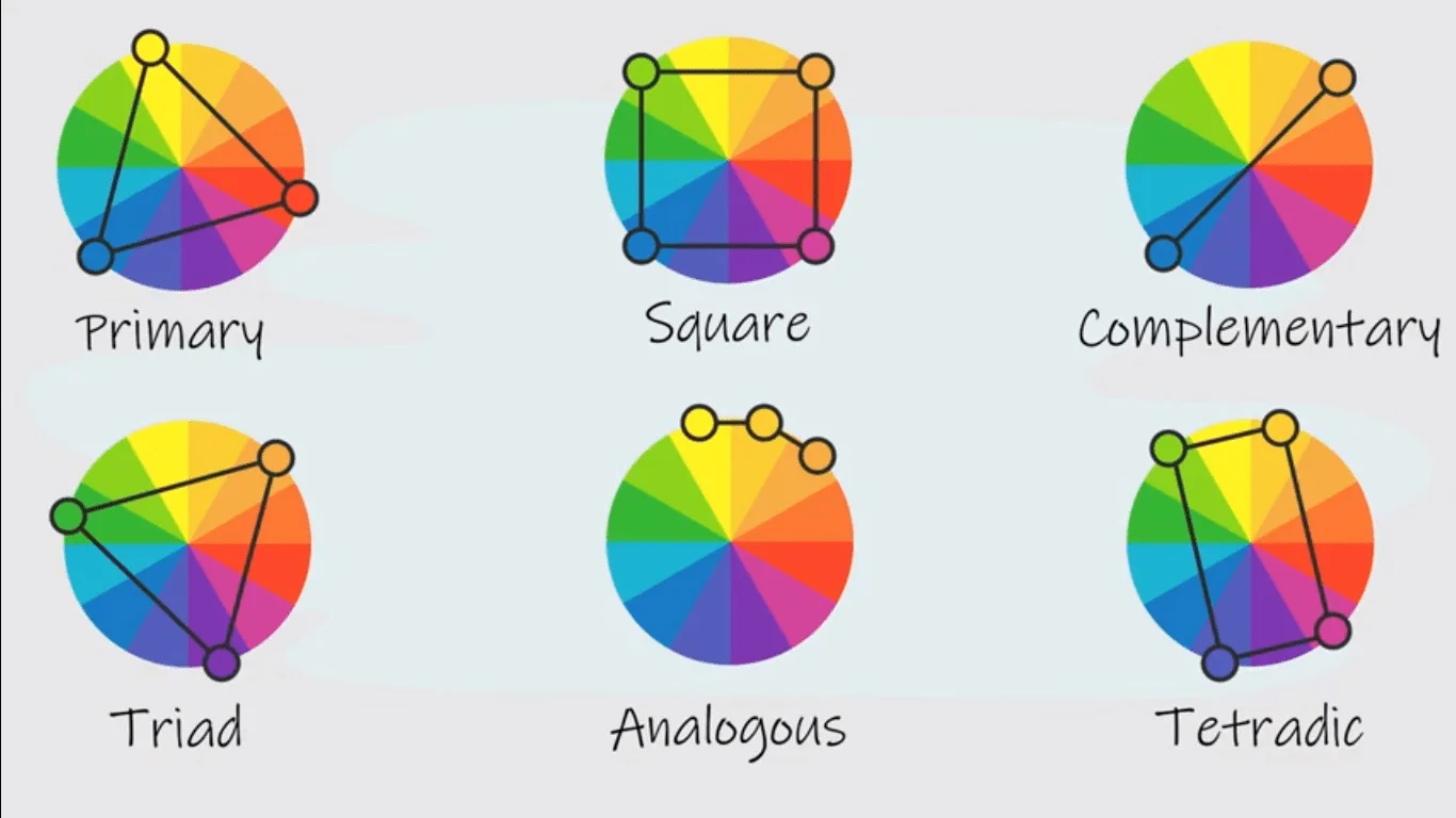
Colour theory is the only theory which remains unproven yet beneficial for an artist. It is based on the colour wheel, colour value, and colour scheme. A colour’s name is called a hue. The intensity of the colour is known as chroma, saturation, brightness, or purity. The chroma reflects the amount of the original colour. The more the chroma, the fewer colours are mixed. Colours too have value which dictates how dark or light it is. In addition to these three elements, colours have an additional component called temperature. A temperature reflects the warmness or coolness as felt by the viewer.
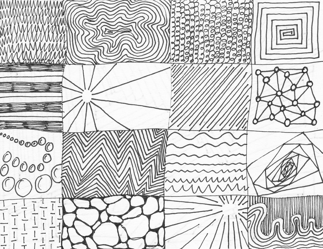
Texture
As the name suggests, texture is the way an object feels to touch. Representing texture on paper is tough but not impossible. This is done by brush strokes or specific marks which elaborate the visual texture of the surface. Each texture reflects light in a certain way. For example, a popcorn wall has numerous spots of light and darkness. Hence, texture may be represented by playing with the value of colour. Another ‘modern’ way to create texture in a painting is the use of impasto techniques, which create raised surfaces. Titian is generally acknowledged as the first to use this technique.
Textures are both real and implied. Sculptures and impasto fall under the category of real texture, whereas paintings fall under implied texture.
Image – ‘7 Elements of Art Drawing’
Image Courtesy – ThoughtCo
Op Art’s Journey: From Optical Illusions to Interdisciplinary Innovation (Part-3)

Hi Ya’ll !!
I love writing about pop culture and all things queer.
Sub Editor at Abir Pothi