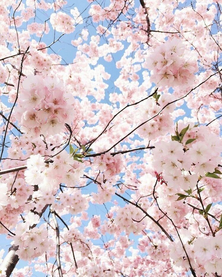
Pastel hues have a unique capacity to create a calming and peaceful atmosphere. These delicate colours, distinguished by their subdued tones, have the innate ability to arouse feelings of tranquillity and peace. Pastel colours envelop their surroundings with a soft, understated beauty that promotes relaxation and a serene frame of mind, like a delicate whisper of nature’s colour spectrum. Pastel colours have the unique capacity to calm the hectic bustle of modern life, providing a break from the intensity of strong and vibrant hues, whether they are used to decorate walls, clothing, or artwork.
Why are Pastel Colours So Soothing?
Pastel colours have a low saturation, which means they have a delicate intensity that doesn’t overwhelm the senses. This plays a significant role in their calming allure. Additionally, pastels have less grey than other colours, which gives them a softness that is easy on the eyes and the mind. They are closer to the lighter end of the value scale in the HSV (Hue, Saturation, Value) colour model, giving them a delicate and airy aspect that is comforting and soothing. Low saturation, a few grey undertones, and the precise placement throughout the colour spectrum all combine to effectively produce a calming, serene ambience in interior spaces, clothing, or artistic expressions.
Courtesy: Pinterest
Use of Pastel Colours In Marketing
Courtesy: Pinterest
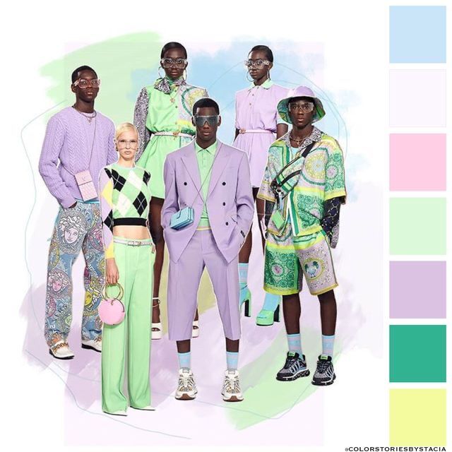
Due to their innate capacity to arouse positive feelings and draw attention in a subtle yet potent way, pastel colours have grown in popularity in marketing. These delicate, subdued colours are perfect for developing a friendly and welcoming brand image because they are frequently connected to emotions of calmness, purity, and nostalgia. Pastel colours are widely used in marketing to portray a feeling of class, refinement, and modernism while still keeping a warm and approachable tone.
Courtesy: Pinterest
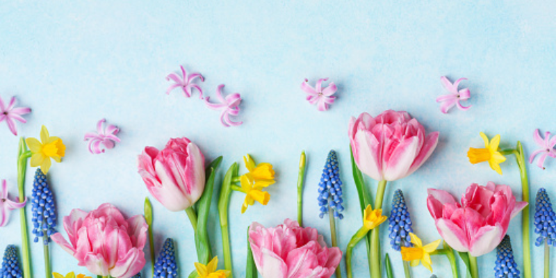
Additionally, marketing campaigns heavily rely on the link between pastel colours and the start of spring. With its sense of rebirth, development, and new beginnings, spring harmonises beautifully with the revitalising properties of pastel colours. As flowers bloom and nature awakens during this season, pastel colours’ gentle and delicate qualities reflect these phenomena, representing positivity and hope. To engage with customers on a deeper level and leave a lasting sense of vigour and optimism, marketers tap into the emotional resonance of spring by introducing pastel colours into marketing materials.
Pastels in Art
Courtesy: Tate
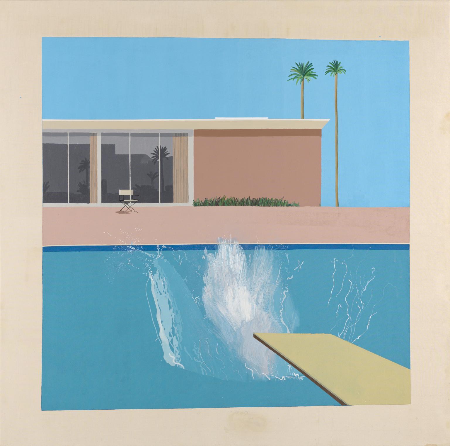
A good instance of the usage of a pastel colour palette in art history would be in David Hockney’s work “A Bigger Splash”. Pastel colours play a crucial role in defining the composition’s distinctive atmosphere and visual impact. The villa’s pastel colours, the pool’s crystal-clear blue, and the delicate pink of the building’s exterior all conjure up images of peaceful luxury and leisure. These delicate, subdued hues not only perfectly capture the essence of a sunny California environment, but also add to the piece’s distinct emotional impact. The viewer is drawn to the dynamic interaction between water, architecture, and nature by the stunning visual contrast created by the pool’s bright, chilly blue and warm pastels. Hockney strikes a balance between realism and abstraction by utilising pastel colours, enveloping the viewer in his or her world.
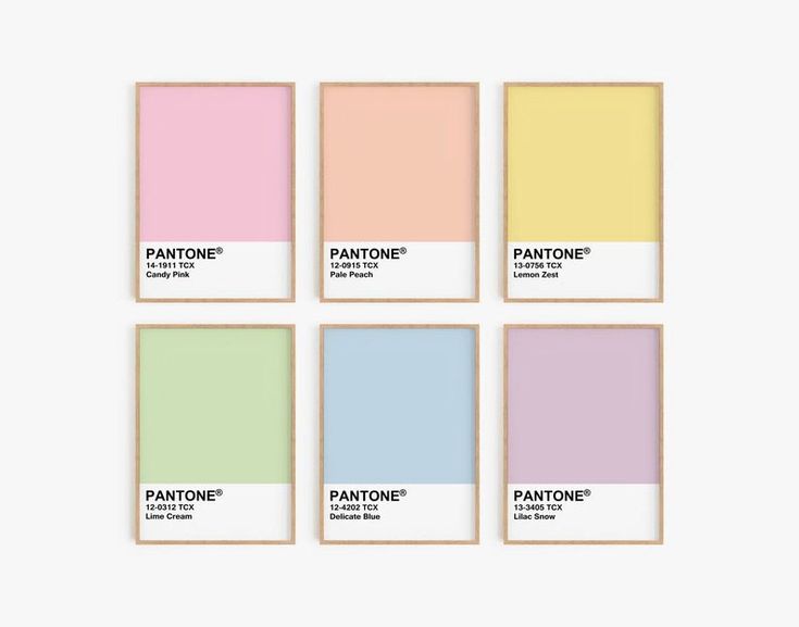
The appealing range of delicate and subdued tints that make up pastel hues effortlessly convey a feeling of peace and sophistication. The essence of the pastel colour scheme is delicately captured by gentle tones like powder blue, soft pink, mint green, and lavender. Baby yellow, peach, light aqua, and dusty rose are subtle variants of these tones that add to the calming spectrum. The tranquil neutrals subdued beige, creamy ivory, and light grey are also members of the pastel family. Each pastel colour has its own allure, providing a flexible palette that may be mixed to make calming compositions in a variety of contexts, from fashion and interior design to art and beyond.
Read Also:
Gaming & Animation is a great choice for those with a passion for Gaming and Animation