
We all use fonts daily, these fonts come into the domain of Typography, which is a design tool that is used around the world. These fonts now are very much part of a culture, you use it for work, for branding purposes, for designing logos or any kind of designing for that matter. These are inseparable parts of our design language now. Many designers have very strong notions on these fonts and the kind of design communication they represent. Before we dip into the history of fonts and typography, let’s go over a few basic details regarding the same.

Define, Font
Font is a typesetting, a particular style of writing, which is of a particular dimension, size and colour.The term ‘font’ originates from the Middle French word ‘fondre,’ meaning ‘to melt,’ derived from the Latin word ‘fundere,’ which translates to ‘melt, cast, pour out.’
Define, Typography
Typography is an assortment, an arrangement of words and letters into something that can be read and is comprehensible. It has to be pleasing and aesthetically nice to the eye. A typographer can choose a typical typeface along with its size, colour, spacing etc and nicely put it out on a white background.
Tracing Back the Origins of Typography
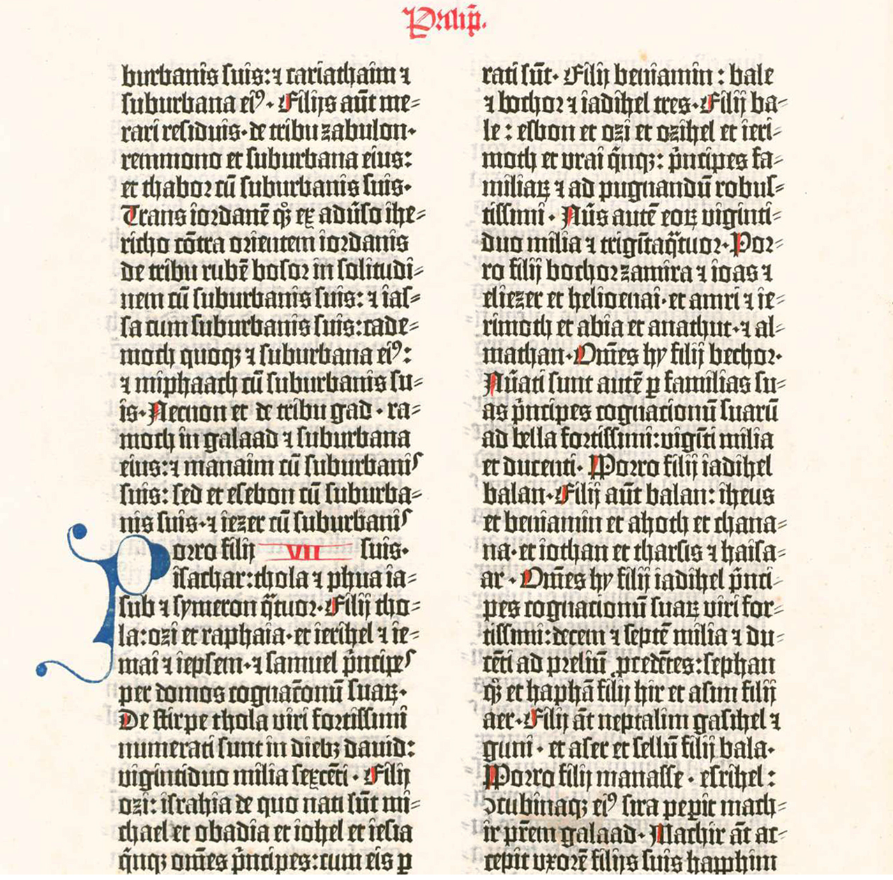
We believe that typography may be a relatively modern practice, however many symbols have been used and printed for centuries now. We see markings on seals from Mesopotamia, the Brahmi script on a stone plate from the Satvahana period, scriptures found all over the world with different imprinted symbols. All of these are earlier predecessors of typography or font. Although, to trace back the exact origins we have the initial days of printings in the 11th century in China during the Song dynasty. Bi Sheng invented a movable type using porcelain between 1039 and 1048. While the advent of metal movable plates happened in 1230 in Korea during the Goryeo dynasty which was far more durable than its ancestors.
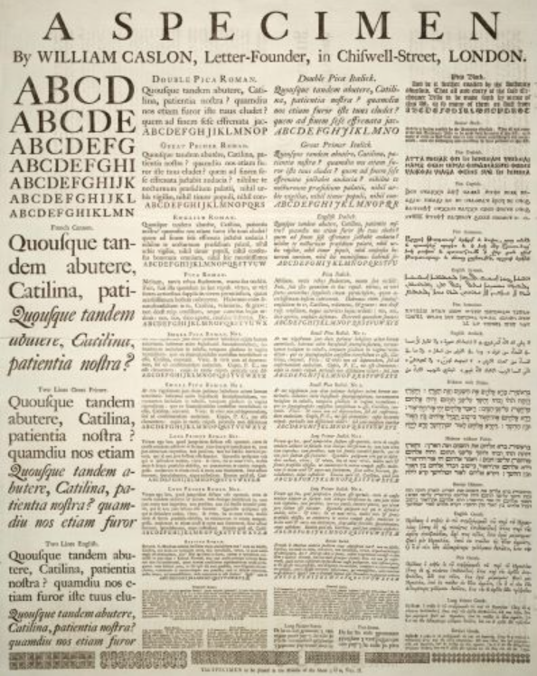
We have in another article on the history of Graphic design, here mentioned the origins of the first printing press that was setup around 1440 by Johannes Gutenberg, a German goldsmith. This set off the printing revolution and revolutionised how we saw graphic design and with it typography. With this innovative press, he could produce up to 3,600 pages per day—far surpassing the meager forty pages achievable through manual printing. While Gutenberg automated and mechanized the printing process, it’s noteworthy that in Asia, they had been employing movable type for almost a century before these developments. Around 1470, the French engineer Nicholas Jenson (c.1420-1480) crafted one of the earliest Roman typefaces. Jenson, a printing pioneer akin to Johannes, dedicated a significant period of his career in Italy. His contributions played a key role in solidifying Venice as a prominent hub for printing. Another big name in typography is Morris Fuller Benton (1872-1948) who gave font classifications.
Types of Typography
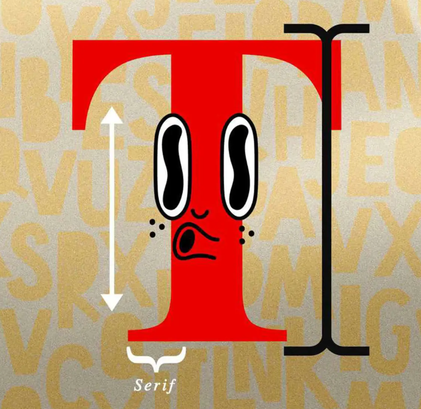
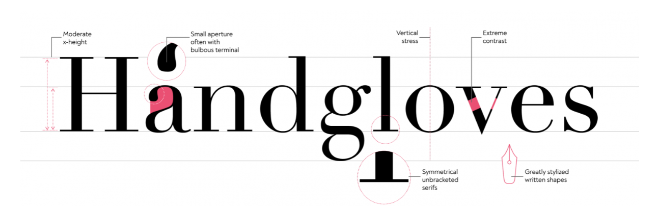
It’s crucial to recognise that there are three primary types of typefaces, with the first two being the most widely acknowledged: serif and sans serif.While serif is minimalistic, they are more legible in nature. While sans serif includes fonts not in the fonts which are decorative in nature and are for purely ornamentation purposes.
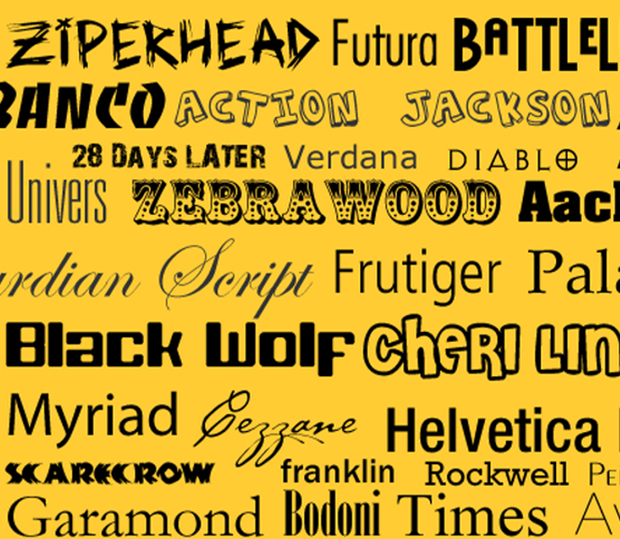
Influential Fonts in Modern Times
Now that we have understood the basic details about fonts and typography and briefly touched upon the history of the same. Let’s have a look at some of the most popular fonts and their influential history. There is Textura, a type of digital font that traces its history with blackletter calligraphy which was very popular in the mediaeval times. It is interchangeably used as a gothic or old english typeface. Another popular typeface is Baskerville named after the designer who invented it John Baskerville in 1750, this font is more legible and has a great quality to it.

Then we have Didot, named after the printing family Didot. Firmin and Pierre Diddot developed various variations of the style. It has an elegant composition when printed in large size, however is a little less comprehensible in small sizes. Next typeface is Garamond that comes from the French punchcutter Claude Garamond and Italian publisher Aldus Manutius. There is some consistency to it that made it so popular. Then we have the heavy duty fonts such as Franklin Gothic which is referred to as grotesque sans serif font with franklin referring to Benjamin Franklin. It has always worked as a great header and is clear and can be recognised from afar. In modern times, it has many variations but is still recognised for its punctuated lettering and clean, crisp lines.
Times New Roman, the most recognisable font there is. Dipping into its history a little bit, renowned type designer Stanley Morrison confronted the London Times, criticising their outdated design choices and asserting the need for improvement. In response, The Times London invited him to create a superior alternative. The outcome was a font, now known as Times New Roman, that is notably more legible. Morrison’s design featured increased condensation and thicker vertical lines, resulting in darker words that are easier to distinguish. He argued that his font was more economical, allowing more text to fit on a page, and enhanced readability with subtle adjustments to line thickness. Given its widespread usage today, Morrison’s design undoubtedly achieved success.
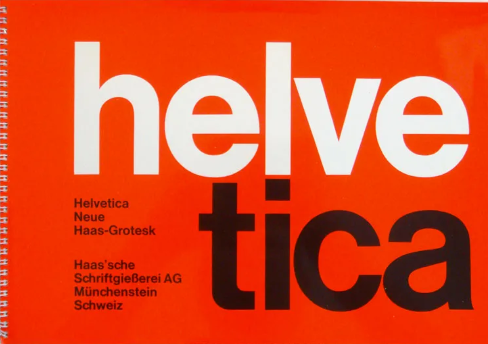
Helvetia is another popular font, designed in 1957 by Mac Meidinger and Eduard Hoffman at the Haas Type Foundry in Switzerland, it emerged as the ideal typeface for the International Style, serving as its quintessential representation. Its strength lay not in being strikingly different but in its remarkable simplicity, making it versatile for use in various contexts. While it continues to be widely used today, one of its most iconic applications is in the signage of the New York City subway system. Bauhaus typeface is another font created to standardise the use of design in a universal manner. Bauhaus was the name of the art movement or German school of art which was internationally acclaimed. The font was developed during the Art Nouveau movement which was also discussed in the article tracing the history of Graphic design. The font is known for its geometry and linear pattern and simplified lettering.

Lastly, in this article we shall discuss the Comic Sans font which is popular for all the wrong reasons and it one of the most hated fonts that exist. Crafted in 1995 by Vincent Connare, this font was specifically designed to emulate the text commonly found in comic books. Despite facing criticism from designers, Connare takes pride in his creation and believes that its lighthearted and playful essence is something the average person can appreciate.

Typography within itself has an endless body of work that has aided graphic designers in modern times immensely. The different typographic designs, styles have led to a pop-cultural revolution and will continue to do so in the future as well.
Feature image Courtesy: Crazy Egg

Contributor