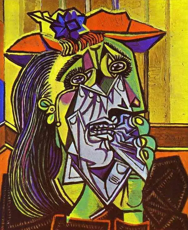
When we talk about composition painting, we mean the composition of the painting and not composite deck painting. While the former is a phenomenon which imparts coherence to an art piece, the latter means, simply put, painting composite decking. But what is composition art painting? What are the core principles of the theory? What types of paintings can one do with composition painting? Does it support all mediums, watercolor composition painting for example? This article will answer all of your burning questions.
What is Composition Painting?
Composition drawing painting dictates how well the elements of a painting will get along. It skillfully balances all the elements of art present in the pictorial composition painting. If you would’ve seen Hieronymus Bosche’s Garden of Earthly Delights, you would indeed find numerous elements, both in terms of colour palettes and figures. But despite being quite jarring, it serves as a singular unit. Let’s take something simpler. Despite playing with shades of varied hues, what brings Mark Rothko’s abstract painting composition together? The simple answer – the composition.
What are the Rules for a Good Composition Painting?
While we cannot underestimate the artists’ intention and technique, certain design principles are followed by almost all artists of different schools for composition painting. Before they even paint, artists envision the painting. It aids in deciphering where the audience’s eyes would linger. One may choose to organize the elements at the center while others work better at the periphery. Once the centre of interest is selected, it makes the arrangement an even more easy task. The harmony of these elements defines the unity of the painting.
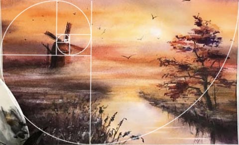
A good composition painting takes care of the shape, proportion, lighting, rhythm, and patterns of the various elements. Despite these principles, the audience’s line of vision affects how the painting is perceived. For example, if you decide to enlarge a singular element of the painting, its significance would increase in the viewer’s mind. With these factors, you can even create a jarring effect in your painting, which may help if your objective is to bring the viewers’ eye to a focal point.
Conventional Composition Paintings Technqiues
There are some conventional rules which are followed by numerous artists. They are discussed in the following paragraphs. But that must not deter you from carving your own niche and style as is the case with cubism or abstract expressionism.
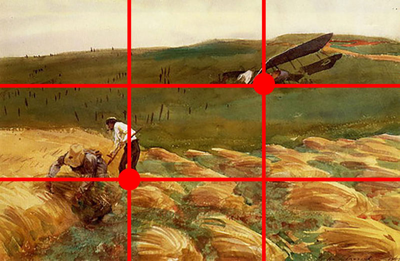
Rules of Thirds
Imagine you are painting a village composition painting. To create a visually pleasing assembly of the elements, you need to bisect your canvas into thirds. Now place the focal elements near the intersecting lines. This ensures that the subjects do not divide the painting, and the viewer’s eye directly goes to these lines. Some call the rule of thirds a glorified take on the golden ratio, although it remains to be proved.
Rule of Odds
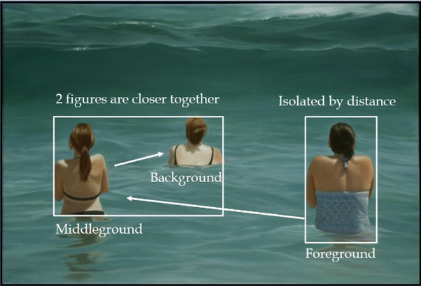
The rule of odds dictates that it is more comforting and natural to include an odd number of subjects rather than an even number. For example, in a human figure composition painting, it is always suggested to incorporate three human figurines. While you may definitely go for an even number of individuals, it will result in a symmetry which seems artificial as perceived by the human psyche.
Rule of Space
If you wish to create an easy composition painting drawing with a moving subject, you might want to inculcate the rule of space into your painting. The rule of space describes how negative space (white space) is usually an indicator of movement. For example, if you were to draw a picture of a car moving to the right, there would be more negative space on the right rather than the left. It signifies the movement of the subject towards the right, taking the viewer’s eyes along with it.

The illusion of movement can also be denoted by playing with the shapes and sizes of the elements. Rather than going for a pattern, it is suggested to place some objects closer to the horizon and some at the back. In such a composition painting, the viewer’s eyes wouldn’t simply follow a line, rather they would run around the perimeter of the objects.
Rule of Simplification
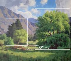
We need to side with Marie Kondo here. Removing the clutter brings joy to the soul. In the case of an effective yet easy composition painting, the fewer the number of elements, the more pleasing they will be to the eye. Since there is no focal point, it confuses the audience. An artist may bring the audience’s eye to the subject by elaborating on it, especially its edges. The background of the painting must be less detailed to ensure that the audience’s attention is where the artist intended.
Rule of Shapes
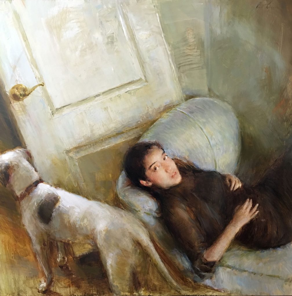
The rule of shapes borrows from the rule of odds. If you were making a human composition painting, it is said that the mouth and the eyes must form an equilateral triangle which results in a conventionally attractive face. The supremacy of the triangle is not to be underestimated as it evokes a sense of stability, security, and strength in the composition painting.
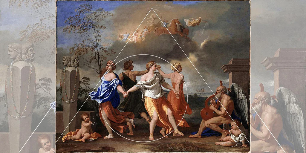
With these rules, one can easily draw a creative composition painting. With these protocols, you may adjudge the viewer’s attention which will help you take control of where their eyes linger.
Image Courtesy – The Art Of Composition

Hi Ya’ll !!
I love writing about pop culture and all things queer.
Sub Editor at Abir Pothi


