Everybody knows that Vincent van Gogh loved the colour yellow. But why? Well, the story begins 19,000 years ago…

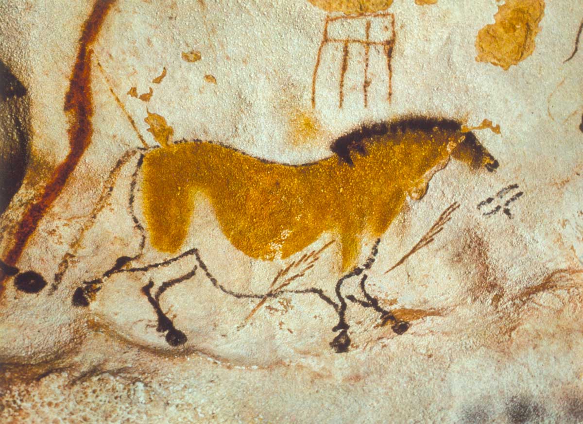
Yellow is one of the oldest colours in art. For most of history it came from yellow ochre, a naturally occurring and readily available clay-like substance. These cave paintings from 17,000 B.C. in Lascaux, France, include a yellow horse:
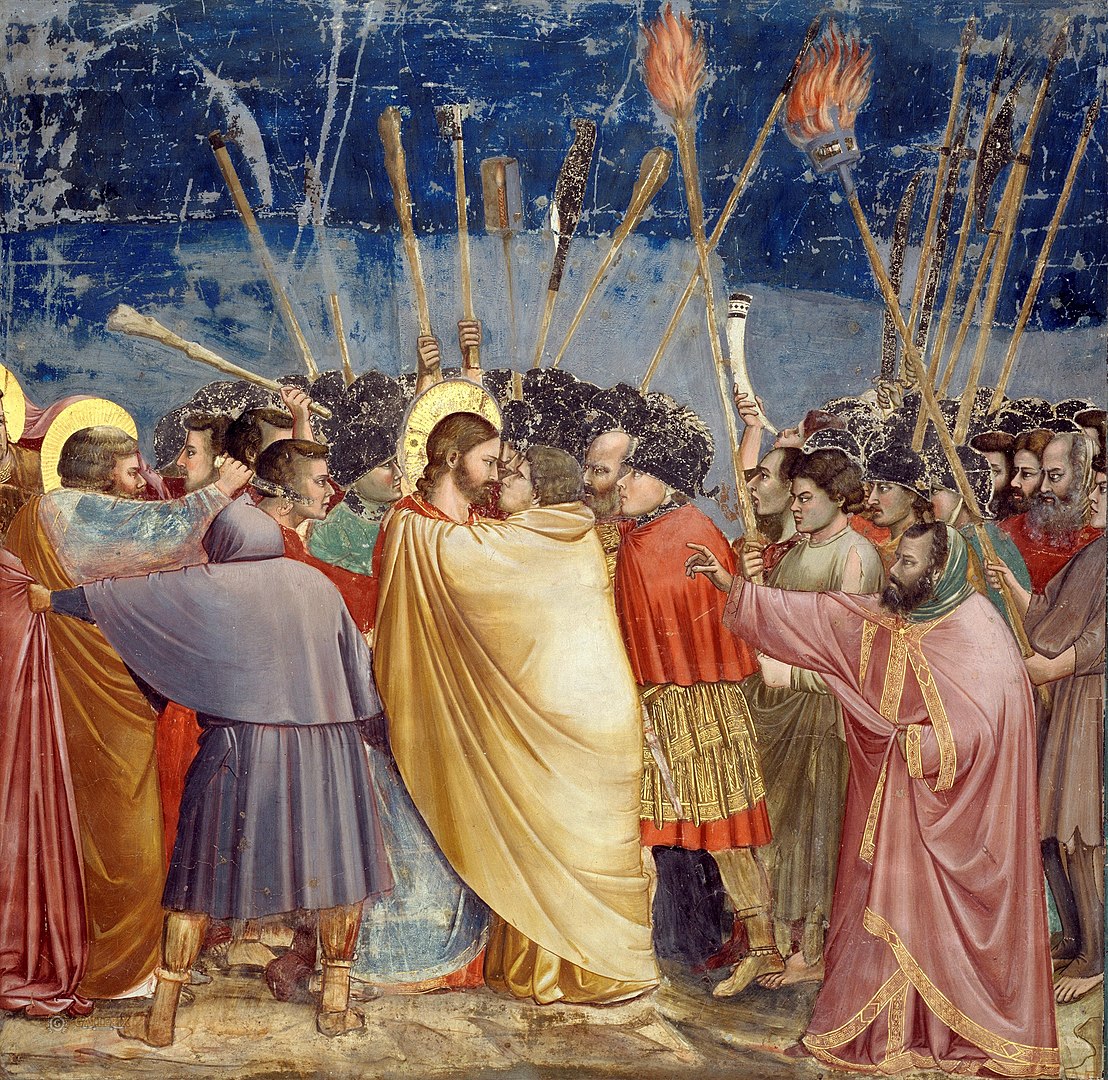
After that we see yellow cropping up in ancient art across the world, again from ochre. The Ancient Egyptians loved it, probably because it was similar to and thus symbolised gold, and so did the Romans. During the Middle Ages yellow came to be associated with Judas, even though the Bible never mentions this, and so he was often painted in yellow robes. As in this work by Giotto (1267-1337):
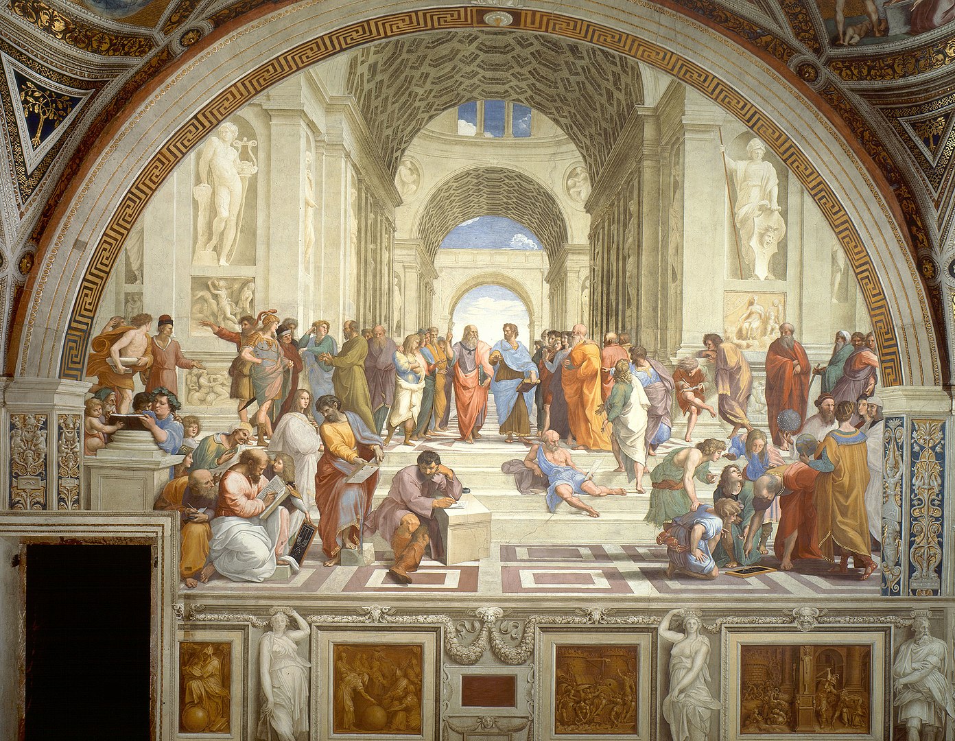
By the time we arrive at the Renaissance proper, in the 16th century, painters had embraced real perspective and depth in art, along with classical themes. And so yellow was freed from its negative connotations. We see plenty of it in Raphael’s glorious School of Athens (1511):
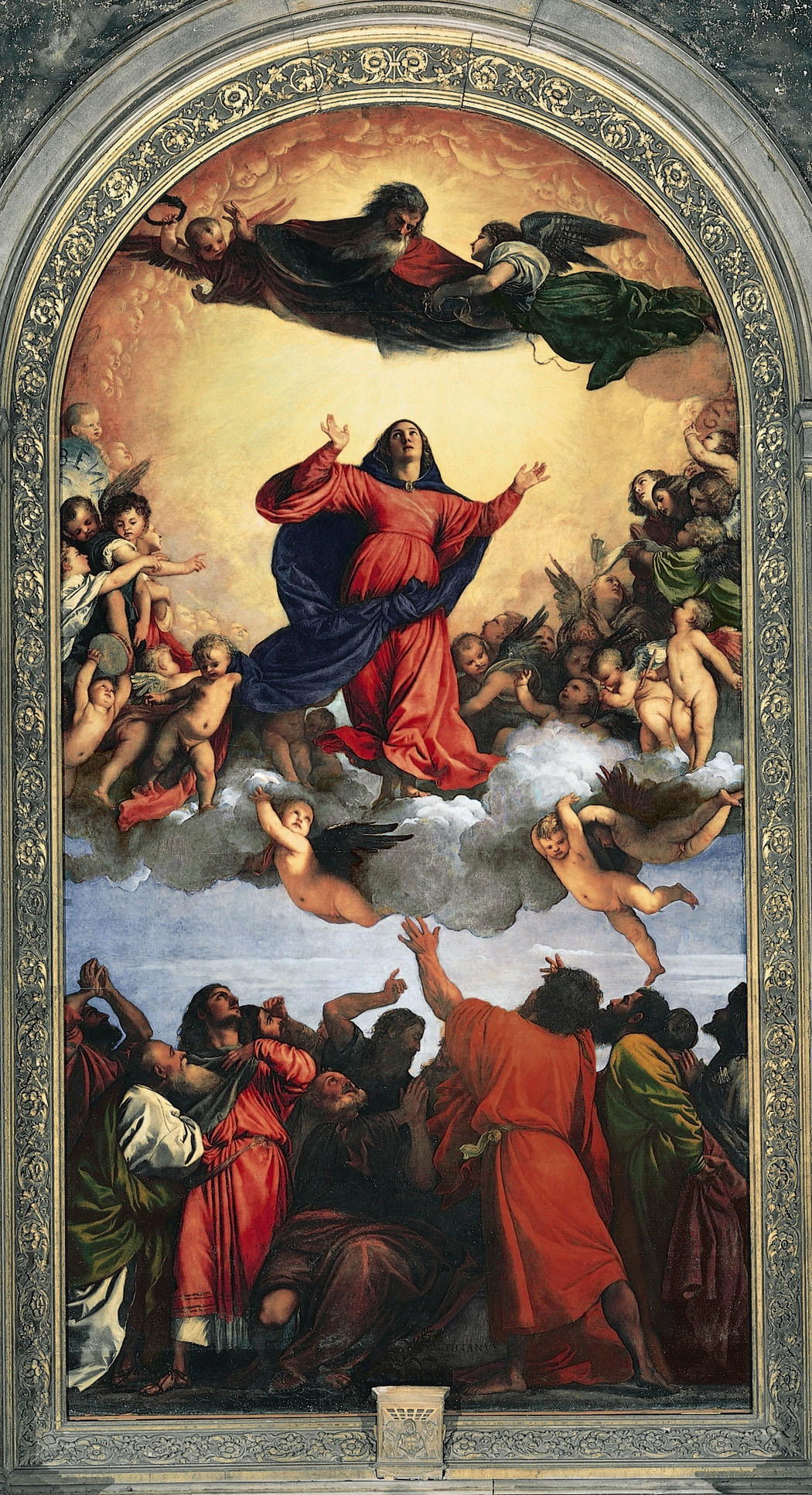
But during the Renaissance there was a tension between the painters of Florence and Rome, who favoured shape and composition, and the painters of Venice, who favoured colour. So we can see the great Venetian painter Titian (1490-1576) using yellow much more intensely:
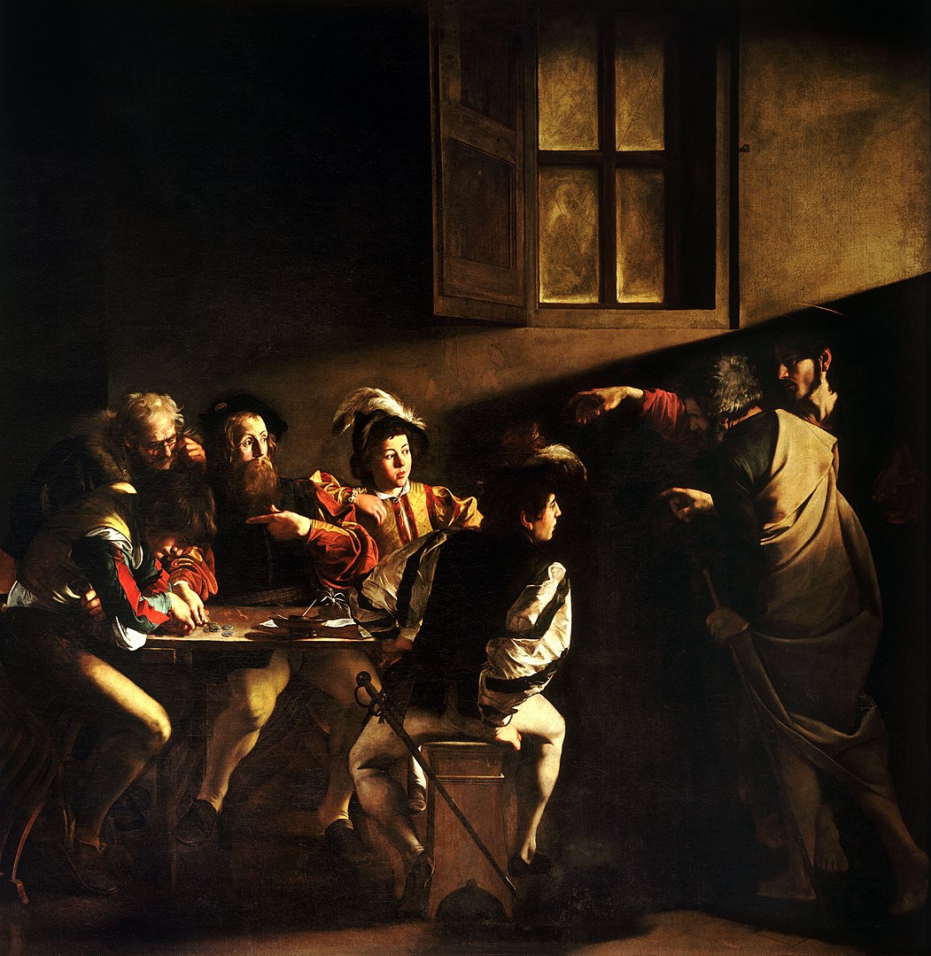
Moving into the 17th and 18th centuries, colour itself began to take centre stage. Nicolas Poussin (1594-1665), a descendent of Titian’s Venetian School of colour, took up the mantle of intense and expressive colours, including yellow. While the great Caravaggio used yellow in a way that it hadn’t quite before: as real sunlight itself. Through intense chiaroscuro (contrast between light and shadow) Caravaggio allowed himself to use yellow more powerfully than ever.
One thing you’ll notice about the use of colour from the Renaissance through to the 18th century is its realism. Artists depicted the world as it really appeared, whether in an idealised way or as in daily life. That changed somewhat at the beginning of the 19th century, when romantic painters like JMW Turner looked to emotion as the driving force of art. And yet it was the Academy of Fine Arts in Paris dominated the art world in the mid 19th century. They were loyal followers of the High Renaissance, of Leonardo and Raphael, who prioritised the human form, composition, and perspective. The Academic painters imitated the High Renaissance in everything they did, including a preference for “dignified” themes from Classical and Biblical history. And, crucially, they were studio painters who had models pose in carefully orchestrated lighting. In reaction to the Academy came the Impressionists, led by Edouard Manet and Claude Monet, who realised that the world doesn’t look like a painter’s studio. We see things differently outside, beneath the sky, in changing light, and with all that movement…
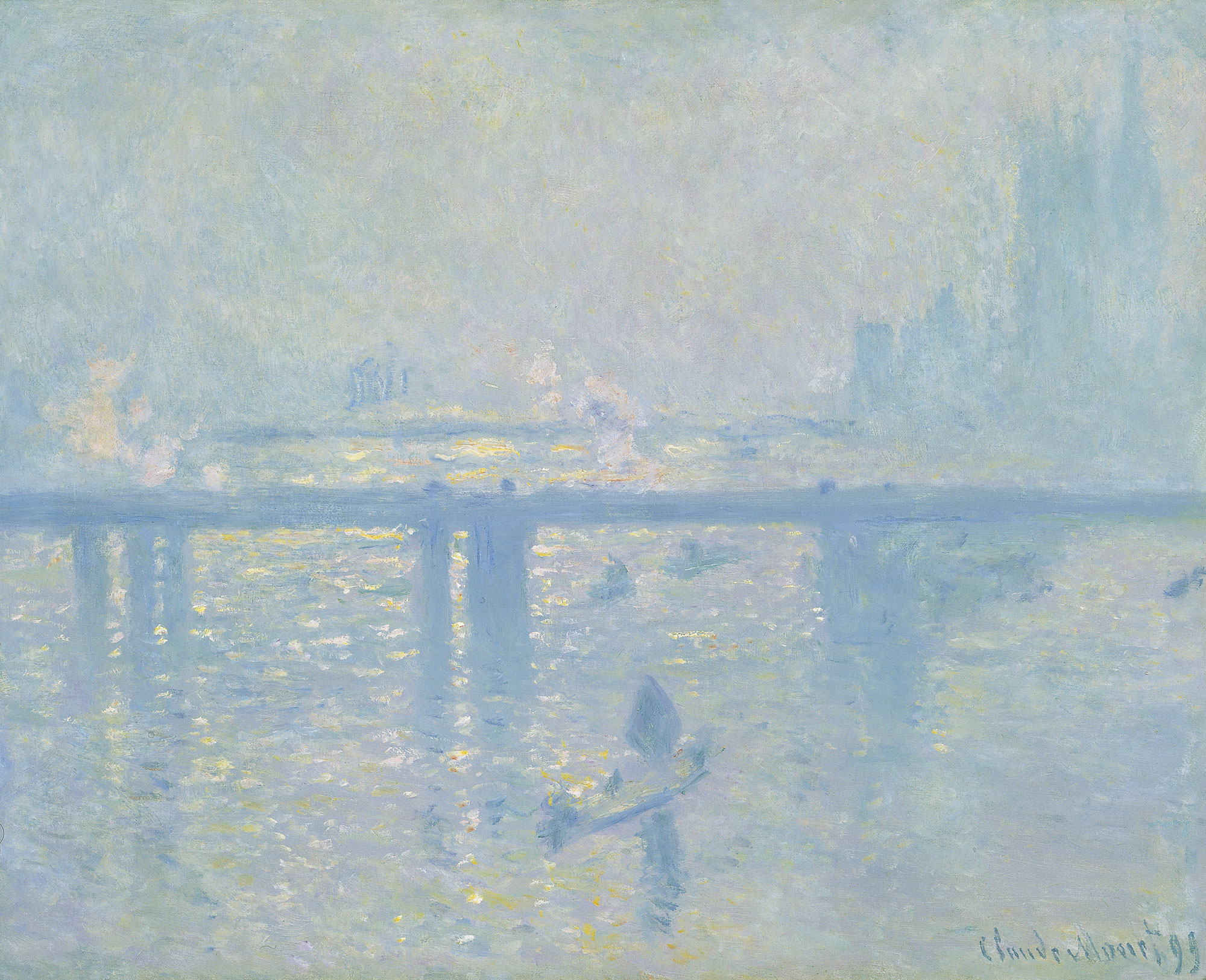
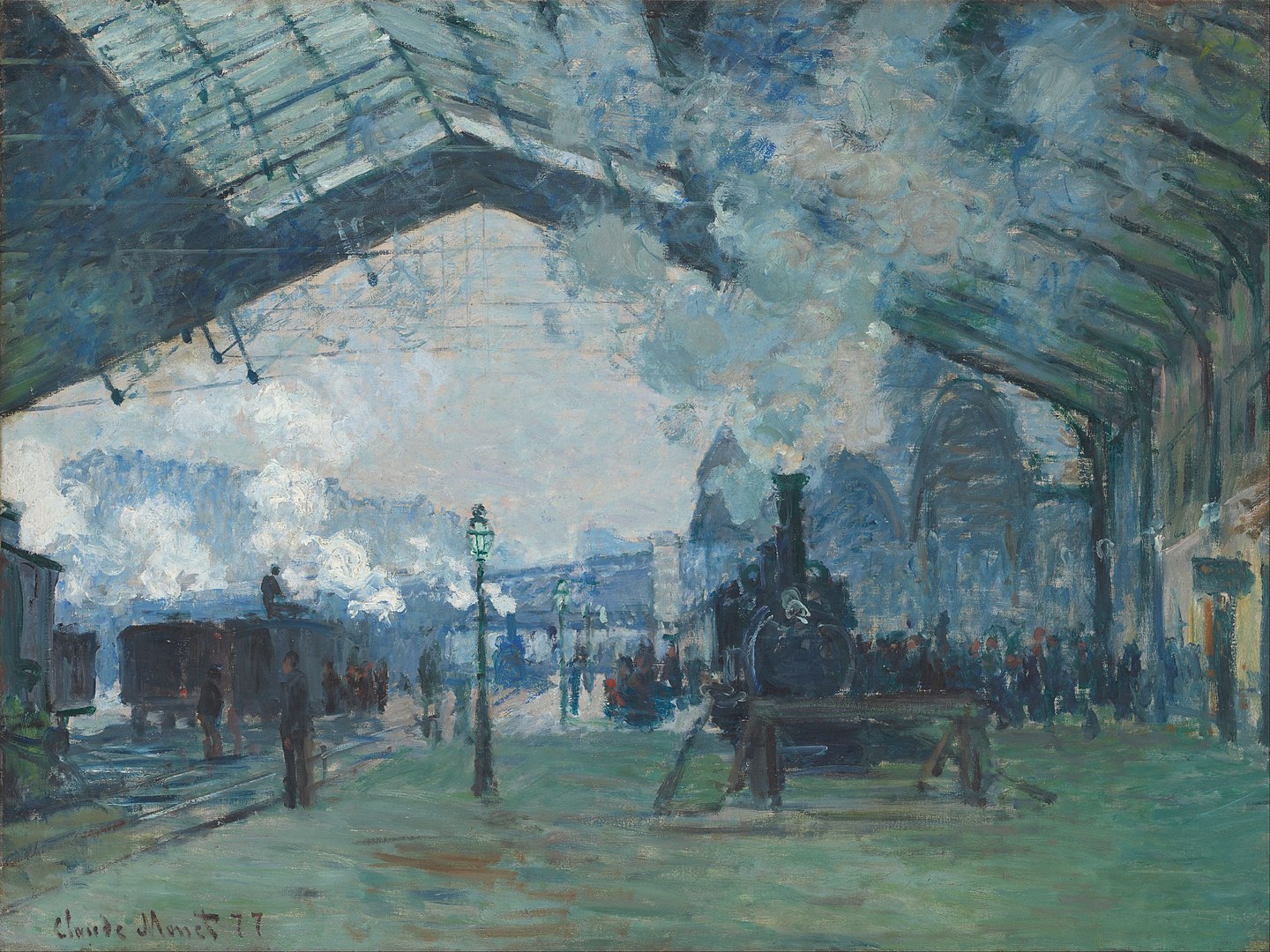
This entailed a preference for colour over line, which the Impressionists saw as a better representative of reality. A return of the Venetian-Florentine divergence in painting from centuries before. And, like the Romantics, they saw colour’s expressive power. Take Monet’s blue
The Impressionists also embraced unconventional angles and scenes from ordinary life, inspired by the influx of Japanese prints into Europe. Such as a train pulling into a station, a far cry from the Biblical and Classical scenes of the Academy.
Now we’re in the 1880s, when a former theology student, preacher, and school master called Vincent van Gogh had started painting. His early works are unrecognisable from the artist we know and love. Where are the vivid colours? Where is the yellow? We need to talk about Gaugin.
Paul Gaugin (1848-1903) reacted to Impressionism by taking everything one step further. They had embraced a more subective form of realism; Gaugin dived headlong into the abstract. And he liberated colour from the world as we perceive it. Specifically, Gaugin embraced unnaturally vivid colours. He also broke from the artistic establishment by moving away from linear perspective even further. He painted quasi-abstract, flat planes of colour rather than forms with weight and depth.
Vincent van Gogh met Gaugin in Paris, and they later lived together for a time. The lesson had been learned, both from Parisian Impressionism and Gaugin. Van Gogh took their liberation of form and colour and ran with it. There’s also an important technical point here. We remember that naturally occurring yellow ochre had long been used to make yellow paint. But technological developments in the 19th century led to the creation of chrome and cadmium pigments; much brighter yellow was possible. And, remembering the work of the Impressionists and the Post-Impressionists who reacted to them, we can see what influenced Van Gogh to forget what colour the world really was and to paint it just as intensely as he *felt* it to be.
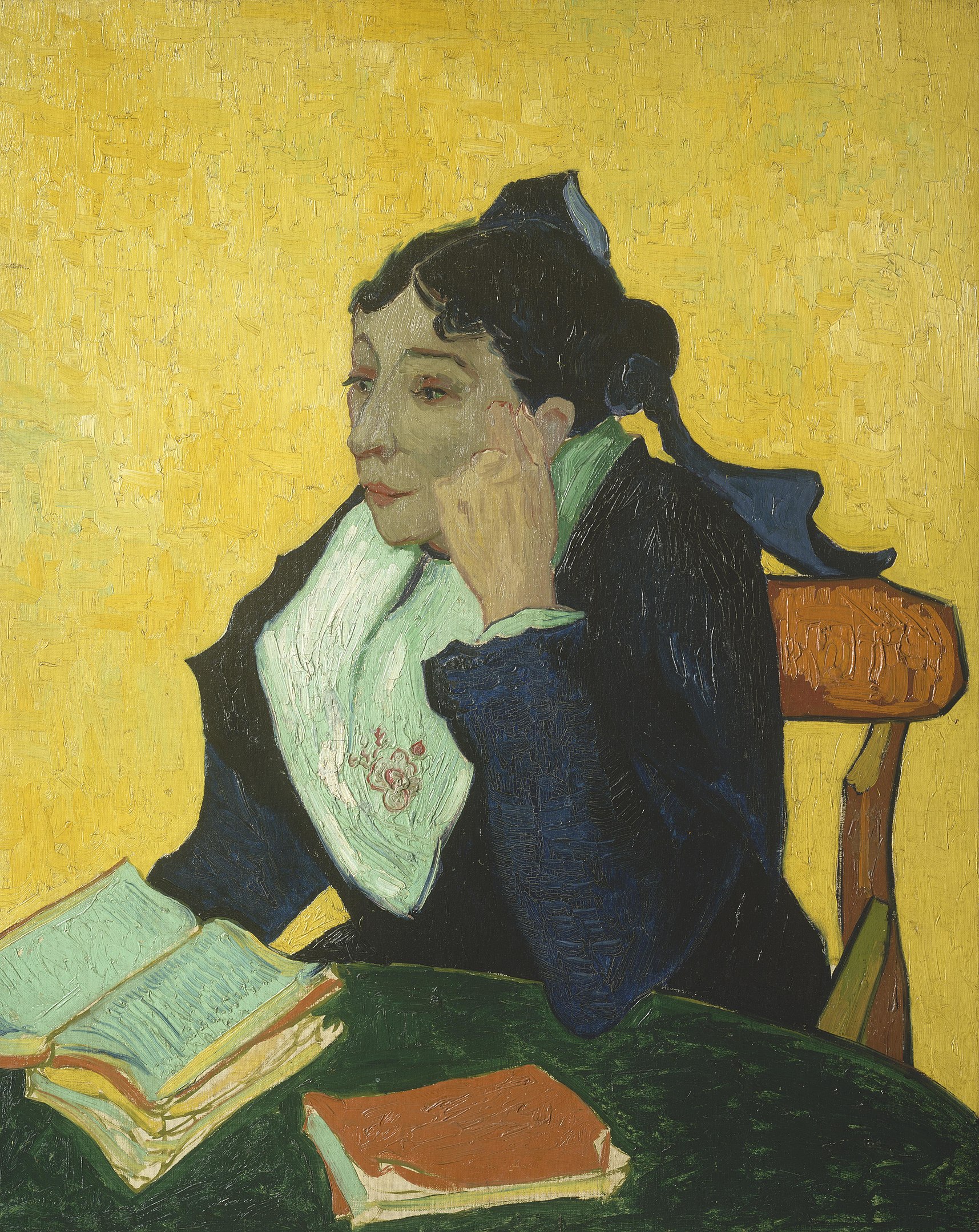
It also tells us why van Gogh painted not only with vivid yellow but also why his version of reality isn’t “realistic” in the sense of objects or places looking as they might do in a photograph. But what’s more important than any of this art history was Vincent van Gogh’s own mind and heart. As he wrote to his sister in 1888: “The sun, a light that for lack of a better word I can only call yellow, bright sulfur yellow, pale lemon gold. How beautiful yellow is!” It was his inspired, anxious, troubled, bright genius that unleashed yellow like never before or since. Whether dominating the view from his room at the hospital in Arles or as a solid background for a portrait.
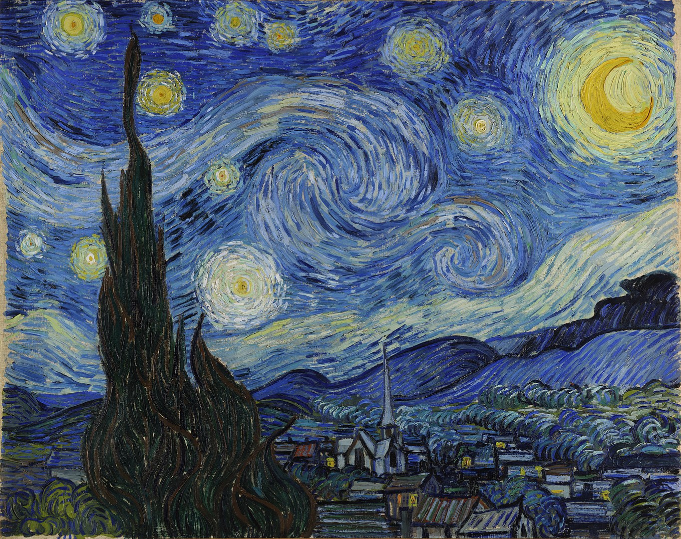
Or, in harmony with his also-beloved purple, creating a vivid night sky which isn’t “realistic” at all, and yet which is more deeply real and expressive than any photograph could ever be. And that, in so many words, is why van Gogh loved yellow.
From tweets by The Cultural Tutor.