Introduction
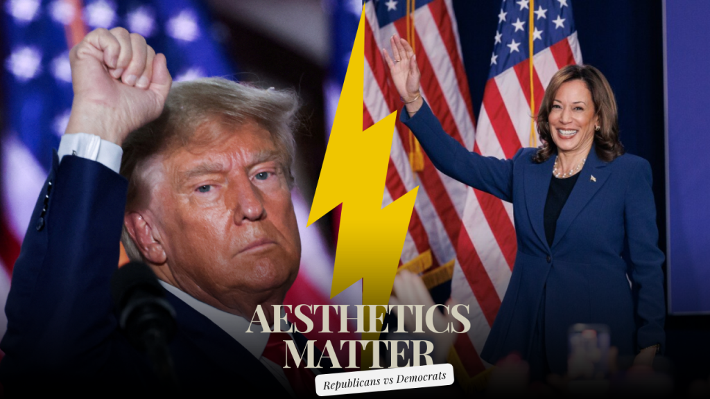
In US elections campaign aesthetics are very important in shaping how voters feel and can also play a critical role in determining electoral results. This includes logos, colours schemes, fonts, and images: in other words everything that connects these products to the political parties that create them through messages, values and brand identities. They are not just decorative however but have deeper meanings as they influence voters to a large extent and as such must be handled with care when it comes to voter engagement and sentiments
Campaign aesthetics show broader political strategies. This is designed specifically for people who want to bring out feelings in their hearts whenever they hear about him or her in comparison with other candidates by creating something that looks different regardless of whether it is mistaken or not. Additionally, they help in distinguishing the candidate from other candidates running for the same offices. Indeed, the Republican and Democratic parties have their unique design languages that correspond to their ideological positions among other things.
During the campaign season, Republican aesthetics tend to be inclined towards the conventional, patriotic imagery with an emphasis on issues of nationalism and conservative ideas. This betokens a design that is daringly honest in its simplicity and makes use of well-known icons of identity including the flag and eagle as the people’s symbol of America. The goal here is to create feelings that communicate stability and consistency wherefore they could attract citizens who cherish historical background as well revisiting the past rediscovering its original essence. Conversely, Republicans typically adopt a more conservative and exclusive look that does not really appeal to all sections of American society. Their campaign visual messages tend to focus on specific values—freedom and individualism—that define their party unlike the Democratic party meaning their design choices are often classical or standard without considering a wide audience other than their targeted group of people. These current design decisions are much more contemporary than those taken previously because they feature images that are less hardline but can be understood by everyone like other voters especially young people different races as well as ethnicities.
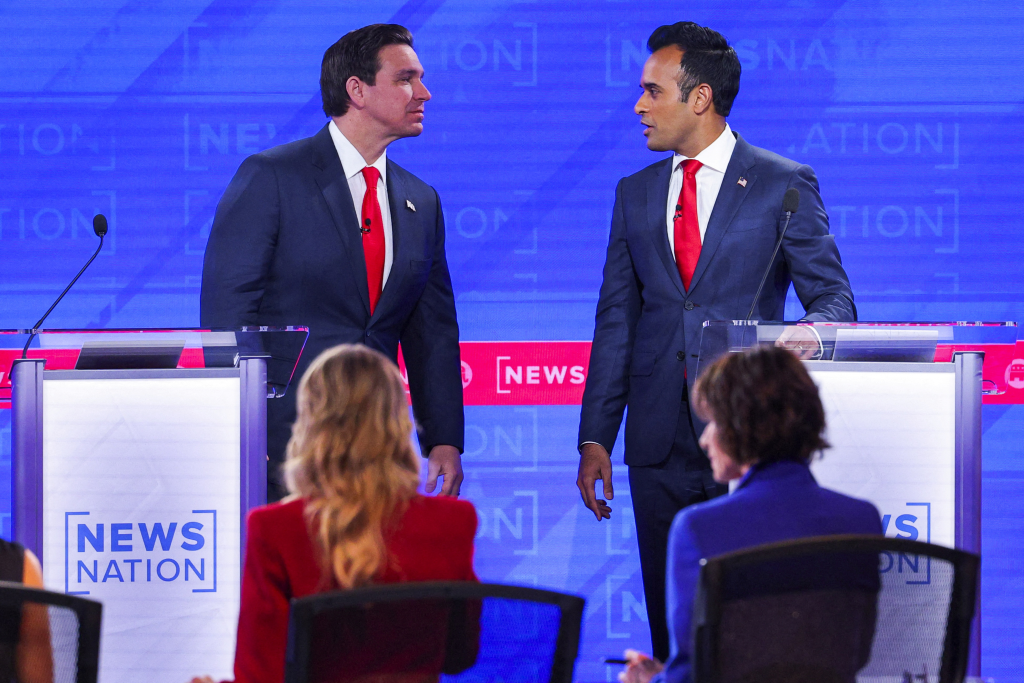
A deep look into how the Surface Behaviour of Republican vs Democratic Campaigns are helps to understand how they represent themselves, catch their base’s attention, and draw in the ambivalent voters. This essay is an in-depth examination of the aesthetic distinctions between them vis-a-vis their key messages and in shaping voter conduct during contemporary electioneering.
Historical Context
The aesthetics of political campaigns in the United States have evolved significantly over the years, reflecting changes in technology, media, and public sentiment. To understand the current visual strategies of the Republican and Democratic parties, it’s important to examine the historical evolution of campaign aesthetics.
Early Campaigns and Print Media
In the early days of American politics, campaigns were largely characterised by printed materials such as posters, pamphlets, and broadsides. These early visuals were straightforward and utilitarian, often featuring simple portraits of candidates along with their key messages. The limited reach of print media meant that campaigns were localised, and aesthetics played a secondary role to the content of the message.
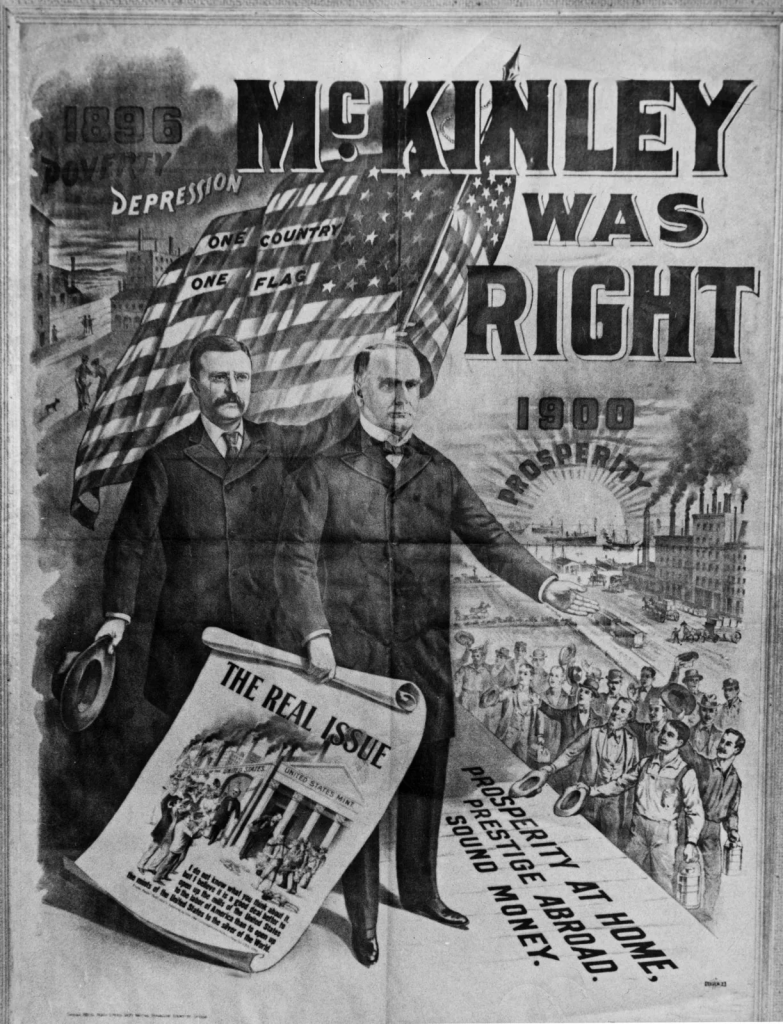
William McKinley (holding broadsheet) with Vice Pres. Theodore Roosevelt in a campaign poster for presidential reelection in 1900.(less)| Courtesy: britannica
The Rise of Radio and Television
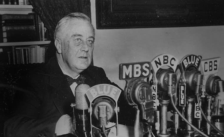
The advent of radio in the early 20th century brought about a new dimension in campaign aesthetics. Candidates like Franklin D. Roosevelt used radio effectively to communicate directly with voters through “Fireside Chats,” which were less about visual aesthetics and more about the tone and content of the message.
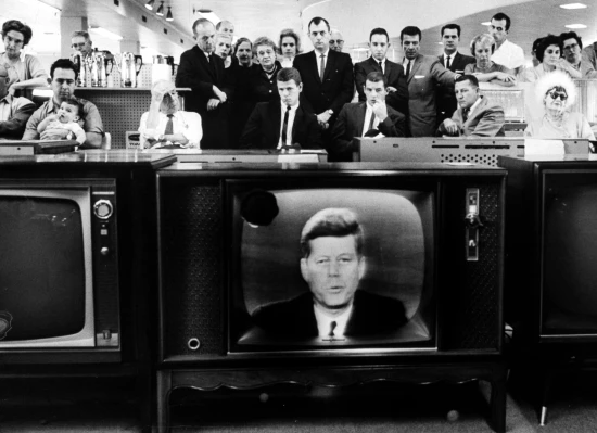
The true transformation in campaign aesthetics began with the rise of television in the 1950s. Televised debates, such as the famous Nixon-Kennedy debates of 1960, highlighted the importance of visual presentation. John F. Kennedy’s polished appearance and calm demeanor contrasted sharply with Richard Nixon’s less favourable television presence, underscoring how visual and stylistic elements could influence public perception.
The Digital Revolution and Modern Campaigns
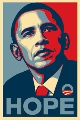
The late 20th and early 21st centuries saw a dramatic shift with the rise of digital media. The 2008 presidential campaign of Barack Obama marked a significant turning point in how aesthetics were used. Obama’s campaign utilised a sleek, modern visual identity with the now-iconic “Hope” poster by artist Shepard Fairey. This visual branding emphasised simplicity and optimism, resonating strongly with a diverse and tech-savvy electorate.
In the digital age, campaign aesthetics have become even more sophisticated and targeted. Social media platforms, such as Facebook, Twitter, and Instagram, have introduced new opportunities for visual storytelling. The Obama campaign’s success in leveraging these platforms set a new standard for how campaigns use digital aesthetics to engage with voters on a personal level.
The Evolution of Party Aesthetics
Over time, the Republican and Democratic parties have developed distinct visual identities that reflect their core values and political strategies. The Republican Party’s aesthetics often draw on traditional American symbols and conservative colour schemes, aiming to evoke a sense of patriotism and stability. In contrast, the Democratic Party has embraced more contemporary and inclusive visuals, reflecting its focus on progressive values and diversity.
Contemporary Trends
Today, campaign aesthetics continue to evolve, influenced by emerging technologies and changing voter demographics. The use of data analytics allows campaigns to tailor visual elements to specific voter segments, enhancing their effectiveness. Additionally, the increasing importance of online presence has led to a more dynamic and interactive approach to campaign aesthetics.
Understanding this historical context provides a foundation for analysing the distinct visual strategies employed by the Republican and Democratic parties in contemporary elections. It highlights how past developments have shaped the current aesthetic approaches and the ways in which these strategies are employed to resonate with today’s electorate.
Republican Campaign Aesthetics
Visual Themes and Symbolism
The visual aesthetics of Republican campaigns often emphasise traditional, patriotic elements, reflecting the party’s core values of conservatism, nationalism, and respect for historical institutions. Key themes include:
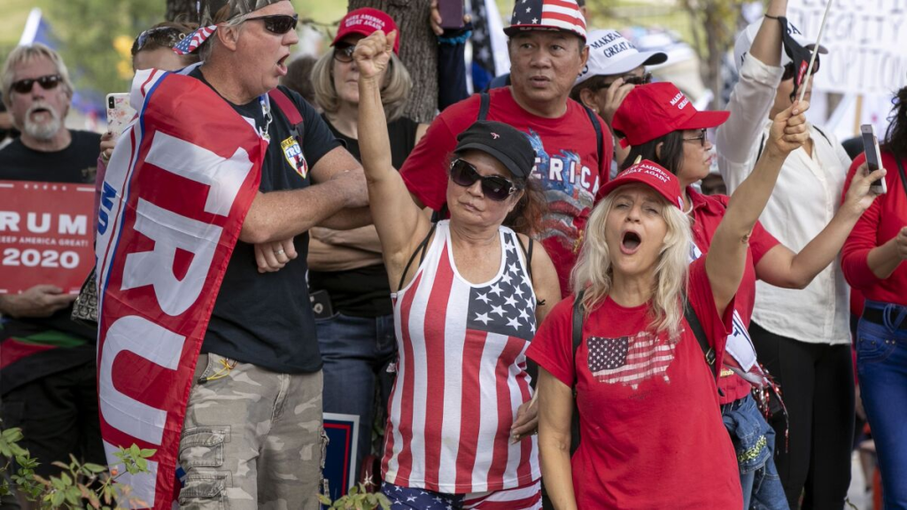
Patriotism and Nationalism: Republican campaigns frequently feature symbols like the American flag, bald eagles, and the Statue of Liberty. These symbols are intended to evoke a sense of national pride and unity, reinforcing the party’s commitment to American values and heritage.
Traditionalism: The design elements used in Republican campaigns often draw on a classic, conservative color palette—primarily red, white, and blue. This color scheme is not only symbolic of the American flag but also evokes feelings of stability and continuity.
Strength and Authority: Imagery in Republican campaigns may include strong, bold visuals such as stern portraits of candidates or dramatic, heroic depictions. This approach is designed to convey a sense of leadership, strength, and decisive action.
Design Elements and Typography
The design choices in Republican campaigns typically reflect a serious and authoritative tone:
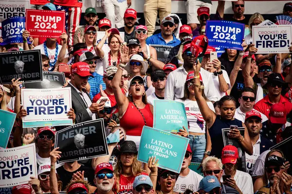
Bold Fonts: Republican campaigns often use strong, serif fonts or bold sans-serif fonts that project a sense of confidence and reliability. These fonts are chosen to convey a straightforward, no-nonsense approach.
Simple and Direct Visuals: Visuals in Republican campaigns are usually clear and uncluttered. The use of straightforward imagery and minimalistic design helps to communicate messages directly and efficiently, avoiding any potential distractions.
Traditional Imagery: Visual content often includes historical or iconic American landmarks, military imagery, or depictions of American families. These elements serve to reinforce a connection with traditional values and societal norms.
Messaging and Themes
The aesthetics of Republican campaigns are closely aligned with the party’s messaging strategies:
Conservative Values: Republican campaign visuals are designed to highlight themes of law and order, economic freedom, and traditional family values. The imagery and design elements are intended to resonate with voters who prioritse these conservative principles.
National Security and Economic Prosperity: Campaign materials often emphasise strong national security, economic growth, and job creation. The visuals might include depictions of economic success, military strength, or patriotic symbols of American achievement.
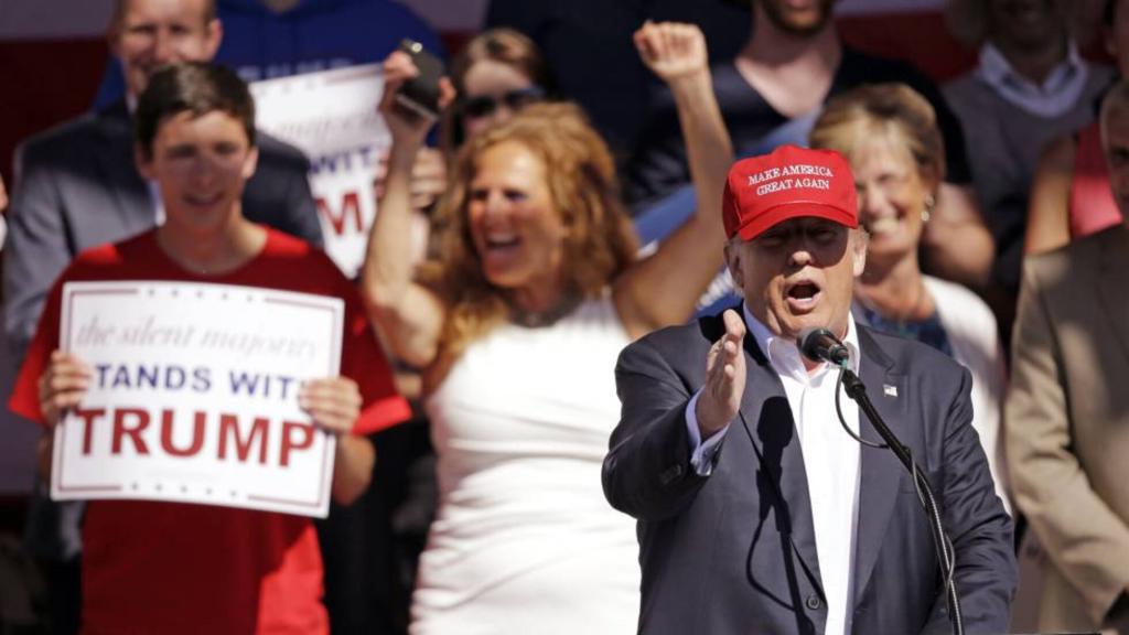
Direct and Uncomplicated Messaging: Republican campaigns typically use clear, straightforward messages that align with their visual aesthetics. This approach is intended to appeal to voters seeking stability and a return to foundational American values.
Notable Examples
Several Republican campaigns have effectively utilised these aesthetic strategies to make a lasting impact:
Donald Trump (2016, 2020): Trump’s campaigns utilised a distinctive aesthetic characterised by bold, attention-grabbing visuals and straightforward messaging. The use of red, white, and blue colours, along with aggressive slogans like “Make America Great Again,” highlighted themes of nationalism and economic revival.
Ronald Reagan (1980, 1984): Reagan’s campaigns used powerful, patriotic imagery and straightforward messaging. The use of American flags, imagery of Reagan as a strong leader, and slogans like “Morning in America” emphasised a return to traditional values and national pride.
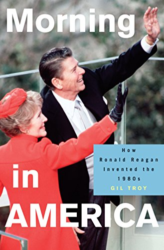
Gil Troy. Princeton University Press| Courtesy: publishersweekly
George W. Bush (2004): Bush’s campaign employed strong, bold visuals and themes of national security and stability. The use of the American flag and images of military personnel were designed to reinforce his position as a leader in times of uncertainty.

George W. Bush at a campaign rally in Clinton, South Carolina, 2000.| Courtesy: Mark Wilson Getty Images
Democratic Campaign Aesthetics
Visual Themes and Symbolism
Democratic campaign aesthetics are designed to reflect the party’s progressive values, inclusivity, and focus on social justice. Key visual themes include:
Diversity and Inclusivity: Democratic campaigns often emphasise diversity in their imagery, featuring representations of various racial, ethnic, gender, and age groups. This approach aims to reflect the party’s commitment to representing all Americans and fostering an inclusive society.
Modernity and Change: The visual aesthetics typically incorporate contemporary design elements to symbolise progress and innovation. This might include modern, sleek graphics, dynamic layouts, and vibrant colour schemes that suggest a forward-looking approach.
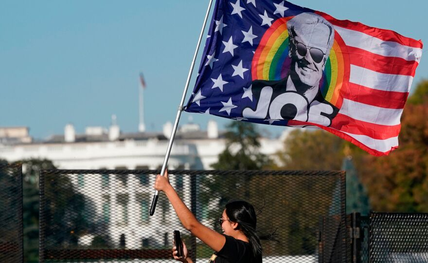
Social Justice and Equality: Campaign visuals often include symbols associated with social movements, such as rainbow flags or illustrations of protest scenes. These elements underscore the Democratic commitment to equality, civil rights, and social reform.
Design Elements and Typography
The design choices in Democratic campaigns tend to emphasise approachability and modernity:
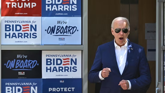
Dynamic Fonts: Democratic campaigns frequently use clean, sans-serif fonts that are modern and easy to read. These fonts contribute to a fresh, contemporary look and convey a sense of openness and accessibility.
Vibrant Colour Palettes: While red, white, and blue are still used, Democratic campaigns often incorporate a wider range of colours, including brighter and more varied hues. This use of colour helps to create a more engaging and optimistic visual identity.
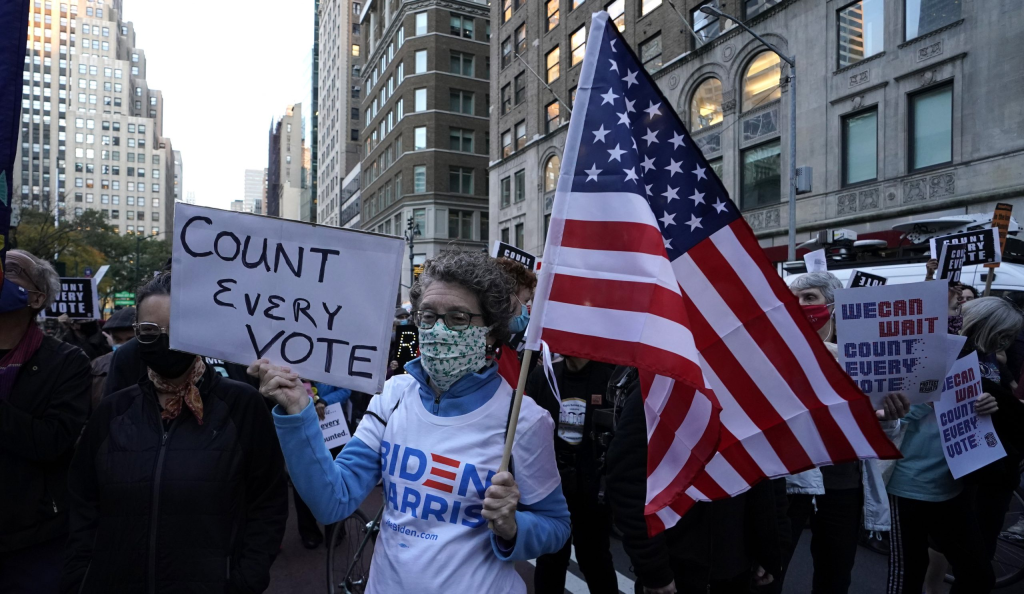
Inclusive Imagery: Visual content in Democratic campaigns may include images of diverse groups of people, modern urban settings, and symbols of community and solidarity. This imagery is chosen to resonate with a broad and diverse electorate.
Messaging and Themes
The aesthetics of Democratic campaigns are closely aligned with their messaging strategies:
Progressive Values: Democratic campaign visuals are designed to highlight themes of social justice, environmental sustainability, and progressive reform. The imagery and design elements often focus on addressing systemic inequalities and advocating for change.
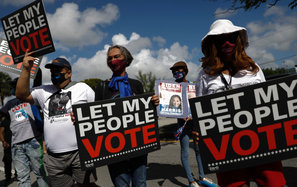
Hope and Optimism: Campaign materials frequently convey a message of hope and positive change. Visuals might include uplifting imagery, such as sunrise motifs or aspirational scenes, to evoke a sense of optimism and future potential.
Community and Empowerment: The messaging often centres on community engagement and grassroots empowerment. Visuals may depict collective action, community gatherings, and diverse groups working together to drive change.
Notable Examples
Several Democratic campaigns have effectively utilised these aesthetic strategies to make a significant impact:
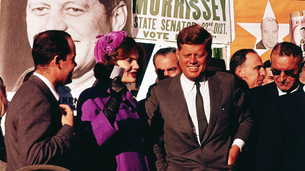
John F. Kennedy (1960): Kennedy’s campaign employed sleek, modern visuals and emphasised youthful energy and optimism. His use of the iconic “Kennedy for President” logo and dynamic campaign materials helped to project a sense of newness and progress.
AP
Barack Obama (2008, 2012): Obama’s campaigns are renowned for their innovative use of design and digital media. The “Hope” poster by Shepard Fairey, with its clean lines and bold colours, became an iconic symbol of the campaign. The use of modern graphics, engaging visuals, and social media strategies helped to galvanise a broad and diverse voter base.
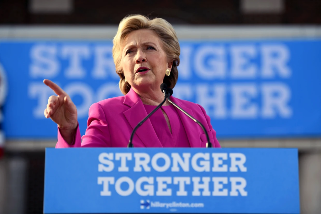
Hillary Clinton (2016): Clinton’s campaign utilised modern, inclusive visuals and emphasised themes of breaking barriers and advancing gender equality. The campaign’s use of vibrant colours, inclusive imagery, and the “Stronger Together” slogan underscored a message of unity and progressive change.
Joe Biden (2020): Biden’s campaign focused on themes of unity, recovery, and inclusivity. The use of clear, straightforward design elements, along with a mix of traditional and modern visuals, helped to communicate a message of stability and renewal.
Comparative Analysis
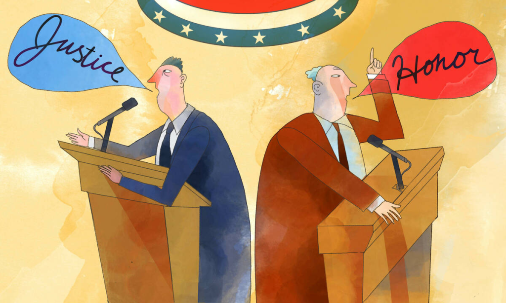
The aesthetics of Republican and Democratic campaigns offer a fascinating contrast that reflects each party’s core values, messaging strategies, and target demographics. This comparative analysis explores the visual differences between the two parties’ campaigns, examining their design elements, emotional impact, and effectiveness in engaging voters.
Visual Contrast
Republican Campaigns: Republican aesthetics often rely heavily on traditional color schemes such as red, white, and blue. These colors are used to evoke a sense of patriotism, stability, and familiarity. Red, in particular, is used to convey strength and urgency, while blue is associated with trust and reliability.
Democratic Campaigns: In contrast, Democratic campaigns utilize a broader and more varied color palette. While blue remains a prominent colour, it is often paired with a range of additional hues, such as vibrant purples, greens, and oranges. This approach aims to create a modern, dynamic visual identity that reflects diversity and optimism.
Typography
Republican Campaigns: Typography in Republican campaigns tends to feature bold, serif or strong sans-serif fonts that project authority and seriousness. These fonts are designed to communicate clarity and confidence, aligning with the party’s emphasis on tradition and stability.
Democratic Campaigns: Democratic campaigns often use clean, sans-serif fonts that are contemporary and approachable. The typography is chosen to be accessible and friendly, reinforcing the party’s focus on inclusivity and progressive values.
Imagery
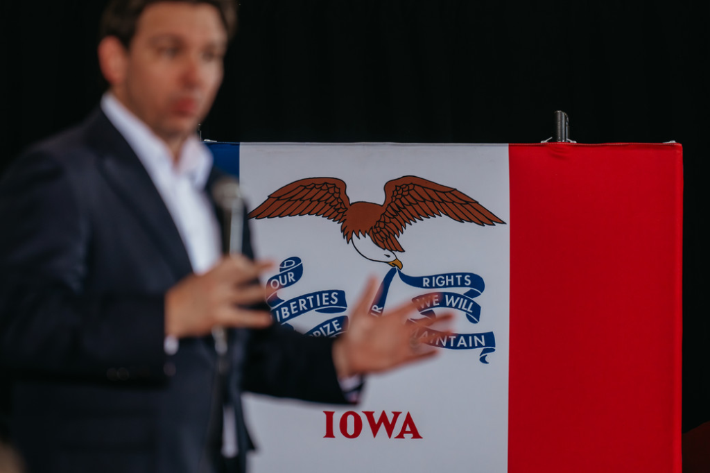
Republican Campaigns: The imagery in Republican campaigns frequently includes traditional American symbols, such as the flag, eagles, and military references. These visuals are designed to appeal to voters who value national pride and conservative principles.
Democratic Campaigns: Democratic campaign imagery tends to highlight diversity and community. Visuals might include representations of various demographic groups, urban settings, and symbols of social progress. This imagery is aimed at reflecting the party’s commitment to inclusivity and social reform.
Emotional Impact
Republican Campaigns
The visual elements used in Republican campaigns are crafted to evoke feelings of patriotism, strength, and reliability. The use of traditional symbols and bold colors is intended to instill a sense of national pride and confidence in the candidate’s ability to maintain stability and uphold conservative values.
The straightforward, authoritative design approach is designed to appeal to voters seeking continuity and a return to established principles. This can create a strong emotional connection with those who prioritize traditional values and national unity.
Democratic Campaigns
Democratic campaign aesthetics aim to generate feelings of hope, inclusivity, and progress. The use of vibrant colours, modern design elements, and diverse imagery is intended to inspire optimism and a sense of collective empowerment.
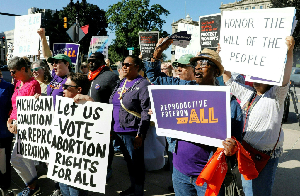
By emphasising themes of social justice and community, Democratic campaigns seek to connect emotionally with voters who are passionate about reform and diversity. The approach is designed to engage individuals who are motivated by a vision of positive change and inclusivity.
Audience Engagement
Republican Campaigns
Republican campaign aesthetics are designed to resonate with traditional and conservative voters who value stability and national pride. The emphasis on classic symbols and strong, direct messaging helps to solidify support among this demographic. The clear, bold visuals and traditional themes are effective in mobilising a base that values continuity and a strong national identity. However, this approach may be less effective in reaching younger, more diverse voters who may seek a more modern and inclusive message.
Democratic Campaigns
Democratic campaign aesthetics are geared towards engaging a broad and diverse electorate, including younger voters, minorities, and progressive individuals. The modern, inclusive visuals and themes of social justice are designed to appeal to those who prioritise reform and diversity. The dynamic and vibrant approach helps to create a strong connection with voters who are motivated by a vision of progressive change and inclusivity. However, this approach may sometimes struggle to connect with more conservative or traditional voters who might find the modern aesthetics less aligned with their values.
Effectiveness
Republican Campaigns
The effectiveness of Republican campaign aesthetics lies in their ability to reinforce traditional values and project strength. The use of patriotic imagery and bold colours effectively communicates the party’s core messages of stability and continuity.The clear, direct visual strategy helps to solidify support among core Republican voters and can be particularly effective in conveying a sense of authority and leadership.
Democratic Campaigns
The effectiveness of Democratic campaign aesthetics is seen in their ability to engage and mobilize a diverse electorate. The modern, inclusive visuals and themes of progress help to resonate with voters who are passionate about social change and equality.
The vibrant and dynamic approach fosters a sense of optimism and collective action, which can be particularly effective in energising supporters and driving voter turnout.
Social media has dramatically transformed the landscape of political campaigns, providing new opportunities and challenges for both Republican and Democratic parties. The platforms—such as Facebook, Twitter, Instagram, TikTok, and others—offer unique avenues for engaging voters, shaping public perception, and disseminating campaign messages. The role of social media in campaign aesthetics and strategy is multifaceted and has evolved significantly over the past decade.
Visual Strategies on Social Media
Platform-Specific Design
Facebook: On Facebook, campaigns utilise a mix of images, videos, and text posts to engage users. The design tends to be more detailed, with opportunities for longer-form content and in-depth messaging. Campaigns often create visually appealing graphics and videos that are optimised for sharing and engagement on this platform.
Twitter: Twitter’s character limit necessitates concise and impactful visuals. Campaigns often use bold images, infographics, and short videos to capture attention quickly. Hashtags and trending topics are also leveraged to amplify their reach and engage with ongoing conversations.
Instagram: Instagram’s focus on visual content leads campaigns to invest heavily in high-quality images, stories, and reels. The aesthetics are typically more polished and artistic, reflecting a modern and aspirational image. Campaigns often use Instagram to create visually cohesive narratives that resonate with younger audiences.
TikTok: TikTok’s short-form video format encourages creative and informal content. Campaigns often use humor, trends, and challenges to engage users in a more relatable and viral manner. This platform allows for a playful and innovative approach to campaign aesthetics.
Engagement Through Interactive Content
Live Streams and Q&A Sessions: Both parties use live streaming to connect with voters in real-time. These sessions allow candidates to engage directly with their audience, answer questions, and discuss policies. The aesthetics of these live events often focus on authenticity and immediacy, with a more informal and personal tone.
Interactive Graphics and Polls: Interactive content such as polls, quizzes, and infographics is used to engage users and encourage participation. These elements are designed to be visually appealing and easy to interact with, promoting higher engagement rates and providing valuable feedback.
Adaptation of Aesthetics for Digital Platforms
Tailoring Content for Each Platform
Campaigns adapt their visual aesthetics to suit the specific characteristics and user behaviours of each social media platform. For example, while Facebook may feature detailed infographics and long-form videos, Instagram will prioritise high-quality photos and short videos. This tailored approach ensures that content is optimised for each platform’s unique format and audience.
Consistency and Branding
Maintaining a consistent visual identity across different social media platforms is crucial for building brand recognition and trust. Campaigns work to ensure that their aesthetics—such as colour schemes, logos, and design elements—are cohesive and recognisable across all digital channels. This consistency helps to reinforce the campaign’s message and create a unified image.
Influence on Voter Perception and Behaviour
Real-Time Feedback and Interaction
Social media allows campaigns to receive real-time feedback from voters, enabling them to adjust their strategies and messaging quickly. The immediate nature of social media interactions can impact voter perception, as campaigns can respond to current events and emerging issues in a timely manner.
Viral Content and Reach
The viral nature of social media can significantly amplify campaign messages. Shareable content, memes, and viral videos can quickly spread across platforms, reaching a vast audience and generating buzz. Successful viral campaigns can enhance visibility and engagement, though they also require careful management to maintain message control and prevent misinformation.
Targeted Advertising
Social media platforms offer sophisticated targeting options for advertising. Campaigns can use demographic data, interests, and behavioural patterns to deliver highly targeted ads to specific voter segments. This precision allows campaigns to craft personalised messages and visuals that resonate with different groups, increasing the effectiveness of their outreach efforts.
Challenges and Considerations
Misinformation and Fake News
The rapid dissemination of information on social media also poses challenges, including the spread of misinformation and fake news. Campaigns must navigate the complexities of managing their online presence while combating false narratives and ensuring that accurate information reaches voters.
Digital Divide
While social media is a powerful tool, there is a risk of excluding voters who are less active online or who lack access to digital platforms. Campaigns need to balance their social media efforts with traditional outreach methods to ensure they reach all segments of the electorate.
Conclusion
the aesthetics of Republican and Democratic campaigns highlight the distinctive approaches each party takes to connect with voters. While Republican campaigns focus on tradition and strength, Democratic campaigns emphasise modernity and inclusivity. As the political landscape continues to evolve, the role of campaign aesthetics will remain a crucial element in shaping voter perceptions and influencing electoral outcomes.

