Colors in Interior Design Psychology
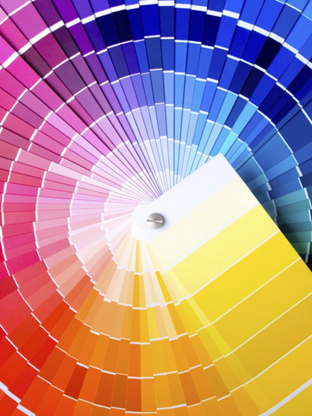
Color psychology in interior design plays a crucial role in shaping the ambience and emotional responses within a space. Each color has its unique personality. Hence, it is extremely important to be wise about the color choices that you make, when designing the house. With a sophisticated understanding of the psychological effects of color in interior design, you can create environments that resonate with desired feelings and behaviours. You may even influence your or your guest’s mood. Let’s explore some of the most popular colors used in interior design and their psychological impacts.
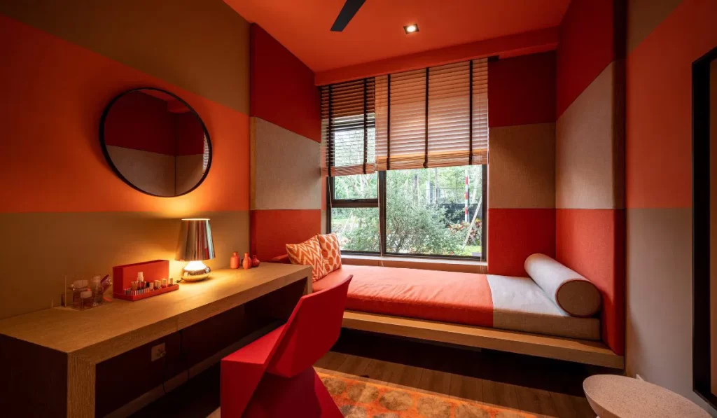
1. Red: The Color of Energy
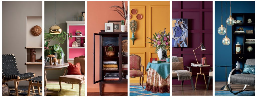
Red is a powerful color that often evokes strong emotions. It also has the highest wavelength, which is often used in warning signals. But red is also associated with passion, excitement, and energy. It can also stimulate the appetite, hence, it is best for dining areas. Be mindful, as the overuse of red can lead to feelings of aggression or anxiety. To leverage red effectively, consider using it as an accent color to add diversity without overwhelming the senses.
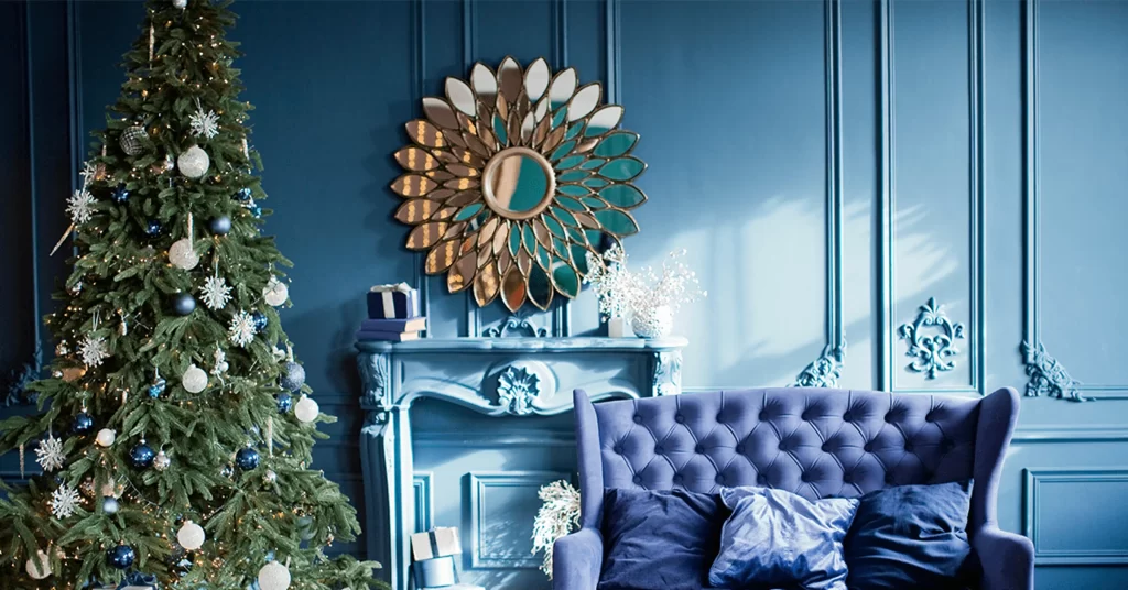
2. Blue: The Color of Calm
Blue is frequently recognized for its calming and serene qualities. In color psychology in interior design, blue can help you relax and achieve a tranquil state. Thus, it is fitting for bedrooms and bathrooms. Lighter shades of blue connote peace, while darker blues evoke stability and trust. Incorporating blue in your house will undoubtedly help create a soothing environment, especially when paired with soft textures and natural light.
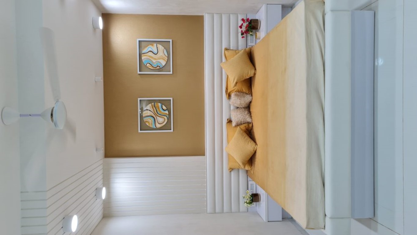
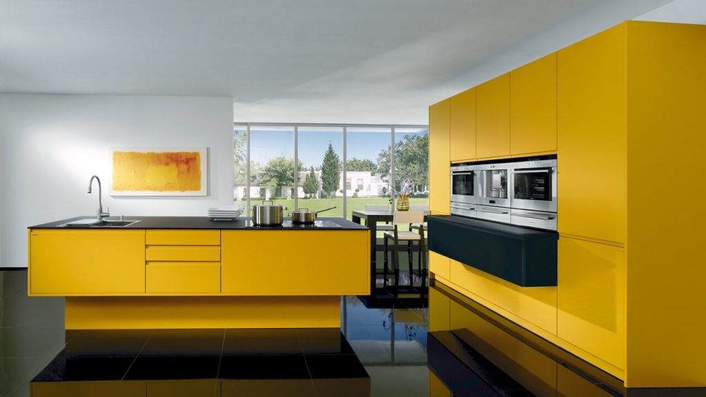
3. Yellow: The Color of Happiness
Yellow is often associated with cheerfulness and optimism. In the study of colors in interior design psychology, yellow stimulates feelings of happiness and energy. It works well in kitchens and playrooms, as the color encourages social interaction and creativity. However, you must use yellow in moderation, as excessive amounts can agitate you and defeat the purpose. Soft pastel yellows can also help you maintain a bright look. Alternatively, you can also use the color in the kid’s room or nursery.
4. Green: The Color of Nature
Green symbolizes growth, renewal, and harmony. The psychological effects of color in interior design reveal that green creates a sense of balance and calm, which is reminiscent of natural surroundings. This makes it an excellent choice for living spaces, offices, and wellness areas. You can match the natural world and invoke various shades of green to create a serene environment. The addition of plants and natural materials can further enhance the effect.
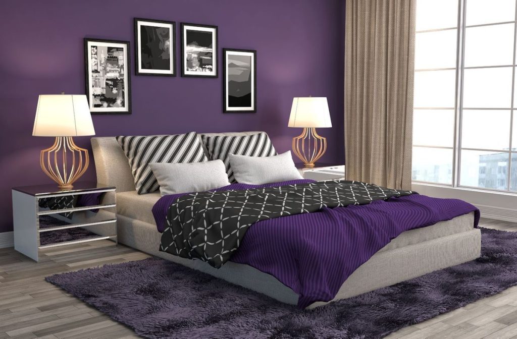
5. Purple: The Color of Luxury
Purple is reminiscent of luxury, sophistication, and creativity. Within the context of colors in interior design psychology, lighter shades of purple like lavender denote a calm ambience, while deeper purples are considered rich and opulent. Using purple in bedrooms, libraries, or your very own reading nooks will create a cosy, inviting space that encourages relaxation and creativity.
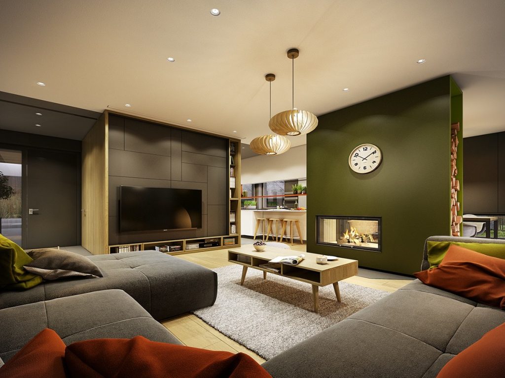
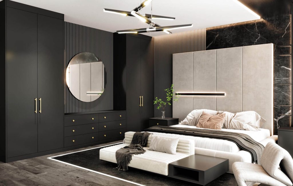
6. Black: The Color of Elegance
Oftentimes, black is seen as mysterious and sinister, but the color is also associated with sophistication and elegance. When talking about the psychological effects of color in interior design, black can create dramatic contrasts and emphasize architectural features. If you are looking to add depth and sophistication to your living spaces, use black in moderation. Be careful, as an overabundance of black can lead to feelings of heaviness, so it’s best to balance it with lighter colors or textures, on the couch or curtains.
7. White: The Color of Purity
White represents purity, simplicity, and cleanliness. In color psychology in interior design, it can create an open and airy feel, making spaces look larger (than usual) and more inviting. It is a popular choice for minimalist designs. However, an all white look is a design no no! To prevent a sterile atmosphere, incorporate texture and accent colors that add warmth and personality to the space. You can also go the stark opposite and use black accents around the space.
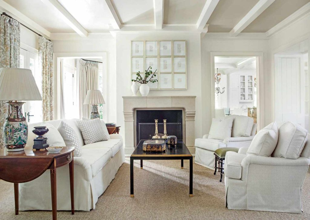
Image Courtesy – Spacey Interior