
Saptarshi Ghosh

Valentine’s Day— A day of love and a day for lovers. Not just the day, the month of February is the month of love for all the married (and unmarried) couples. Sometimes something click in between two individuals that creates a sense of attraction and admiration for each other, thereby giving rise to a bond or relationship. A common field of interest plays a major role in building that bond.
Here at Abir Pothi we got the stories of five (married) couples who had art as their common field of interest. The art style of the couple may vary largely but their love for art is no less than their love for each other. So come lets dive into their art story and love story.
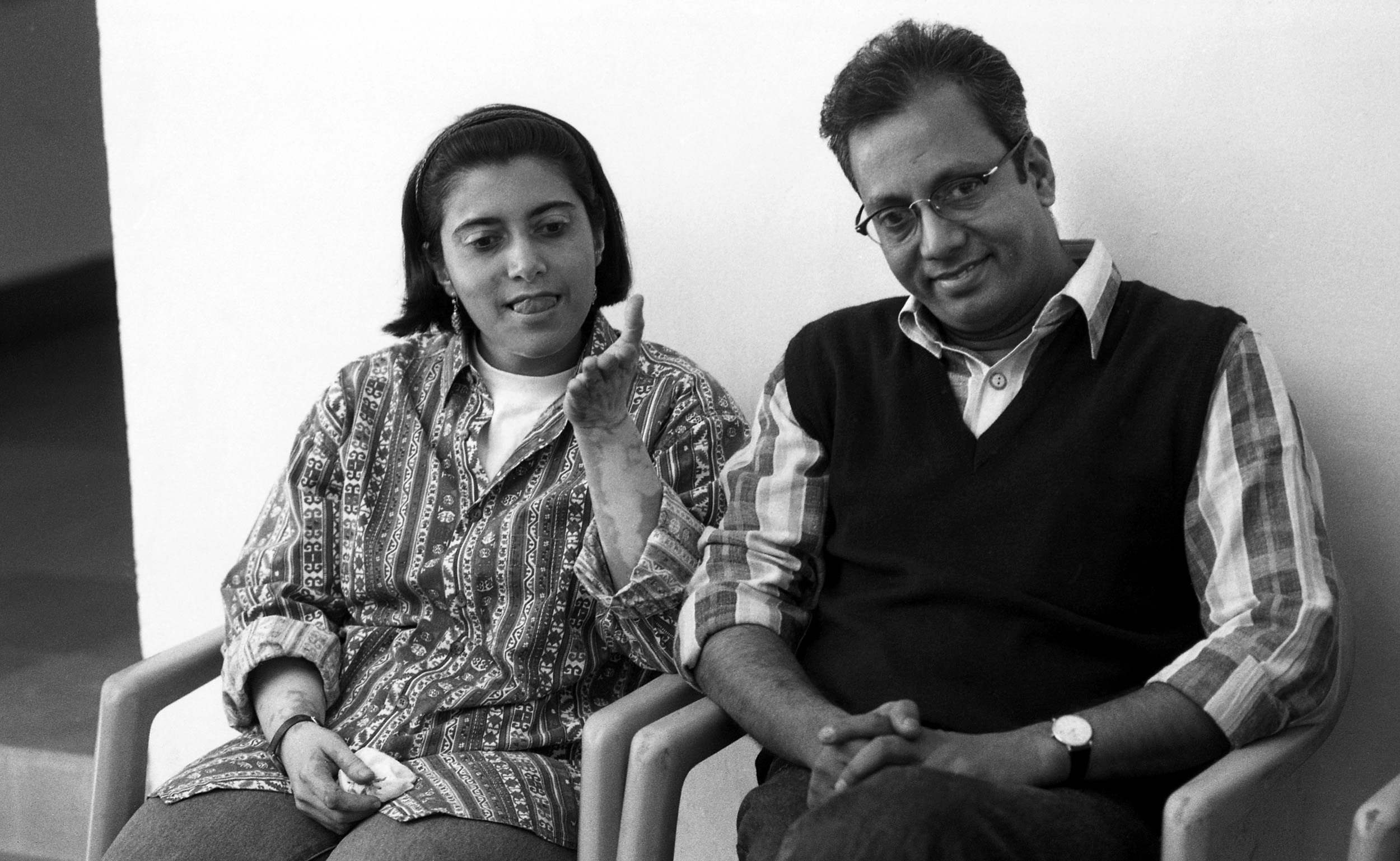
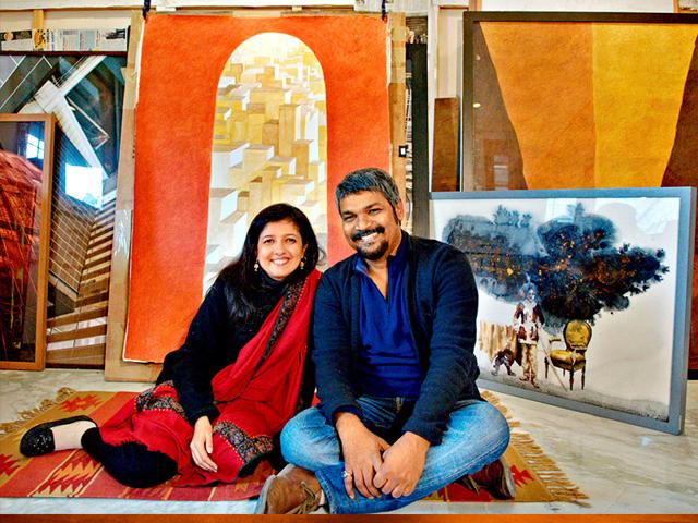
Bharti Kher and Subodh Gupta are considered to be the power couple from the contemporary art scene in India. Born in 1969 in London, Bharti Kher’s artistic career spans more than two decades. Through her works, which consist of paintings, sculpture, collage, video, photography and installations, she addresses issues of identity and culture that traverse the binaries of tradition and modernity, spiritual and the corporeal, nature and technology. Foremost among her signature materials is the bindi, the traditional accoutrement integral to performative womanhood in India. Kher studied a Foundation Course in Art and Design at Middlesex Polytechnic London and obtained her BFA in painting at Newcastle Polytechnic, United Kingdom. Kher is married to the world-renowned contemporary artist Subodh Gupta, whose works span different media – from film, video and performance to sculptural installations using steel, marble, bronze and paint. Born in 1964 in Khagaul, Bihar, he is a formally trained painter, having obtained his BFA from the College of Art, Patna in 1988. He then shifted to New Delhi, where he continues to live and work. Gupta is known for his monumental installation pieces featuring objects ubiquitous in any Indian household, like steel utensils and tiffin boxes. Through his works, he responds to the cultural and economic changes sweeping through a growing nation, under the forces of global capitalism.
Let’s take a brief walkthrough of their individual art careers!
Bharti Kher
Kher migrated to India in the early 1990s. Owing to her upbringing and education in the United Kingdom, Kher’s initial perspective as an artist was that of an outsider. She was influenced by the changing landscape of India, owing to economic liberalisation and the rise of sectarian and communal forces. Initially, her works incorporated objects loaded with cultural significance in the Indian context and poked fun at patriarchal customs and superstitions prevailing in society.
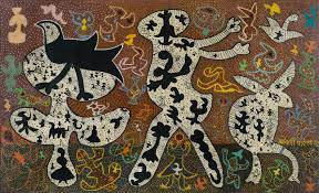
Kher used the bindi for the first time in her 1996 work Spit and Swallow. Comprising two panels, the work featured sperm-shaped bindis, which radiated in opposite directions in each of the panels. The decision to use bindis came about when Kher encountered women wearing them in the markets of Delhi. Kher believes that the bindi is “meant to represent a third eye – one that forges a link between the real and the spiritual-conceptual worlds”. It must be noted that Kher uses the bindi as a material, much like paint or clay, but with an inherent narrative. Some other works of Kher featuring bindis are Formless Connections (2016), Dark Matter MM (2015), Splitting the Atom (2015) and Future is not fixed (2020).
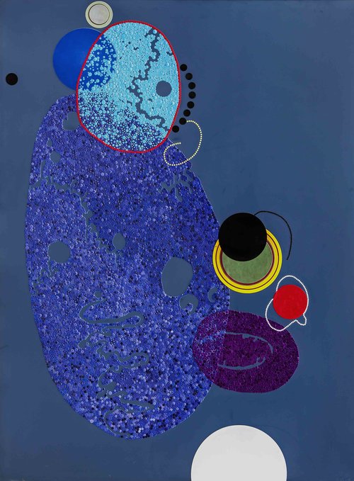
Image courtesy: www.bhartikher.com
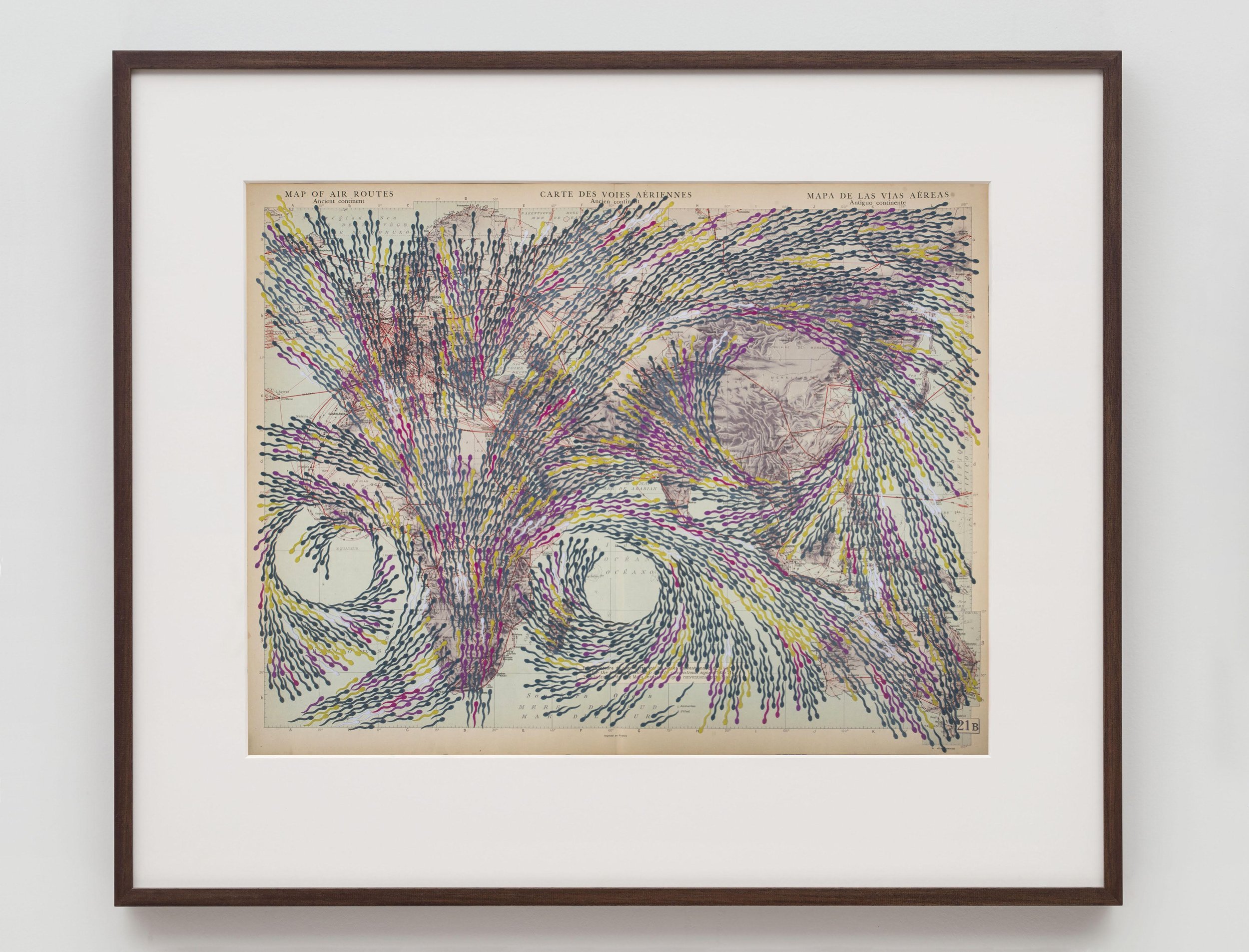
Image courtesy: www.bhartikher.com
Integral to Kher’s oeuvre are her sculptural works, which include fantastical hybrid creatures, blurring the distinction between the human and nature. The animal-human hybrid figure in Arione (2004) is depicted as a dominatrix serving muffins on a tray upon which her breasts rest, voicing repressed feminine fantasies. In her sculpture, Kher often references magical beasts, mythical monsters and allegorical tales. In An Absence of an Assignable Cause (2007), she recreates the enormous heart of a whale using fibreglass, with its veins and arteries protruding. She uses found objects in her works, which she surveys, collects and transforms with the aim of initiating a dialogue between the metaphysical and the mystical.
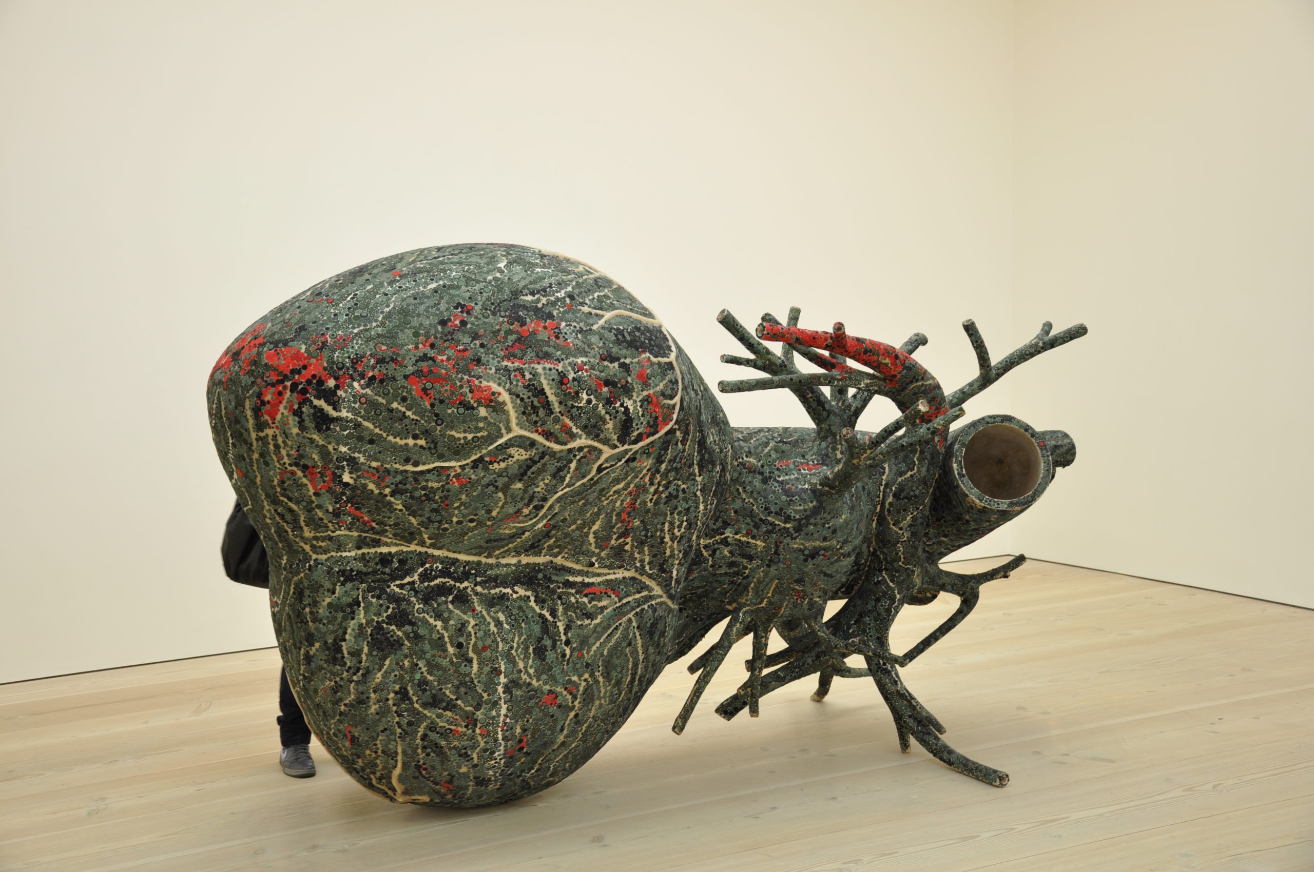
Image courtesy: Wikimedia Commons
Kher’s works were recently on display at the Arnolfini Gallery in Bristol, UK as part of her solo show The Body is A Place.
Subodh Gupta
By incorporating objects commonly used in Indian kitchens and households, like steel utensils, tiffin boxes, bicycles and milk pails, Gupta produces breathtaking sculptures that reflect the anxieties of a nation experiencing radical economic transformation with every passing year. He harnesses the ambiguous connotations these objects evoke in his varied audience – to an unversed Western audience, they appear exotic, whereas to Indian viewers, they are ordinary objects part of their daily life. Gupta uses such mass-produced objects to explore the ambivalence in a society torn between globalisation and traditional customs.
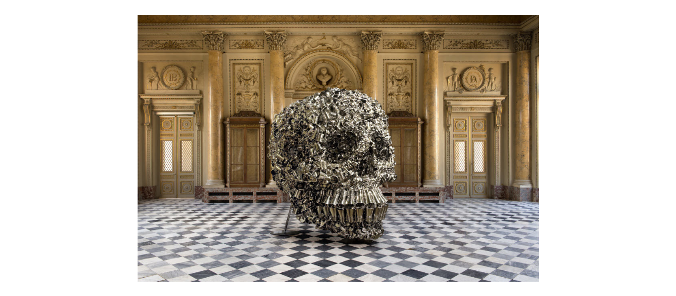
Image courtesy: Artsy
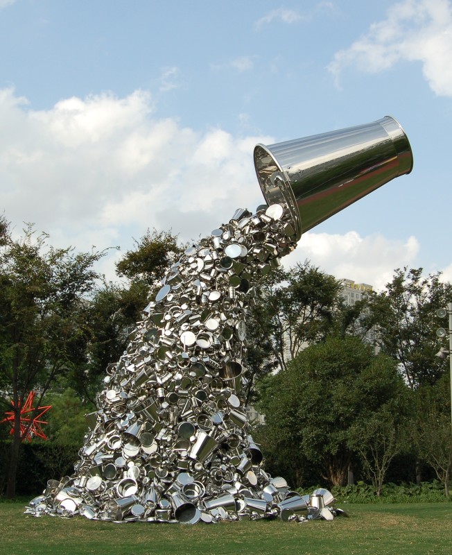
Image courtesy: Nature Morte
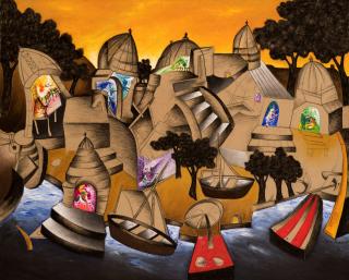
Steel utensils occur in Gupta’s works in various ways. In A Glass of Water (2011), they are shown to serve their usual utility, whereas in Very Hungry God (2006), they accumulate to produce composite structures – in this case, a large, glittering human skull; the work Ray (2012) on the other hand features a giant steel bucket suspended in the air, which pours out a stream of smaller buckets. The inspiration to use steel utensils came to Gupta one day in 1996, when he was on the lookout for new materials to work with and found himself in front of the utensils rack in his kitchen. The first such work that came about was The Way Home I, which was displayed at Chemould Gallery, Mumbai, in 1999. It consists of multiple stainless steel utensils strewn across the floor in no particular order. These utensils symbolise the domestic sphere. However, mingled with these utensils are kattas or country-manufactured guns, which again draw attention to the prevalence of crime and violence in daily life in Bihar.
In Silk Route (2007), Gupta stacked countless stainless steel tiffin boxes in towers, underlining issues of commodification and cancerous proliferation in today’s age of mass-produced goods. His work Cow (2005) comprises a cast-bronze bicycle with shiny aluminium buckets hanging from it – the work is meant to embody how the bicycle supplants the role of the cow in a city, in that milk is individually delivered by milkmen on bicycles. “Buckets are very resonant to me,” explains Gupta. “Where I grew up, big families lived together, and taking the bucket meant you were going to bathe. It’s all creating a juxtaposition between the personal and something bigger.” Many of Gupta’s works also include kitchen racks along with utensils, like Take Off Your Shoes and Wash Your Hands (2008) and Family Nest No. 2 (2012). Gupta’s practice is similar to Marcel Duchamp’s use of readymade objects, as pointed out by Sania Galundi in an illuminating essay: “Gupta adopts the idea of displacement of the readymade popularised by the artist Marcel Duchamp in the early 20th century. Gupta’s artworks often comprise objects displaced from their original context and functional use and displayed in a different context.”
Gupta’s latest exhibition titled Sangam is currently on display till February 19, 2023 at the high-end French departmental store Le Bon Marché – it uses his signature old aluminium utensils collected from markets.
Their story …
Kher met Gupta on a brief trip to New Delhi in 1992, following her art education. They fell in love and soon got married in 1993. Both decided to settle in India itself. Needless to say, they consider each other to be the most crucial factor behind their artistic success. “We do compete, healthily or unhealthily, sometimes,” Kher had said in an interview. “I think the crux of our relationship is art because this is something we are both extremely passionate about.” We at Abir Pothi wish Kher and Gupta a very happy Valentine’s Day!
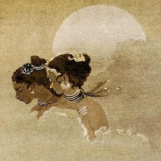
Courtesy- The Indian Portrait
Anju Dodiya is a renowned contemporary artist known for her expressive watercolour paintings layered with symbolism. The self is a recurring theme in Anju’s works. Her practice is informed by a wide range of influences – from Indian and Persian miniature paintings, 17th and 18th century Japanese Ukiyo-e prints, Renaissance painters like Giotto, Bellini to Greek mythology, images from old newspapers, advertisements and contemporary cinema. Anju is married to one of the foremost Indian artists currently working today, Atul Dodiya. Atul’s oeuvre comprises paintings, installations and assemblages, which respond to urgent socio-political issues of our times. Like his wife, his artistic idiom too is shaped by an eclectic mix of influences – from Western and Indian masters, like Picasso, Albrecht Dürer, Bhupen Khakhar, S. H. Raza, to world cinema, literature, contemporary religious and political iconography and popular visual culture, like Bollywood films and advertising billboards. Both Atul and Anju are alumni of Sir J. J. School of Art, Mumbai, from where they graduated in 1982 and 1986, respectively.
Let’s take a look at their individual artistic journeys!
Anju Dodiya
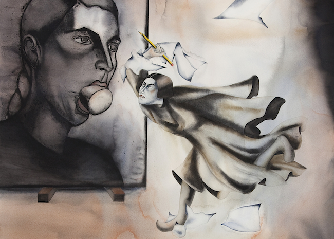
Anju Dodiya is known for her works in watercolour, which feature a harmonious juxtaposition of watercolour smudges and hard-lined charcoal etchings. Her first exhibition, a fictional autobiography (1991), displayed her small-sized, yet expressive ‘self-portraits’ in watercolour, which articulate the creative anxieties of the protagonist/artist persona. The central figure in most of Anju’s works is a woman. Through the female figure, she harks back to history, texts and iconic images from the past.
Courtesy: Chemould Prescott Road
In her experimentations with the materiality of her practice, Anju often paints on the surface of a mattress. This began when, in the early 2000s, she was commissioned to create a painting for the Hotel Grand Hyatt on Shiva and Parvati. Since she wanted to depict Shiva and Parvati’s marriage, Anju decided to paint directly on a mattress, owing to its relation with nuptials. The mattress in Anju’s works becomes a metaphor for domesticity and privacy.
Her important exhibition The Throne of Frost (2007), which was set up in the regal Durbar Hall of the Lakshmi Vilas Palace, Vadodara, was a visual spectacle: as part of the display, 28 double-panelled paintings were installed facing each other, thus creating a reflective chamber. The paintings could either be viewed from a distance or as reflections in the shards of mirror installed on the floor.
Courtesy: Galerie Templon
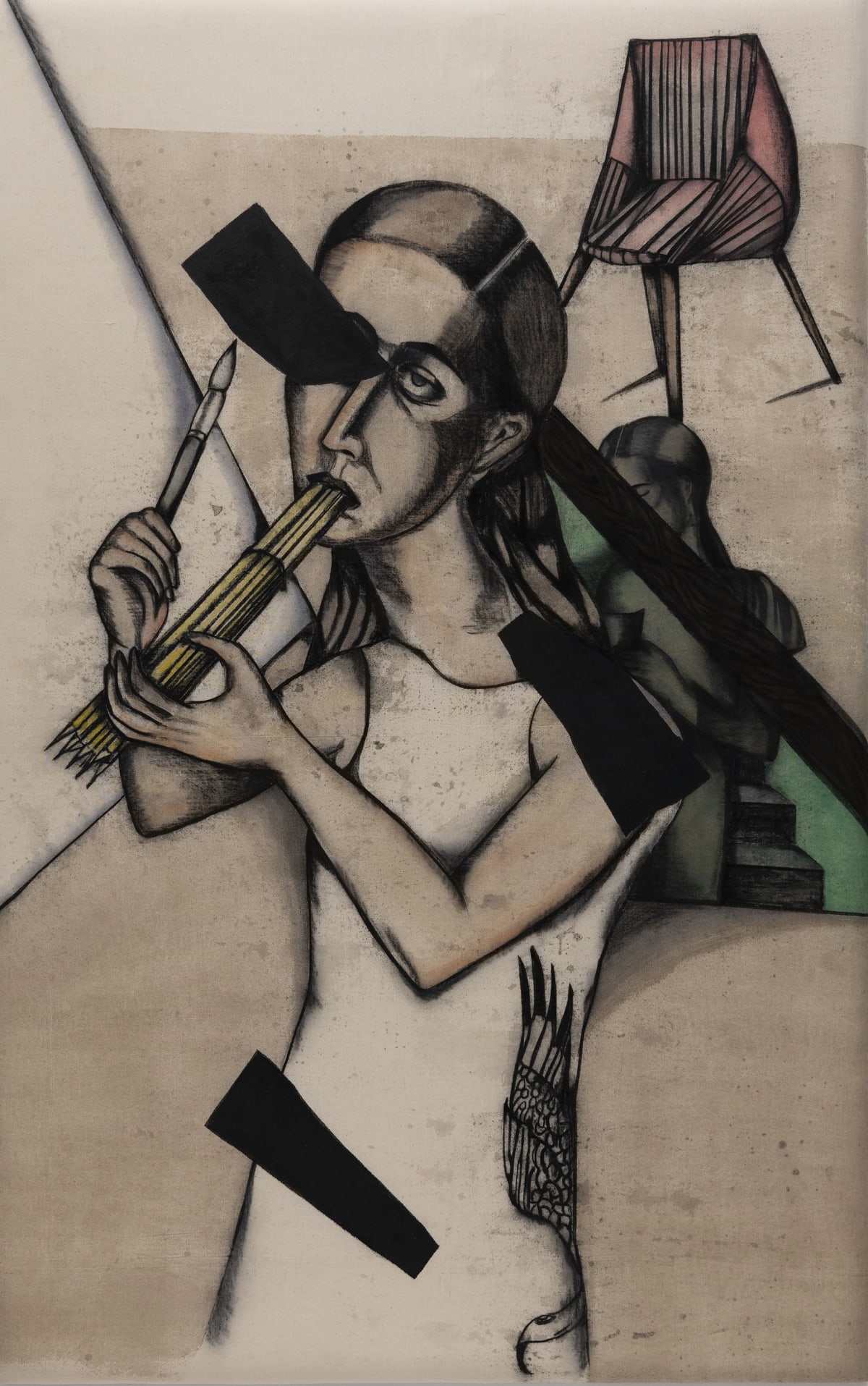
In some of her works, Anju uses artistic paraphernalia to reflect on the process of creating art. In the watercolour Paper Storm (2010), a woman tries to stab a painting with a pencil; both the figures in the painting represent the same person – the artist herself. “It’s the do or die – the challenge of a blank page,” explains Anju. She introduces herself in many of her own works, thereby creating a fictional selfhood. In Pink Scream (2012), the artist is shown to be conversing with a large bust of herself, but with Medusa-like snaky black hair. However, it would be erroneous to consider such works as purely autobiographical. As Ridhi Khanna aptly notes, “Dodiya’s work when seen from a narrow perspective appears to represent self-portraits but over the years her work has evolved into allegorical mind maps, forming a personal mythology of sorts, where the protagonist is faced with multiple dilemmas.”
Anju’s works were on display as part of the exhibition The Chaos Trilogy Part 1: Disorder Under Heaven at the Guild Art Gallery, Mumbai till 5 January 2023.
Atul Dodiya
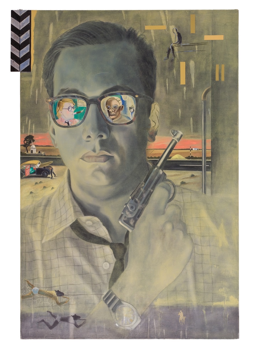
A year-long period of study at the École des Beaux-Arts (1991-92) in Paris made Atul Dodiya reassess his artistic voice and language. During this time, not only did he encounter the canonical works of the Western art tradition in-person but also soaked in influences of the contemporary Western art scene. Bombay Buccaneer (1994) marked a drastic turn from his usual photorealistic approach. A satirical take on a poster of the popular Bollywood film Baazigar (1993), Atul replaced the hero, Shah Rukh Khan’s face with his own; wearing sunglasses and brandishing a gun, he pitched himself as a gangster hero. The sunglasses reflect images of Atul’s two important influences – English painter, David Hockney and the late Baroda group artist, Bhupen Khakhar. Atul also playfully alluded to works of these artists in the pictorial space surrounding the main figure.
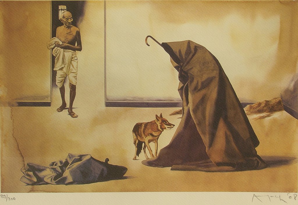
In 1999, Atul received acclaim for his series on Mahatma Gandhi. He thought it pertinent to underline the relevance of Gandhi’s ideology in times of rising communal discord following the Bombay riots (1992-93). Lamentation (1997), Bapu (1998), Bapu at Rene Block Gallery, New York-1974 (1998) and An Artist of Non-Violence (1999) are some paintings from this series. Atul’s engagement with Gandhi is recurrent and can also be seen in recent works like Bako Exists (2011).
Courtesy: Chemould Prescott Road
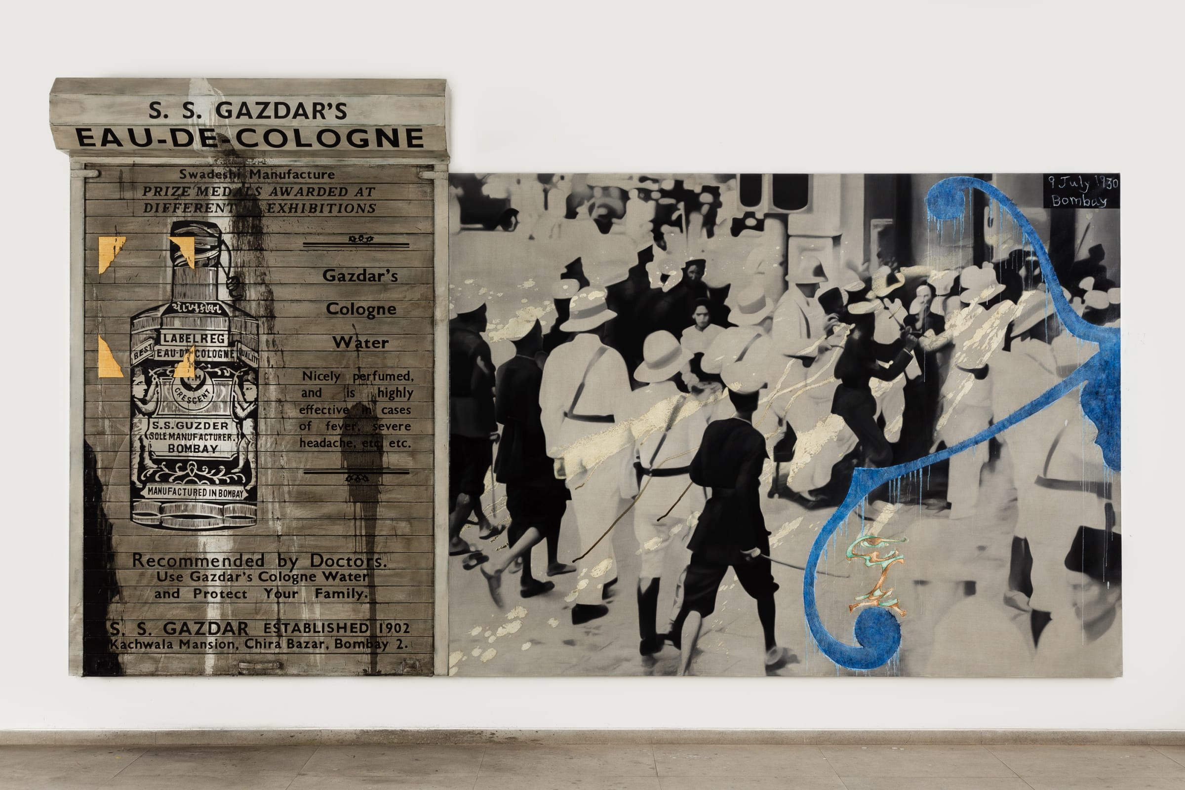
In 2001, he created the first of his iconic paintings on roller shutters as part of the exhibition Century City, curated by Geeta Kapur and Ashish Rajadhyaksha at the Tate Modern. The roller shutters feature in projects such as the Missing series (late 1990s), Dead Ancestors (2012), Police Crackdown, Bombay, July, 1930 (2015) and Stammer in Shade (2020); these works contain a potpourri of visual references – from paintings by Picasso, Van Gogh, Marcel Duchamp and Edward Hopper to oleographs by Raja Ravi Varma.
From 2003, Atul has produced several cabinet-based installations, invoking the colonial-era cabinets of curiosities, like Broken Branches (2003), Meditation (with open eyes) (2011), Fragrance of a Paper Rose (2018). Demonstrating his multidisciplinary approach, these projects contain references to past artworks, texts and other archival materials.
Atul’s latest exhibition Dr. Banerjee at Dr. Kulkarni’s Nursing Home and Other Paintings 2020-2022 is currently on display at Chemould Prescott Road, Mumbai, till 25 February 2023.
Their story …
Atul met Anju at the Sir J. J. School of Art where both of them studied. Speaking of their first meeting, Atul said, “She was the most beautiful girl I’d seen, and above all, she was as passionate as I was about movies and art.” Anju was an admirer of Atul’s work and they would visit galleries together. Unlike Atul, Anju is an introvert who, according to her husband, doesn’t crave success or fame. Atul has contributed significantly to Anju’s flourishing as an artist. Both are passionate about cinema and literature. Though they may not always agree over ideologies and approach to art, they are each other’s best critics. We wish both of them a happy Valentine’s Day!
Pooja Iranna is an eminent sculptor and installation artist. Through her works, she engages with issues like globalisation and its impact on urban spaces. Before
Courtesy- Hindustan Times
training as an artist, she wanted to become an architect. One can consequently discern a predilection towards architectural forms in her art works as well. Pooja is married to the acclaimed visual artist G. R. Iranna. With an oeuvre consisting of paintings, videos and sculptural installations, G. R. Iranna’s works deal with the inner rhythms of human life and the existential crisis plaguing humanity at large. Possessing a certain transcendental quality, they seem to transgress boundaries of space and time.
Let’s take a look at their individual artistic journeys!
Pooja Iranna
Pooja uses various media to create lattice-like structures with intersecting lines and planes, which resemble architectural blueprints. Her works explore the effects of uncontrolled development on urban environments and human populations. As part of her practice, Pooja uses inorganic materials to create art.
Though her art has witnessed visual shifts through the years, Pooja has remained true to her concerns regarding the relationship between human bodies and urban spaces. In an interview with Chitra Balasubramaniam, she summed up the various concerns articulated in her art: “The city, and its relationship with its inhabitants, has always fascinated me, particularly in terms of how we live and how cities are changing all over the world. Inorganic growth is choking us. Geographically based diversity – of peoples and cultures, heritage and history – is being lost every day, taken over by mass-produced, mass-manufactured growth and insane development. This story is being played out all over the world.”
Pooja often works with staples to create ever-expanding grids, highlighting the monotony of existence in cramped urban spaces. Almost Clones (2018) is an installation created using the signature staples ensconced in cement. Through this work, Pooja critiques the monochromatic nature of architecture and urban design: “Buildings look the same everywhere – Shanghai, New York, Tokyo, Cairo, Delhi. In the name of efficiency and mass production, we are simply cloning everything and losing local heritage and culture.”
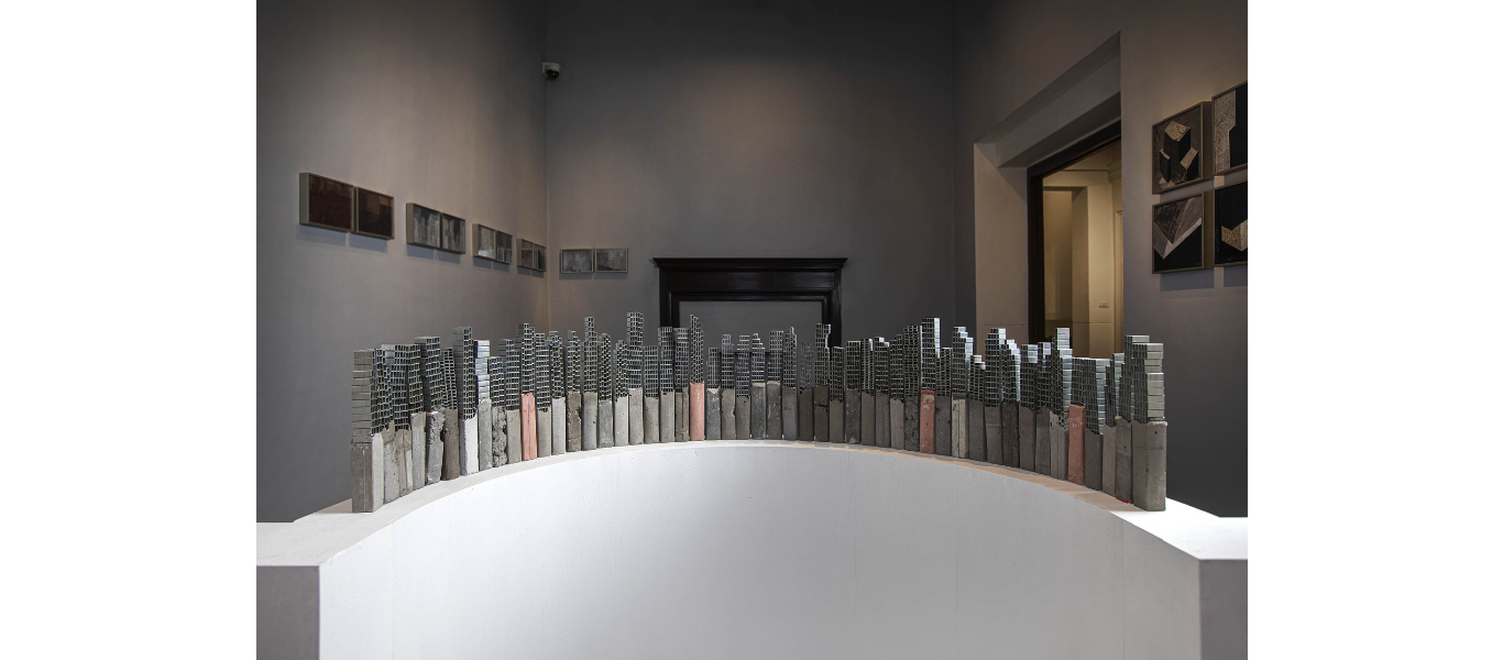
Image courtesy: Artsy
Pooja Iranna’s latest exhibition Silently Continuing … is currently underway at Aicon, New York till February 11, 2023.
G. R. Iranna
Born in 1970 in Bijapur, Karnataka to a family of Shaivaite believers, Iranna’s childhood education took place in the ashram of a gurukul. The holistic learning in a traditional environment left a deep impression on him. Expanding on this, he said, “It inculcated in me the highest regard for human values. It prodded me to ask questions like what’s my purpose?” Influenced by the doctrines of Lingayatism and Buddhism, Iranna in his works dwells on the philosophy of life and issues like morality and wisdom.
Iranna deploys several motifs with metaphorical suggestions regarding the human condition, like the tree, globe and carpet. Deeply aware of the interconnectedness between all forms of life, Iranna uses the tree to represent the network of life encompassing both the human and nature. He also frequently engages with ash as a material, which has deep spiritual and cultural significance. In Shaivaite traditions, ash symbolises the mortality of life and is used to anoint a newborn child. In Silver Ash (2020), Iranna uses acrylic and ash on tarpaulin to uncover abstract formations hidden beneath the anatomy of a tree. In an interview with Abir Pothi, Iranna elaborated on his use of ash: “Dust to dust – there is a certain meaning inherent to this ash, and I am merely trying to bring forth its own essence, and explore that meaning. […] We are all just guests here on earth, and also a part of nature. If we become one with nature, and see ourselves from far above, it is clear that we are nothing – a small speck in a vast universe.”
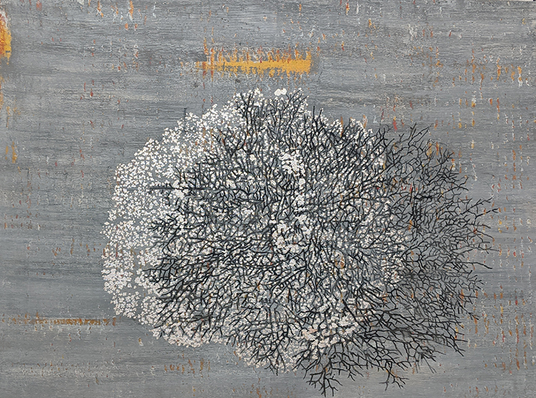
Image courtesy: Guild India
Iranna has also created many sculptural works. Wounded Tools (2007), made with fibreglass, depicts a donkey suspended in air despite being harnessed to a cart carrying wounded tools. It signifies the continuing servitude of the animal to its master. The work won him the Asia Pacific Breweries Foundation Signature Art Prize in 2010.
Iranna’s recent works, grappling with issues like citizenship, refugee crisis and climate change, were on display as part of the exhibition The Chaos Trilogy Part 1: Disorder Under Heaven at the Guild Art Gallery, Mumbai till 5 January 2023.
Their Story …
Evidently, the philosophies of G. R. Iranna and Pooja Iranna’s artistic practice are very different. Illustrating how different they are as artists, Pooja said in an interview, “People might think we’re both artists, and the same, but we’re actually saying very different things. He is towards nature, very much connected to the people and to philosophical world views. […] I’m just the opposite. I want my audience to feel the suffocation of our plastic lives when he talks about breath.” We at Abir Pothi wish the couple a very happy Valentine’s Day!
Reena Saini Kallat and Jitish Kallat
Reena Saini Kallat is a renowned artist whose practice spans drawing, photography, sculpture and installation. Born in 1973, Reena investigates history, collective memory, identity and nationhood through her art. She often works with materials like official records, state constitutions, maps and archaeological surveys. Reena is married to the acclaimed Indian artist, Jitish Kallat, whose works include paintings, photography, collage, sculpture and installations. Lying at the interstices of history, mathematics, science, philosophy and geometry, Kallat’s works over the last two decades have engaged with questions about time, birth, death, mortality, transience, evolution and entropy. Born in 1974, Kallat received a BFA in painting from Sir J. J. School of Art, Mumbai in 1996. His debut solo, titled PTO, was held at Chemould Prescott Road in 1997.
Let’s take a brief walkthrough of their individual art careers!
Reena Saini Kallat
Reena completed her graduation from Sir J. J. School of Art, Mumbai in 1996. Fluidity and futility of borders is a theme that runs through many of her works. Belonging to a family originally hailing from Lahore, she grew up hearing first-hand accounts of the horrors of partition from her relatives. This in turn resulted in her preoccupation with political borders and divisive forms of nationhood.
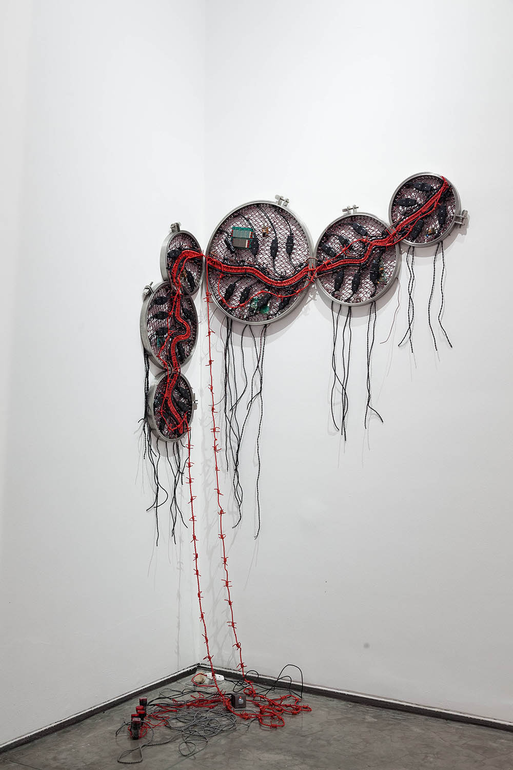
In Leaking Lines (2019), Reena inscribes the borderlines marked by the Partition – Radcliffe Line, Curzon Line and McMahon Line – and juxtaposes them with images of the landscapes which they divide. The lines tear apart a web of interconnections, represented by wires, which existed and thrived previously. In Anatomy of Distance (2014), electric cables resembling barbed wires are laid across conjoined circular metal frames to resemble the Line of Control or LoC – the contested de facto border between India and Pakistan.
Courtesy: www.reenakallat.com
Reena is also concerned with maps and the logic of map-making. In Woven Chronicle (2018), she questions the very way we perceive the map of the world. The north-upwards, south-downwards way of looking at the world map is a result of the dominance of European cartographic practices, which treated the North Star as their fixed reference point for navigation. Reena’s map, made from electric cables resembling barbed wires, is placed south-upwards. Revealing her inspiration behind the use of wires, she says, “I was thinking about the fiber-optic cables that traverse the ocean floors, connecting us, and the way technology is trying to unify and flatten the world with access to information. Wires essentially transmit energy and information from one place to another. Technology and commerce are blurring geographic boundaries.”
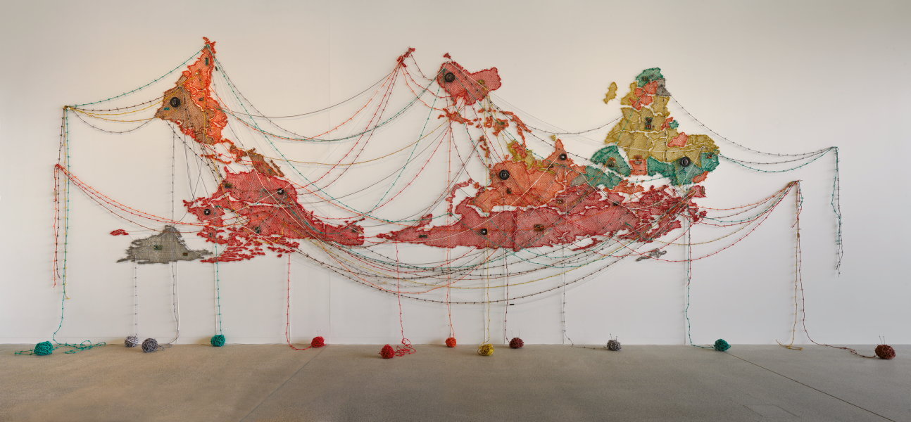
Courtesy: Art Gallery of NSW
Reena’s works are on display at Firstsite, United Kingdom as part of the exhibition Leaking Lines till 16 April, 2023.
Jitish Kallat
In his early years, Kallat’s paintings featured his distinctive visual style inspired by the streets of Mumbai, graffiti, billboards and political posters. Many of his early works also include self-portraiture, albeit in a humorous way. One such work is Modus Vivendi (1000 People – 1000 Homes) (2000), which explored the notion of selfhood in a populous city. Peter Nagy, the co-director of Nature Morte, observes, “Other indigenous painters before him had flirted with international styles such as Pop (most notably Jyothi Bhatt and Bhupen Khakhar ) and the mix and match of Postmodernism (namely Gulammohammed Sheikh and Atul Dodiya), but no one had turned the textures and surfaces of urban India into the fracture of painting quite so successfully.”
Courtesy: www.jitishkallat.com
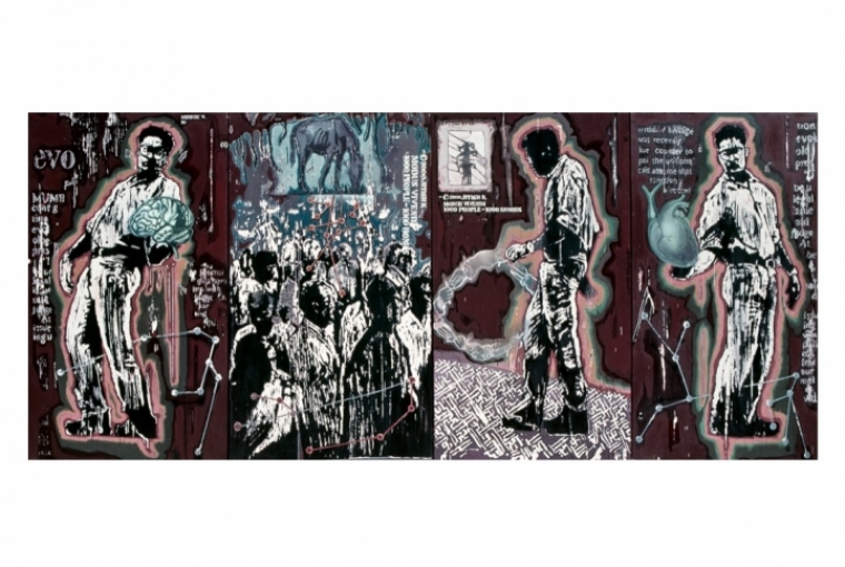
In other works, Kallat studies universalised states of sustenance and the rhythms and cycles in the natural world. For example, the meditative Wind Study (Chloroglobin) (2018) evokes the complex forces of nature, including flora, fauna, vital fluids and chlorophyll. Kallat’s series of photo-collages Chlorophyll Park (Mutatis Mutandis) present an idyllic urban landscape with verdant fields replete with lush, green grass replacing roads. In another photo work titled Conditions Apply 2 (2007), images of rotis replace the moon in its changing phases during the lunar cycle.
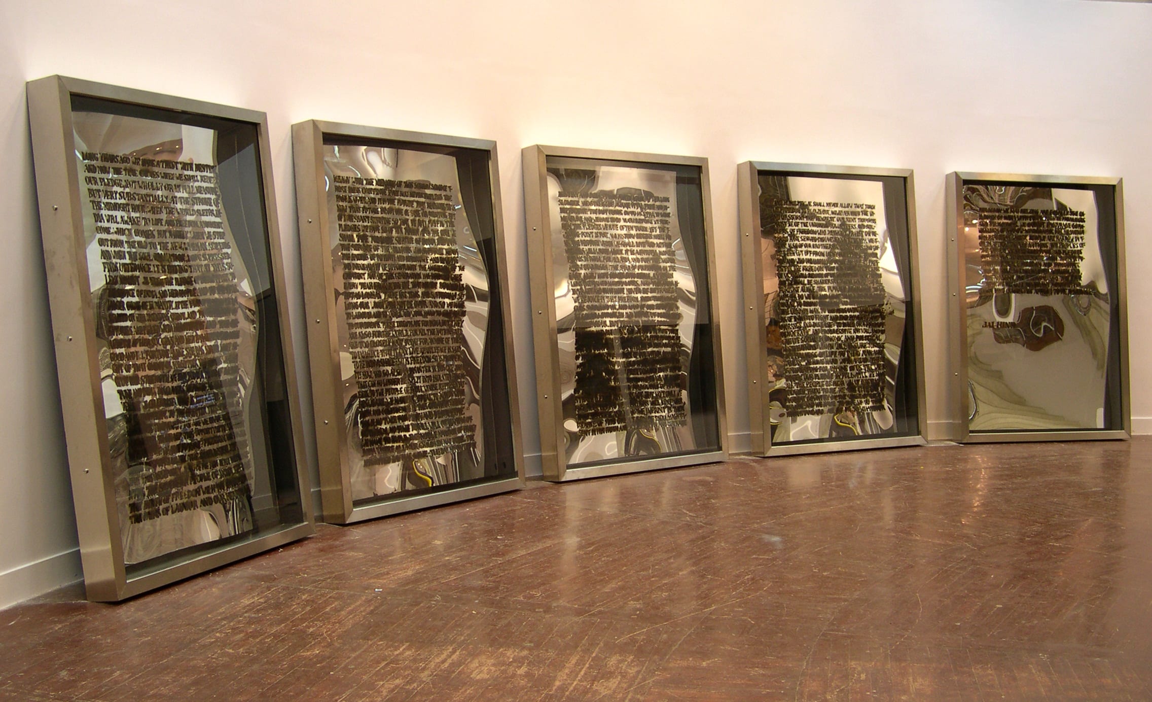
Kallat’s interventions in the realm of sculpture and installation have been significant. Public Notice I (2003) can be described as a deliberate distortion of Nehru’s famous speech delivered on the eve of Indian Independence. Kallat manually inscribed the entire speech on acrylic panels with rubber glue, before setting fire to them. The incinerated remains represent the failure of Nehru’s dream. Epilogue (2011), which is an adaptation of the earlier work Conditions Apply 2, is an assemblage of 22,500 rotis labelled through months and years, tracing out the 753 lunar cycles that quantify his father’s lifetime. Kallat’s works are marked by shifting scales – while some deal with the sweat and grime of existence in the metropolis, others concern themselves with intergalactic vistas.
Courtesy: Chemould Prescott Road
Kallat’s latest exhibition titled Otherwhile was on display at Gallery Chemould, Mumbai between 4 December 2022 and 4 January 2023, marking 25 years of his first exhibition at the same venue.
Their story …
Jitish and Reena’s love story hardly began under ideal circumstances. They fought during a classroom assignment at the J. J. School of Art in 1993. As part of his performance piece, Jitish kept repeating a specific phrase whenever his classmates or teachers would pose any query to him. This was perceived as misconduct and led to their first disagreement. “It was love at first fight,” he quips. They both believe that art is what cements their relationship. “We were actually quite happy to be able to do what we loved, it seemed like luxury enough and it continues to be the same,” says Jitish.
The scintillating Madhvi Parekh is a self-taught artist who took up painting in 1964, inspired by her husband, Manu Parekh, the distinguished Indian painter.
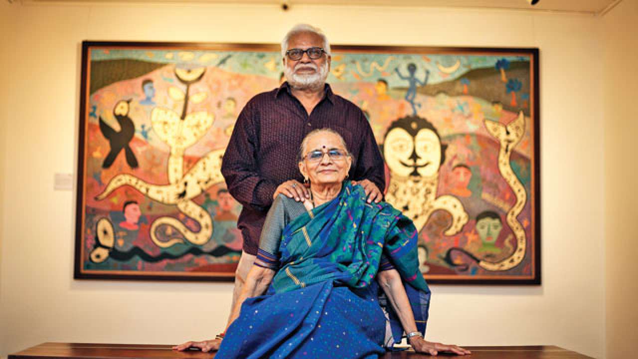
Greatly influenced by artists like Paul Klee and Joan Miró as well as Indian folk traditions, Madhvi’s works conjure up a fabled land of the Indian village, with roots in indigenous art traditions. Manu Parekh works in the modernist tradition. Known for his works on the holy city of Banaras, Parekh’s landscapes stand out for their vibrant colours, bold brushstrokes and prominent lines. He attempts to capture the dynamic relationship between man and nature through his experimentations with figurations and the representation of nature.
Let’s take a brief look at their individual art careers!
Madhvi Parekh
Born in 1942 in Sanjaya, Gujarat, the only reason why Madhvi took up painting was her belief that engaging in some creative activity during pregnancy would benefit the child. “I had no particular intention of becoming an artist,” explains Madhvi. She was in her early 20s when her husband handed her Paul Klee’s Notebooks, which marked the beginning of her interest in art. Beginning with drawing squares and triangles using pen and ink, she soon shifted to animal and human forms.
Madhvi’s works deal with her childhood memories, Indian myths and the vibrancy of folk art. She reminisced, “As a child in rural Gujarat, I have seen the most brilliant lights of nature. The setting sun (for instance) seemed to set the whole world around on fire, and swamp it in a shimmering golden light. Such colours became an integral part of me, and they come out quite naturally in my work as well.” Madhvi’s paintings combine memory with fantasy and surrealist symbols. In her use of oil and acrylic on canvas and watercolour on paper, Madhvi’s practice marks a shift from the traditional materials and surfaces used by folk artists. She deploys the folk idiom with its flat pictorial surface and decorative elements, but does not remain restricted by it.
Courtesy: Eazel
Harmonious coexistence with nature and the emancipation of man from mechanical time are some themes that Madhvi Parekh engages with in her works. For example, her elaborate work The Bird on the Tree (1975), presents “an ecstatic reverie of the natural world”. The painting depicts three black and white amorphous figures over a background patterned with fine lines and dots. Speaking on her process, Madhvi reveals, “I never pre-plan my work. I paint what comes naturally to me. The dotted lines in my paintings are like the running embroidery stitches which I used to do as a child. The vibrancy of the many things that surround me is the source of all my works. They represent different aspects of life as I see and experience. So, every work of mine tries to tell a story.”
Manu Parekh
Born in 1939 in Gujarat, Manu Parekh completed his Diploma in Drawing and Painting from Sir J. J. School of Art, Mumbai in 1962. He then worked as a designer at the Weaver’s Service Centre, Mumbai till 1965, under the mentorship of Pupul Jayakar, the renowned Indian cultural activist and writer. This gave him the opportunity to travel to rural Odisha, Haryana and Rajasthan, where he would study and document folk art forms like Madhubani and Ikat. Meeting indigenous artisans shaped his artistic voice; his experiences in these villages eventually contributed to the themes of fertility and nature in his works.
Parekh shifted base to Kolkata (then Calcutta) in 1965; already familiar with the rich literary, artistic and theatrical tradition of Bengal, the city would become his muse for the next decade. In an interview, he reminisced, “I had a huge attraction to Kolkata because of painting, theatre and Rabindranath Tagore, who I already felt was a great painter. I feel I learned the most about humanness when I went to Kolkata. [It] gave me an opportunity to mature.” In 1975, when Parekh moved to New Delhi, he joined the Handicrafts and Handlooms Export Corporation (HHEC), where he worked as a design consultant for twenty years.
Courtesy: Sanchit Art
Parekh first visited Banaras in 1980, following his father’s death, and was enamoured by it. He spent the next three decades painting the locales of the pilgrim city, which resulted in the Banaras series. The ghats teeming with people, the riverscape, the ordinary lives of people in the city – all these manifest on Parekh’s canvas in his typical stylised idiom and bold colours. It is the endless flow of life that drew him to Banaras. “Till date, I’m not bored of painting a Banaras landscape,” he admits. “It’s a city full of energy where you can witness life and death together.” Parekh has also created works in black and white based on Banaras.
Courtesy: Prinseps
Polemics have always intrigued Parekh – his works prompt the viewer to experience the pain and anguish of their subjects. For instance, in Cry (1990), which was in response to the barbaric blinding of 31 individuals, under trial, by the police (the event known as the Bhagalpur blindings), Kher’s expressionistic use of colour allows the viewer to empathise with the subject’s tragedy.
As an art student, Parekh was immensely impacted by the Swiss-German artist Paul Klee, especially his pedagogical work The Thinking Eye. Among his other influences are Tagore and Ramkinkar Baij, whose works he diligently studied during his stay in Kolkata. Even though Parekh’s canvases are imbued with a distinct sense of Indianness, one can detect influences of Western masters, like Picasso, in them.
Their story …
Though distinct, Manu and Madhvi’s artistic journeys have seen many overlaps. For example, the city of Kolkata invigorated both of them. “The city of Kolkata nourished my art immensely,” observed Madhvi. While Madhu immersed himself in the works of Tagore and Ramkinkar, Madhvi was struck by the Durga imagery, which continues to feature in her works. Needless to say, they consider each other to be their biggest inspiration. Also, if it were not for her husband, Madhvi’s artistic potential would remain unrealised. Abir Pothi wishes the couple a happy Valentine’s Day! We hope they continue to amaze us with more of their artworks!